Strapi Marketplace
Strapi's design assessment, April 2022: a plugin marketplace for its admin where a developer sees who made a plugin and what others think before installing it.
- Year
- 2022
- Track
- design
- Category
- case-study
Tools
- Figma
- Claude Design
In April 2022 Strapi set me a product design assessment: the plugin marketplace inside its admin, before it opened to community plugins. I asked three developers how they choose a plugin and designed the marketplace around their answer. A developer sees what other developers think of a plugin, who made it and whether it fits their project before installing it. It was a hiring exercise and nothing shipped. The screens on this page are that marketplace as a working desktop prototype, made on 25 September 2026 in a Claude Design canvas. I directed it and Claude built it.
Prototype. The plugins, their makers, ratings, reviews and download counts, and the signed-in user are invented.
The brief
Strapi wanted to refresh the marketplace in its admin before opening it to community plugins, so that people could pick the plugins a project needs. It asked for two things: a wireframe that shows the method, in whatever fidelity I chose, and an interface that shows where I took my cues from. Its own design guidelines did not have to be followed. Two screenshots of the marketplace as it was came with the brief.
Strapi also passed on five things its own research had found people wanted to do. These are Strapi's findings, not mine:
- Look for a specific plugin, with search and filters.
- Tell an installed plugin from one that is not.
- Tell plugin types apart: tech, design, SEO.
- Tell official plugins from community ones.
- See a rating score and comments.
How developers pick a plugin
I went to developers first. Three interviews, on 30 March and 1 April 2022, in Turkish, with people who install extensions into the tools they use every day. I asked each of them how they decide which one to take.
The first cross-checks three numbers: downloads, comments and the review score. Whether it is official matters little to them, because extensions are open source and they trust the community to find a bad one quickly. The second treats it like getting an app on a phone: downloads and popularity, sometimes a web search for the best one for the job, read with care. They would probably take the first result, and the official one when in doubt. A maker they know raises their trust a lot. The third installs from the terminal and looks for the default: the most used, made by the platform's own maker, well scored, with many reviews. Their team agrees on tools together, for one consistent code base, and leans on word of mouth for the serious things, like code formatting. Official means it will be supported for a while. For anything custom, an enthusiastic community stands in for QA.
Then I picked what to benchmark. Coding Sans' State of Software Development 2021 survey lists the tools developers use most, and I took its top five: VS Code, Jira, Slack, Microsoft Teams and Zoom. I added Figma. On 2 April I went through each one's plugin directory, and in VS Code I searched for an extension, read its page and uninstalled it.
Everything went on a wall of sticky notes, in two groups: the elements people expect to see, and the feelings and concepts behind how they decide. Each note carries where it came from, Strapi's brief, an interview, or one of the directories. The Supported badge came from Atlassian, and editorial, featured content from Slack and Teams.
Affinity board
UI Elements12
- Search
- Filter
- # Downloads
- # Comments
- Reviews Scores
- Actual Reviews/comments
- Installed / Not Installed
- Plugin Types #tech #design #seo
- The OFFICIAL Extension
- “Supported” Badge
- Card View/Grid
- List View/Table
Feelings & Concepts9
- The Power of COMMUNITY
- OPEN SOURCE
- Easy to MAINTAIN
- “Just like checking the App Store”
- Co-decision of the DEV TEAM
- The Very First Result
- A well-known Company
- Google Search for the best One
- Editorial, Featured Contents
From notes to wireframes
On 3 April I wrote down what to try. Some of it made it through and some did not. The list is here as I wrote it.
Stackoverflow integration? (build trust)
No. of comments and reviews (points). Check app store for that as well.
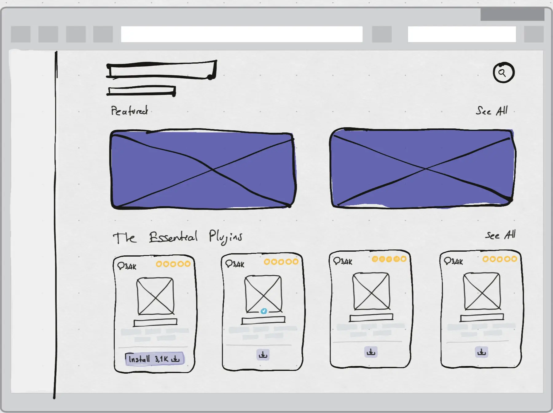
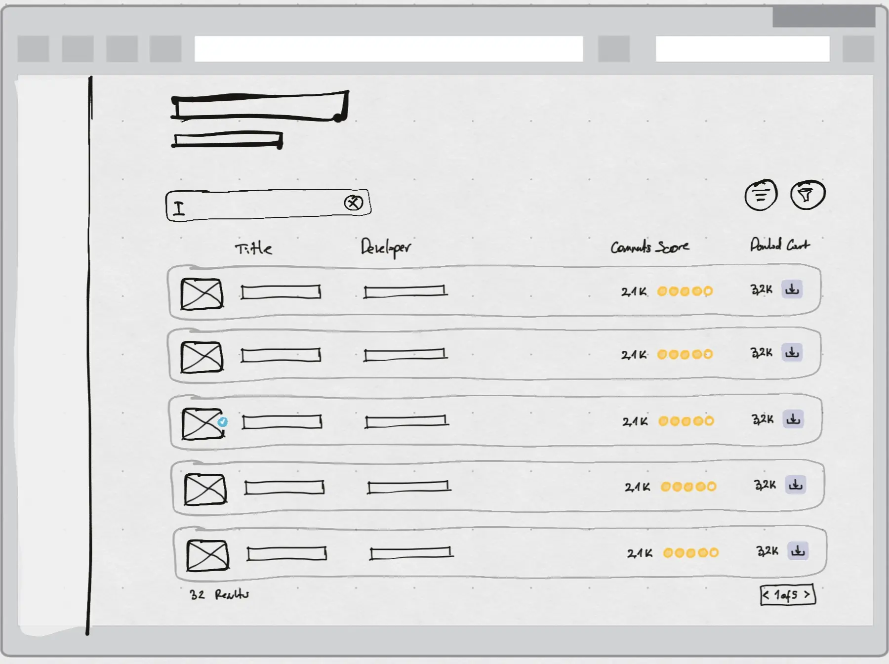
Cards view in the Home of the Marketplace, list view in Search Mode.
Editorial carousel?
Try to make home screen a collective of editorial content. A user that wants to find a specific extension would directly go to search, as demonstrated by the interviewees.
Try “Supported” and “Open-source” badges. “Official” badge is for sure.
“Explore Plugins” and “Search for a Specific Plugin(s)” requires different UIs, because they cater to separate needs.
Do not display the rating if there is not enough reviews yet.
Create two different user stories:
I want to check out the plugins of Strapi.
Editorial · Card View
I know what I want. I'm gonna search for it.
Search · List View
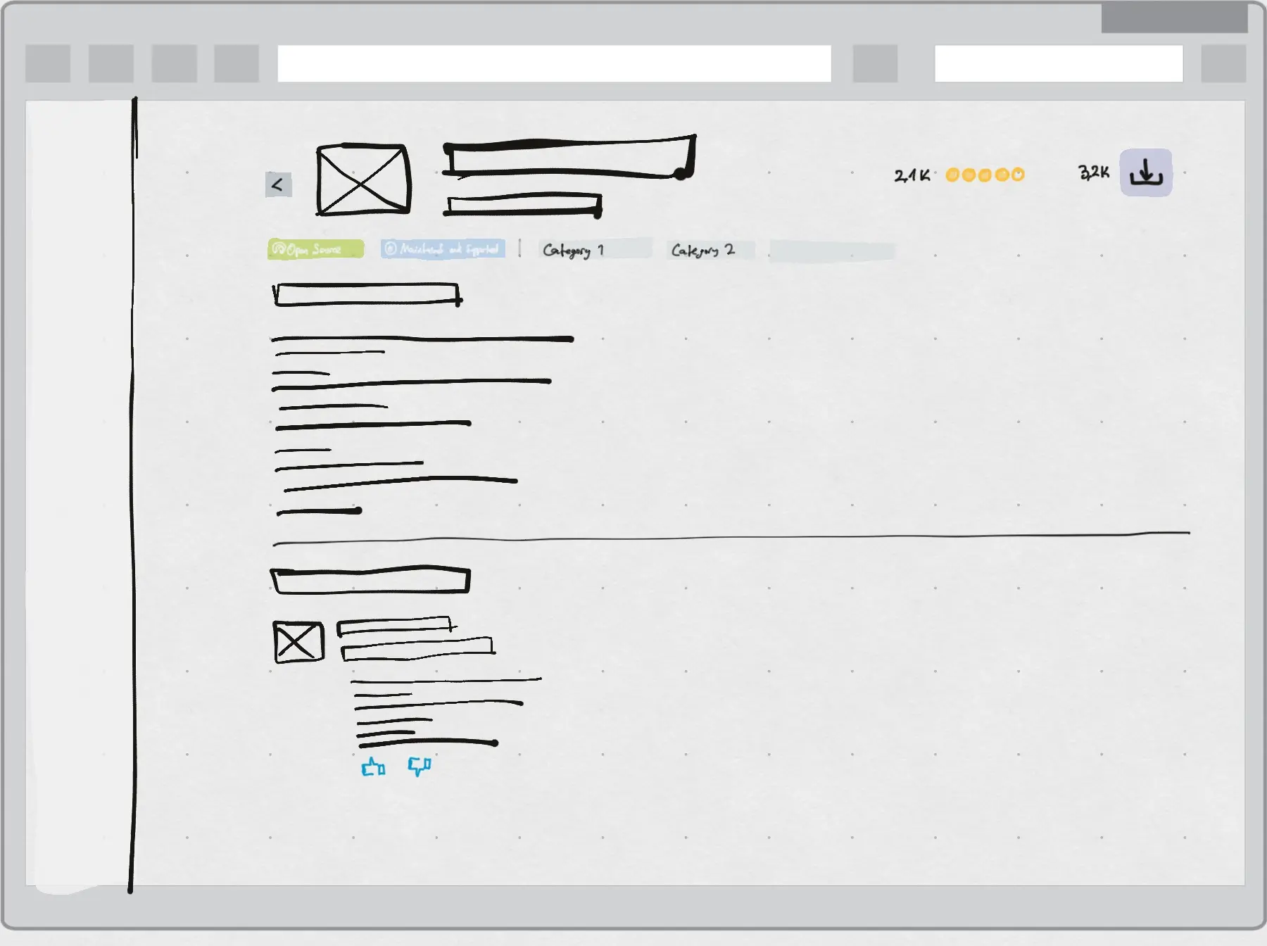
Two user stories came out of it, and the three wireframes follow them. Someone who wants to see what Strapi has lands on editorial content and cards. Someone who knows what they want goes straight to search and gets a list they can scan down, with the developer, the comments, the score and the download count in columns. The third screen is a plugin's page: badges, categories, the description, and reviews with a thumbs up and a thumbs down.
The wireframes
The marketplace
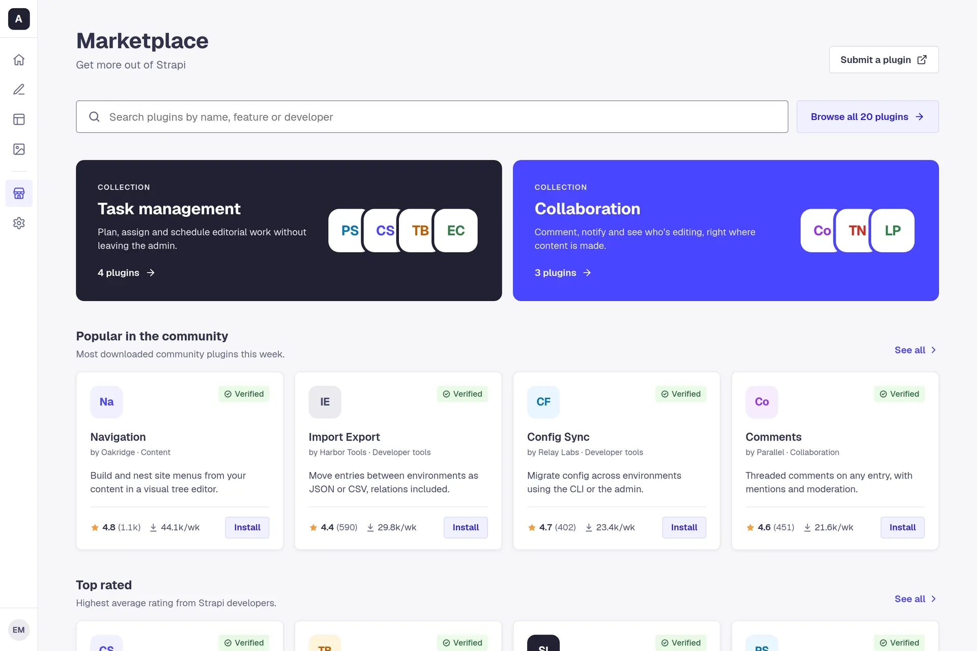
What follows is the marketplace as a working prototype. Everything the three developers told me they check is on the card and on the plugin's page, in the same place every time: who made it, how it is rated and by how many, how much it is used, and whether it works with the project.
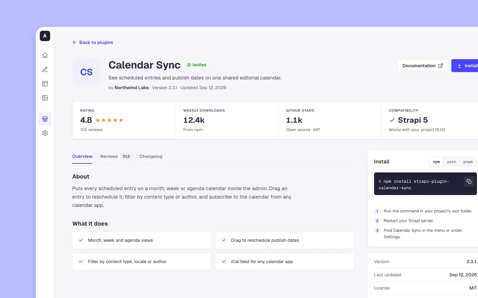
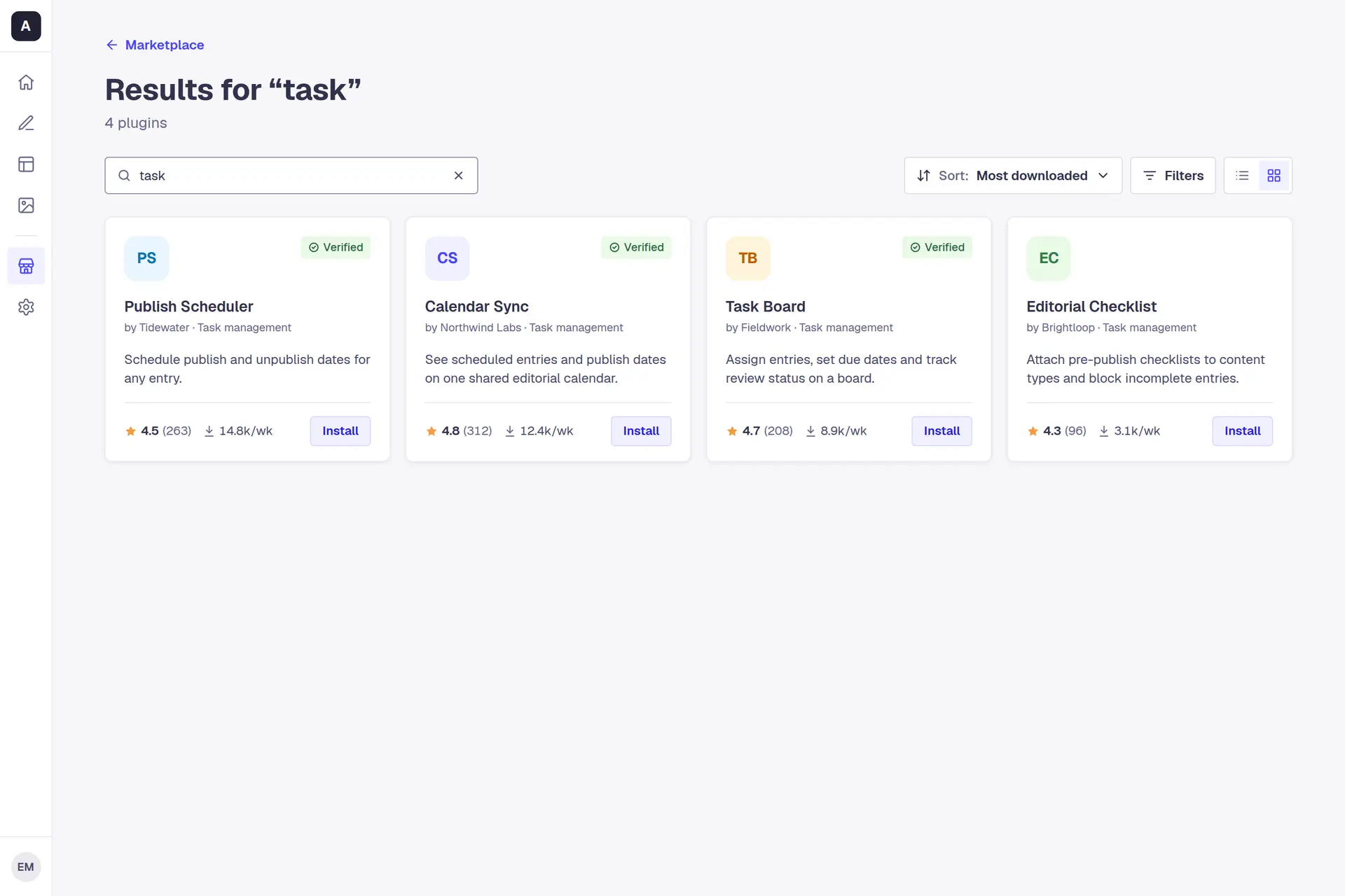
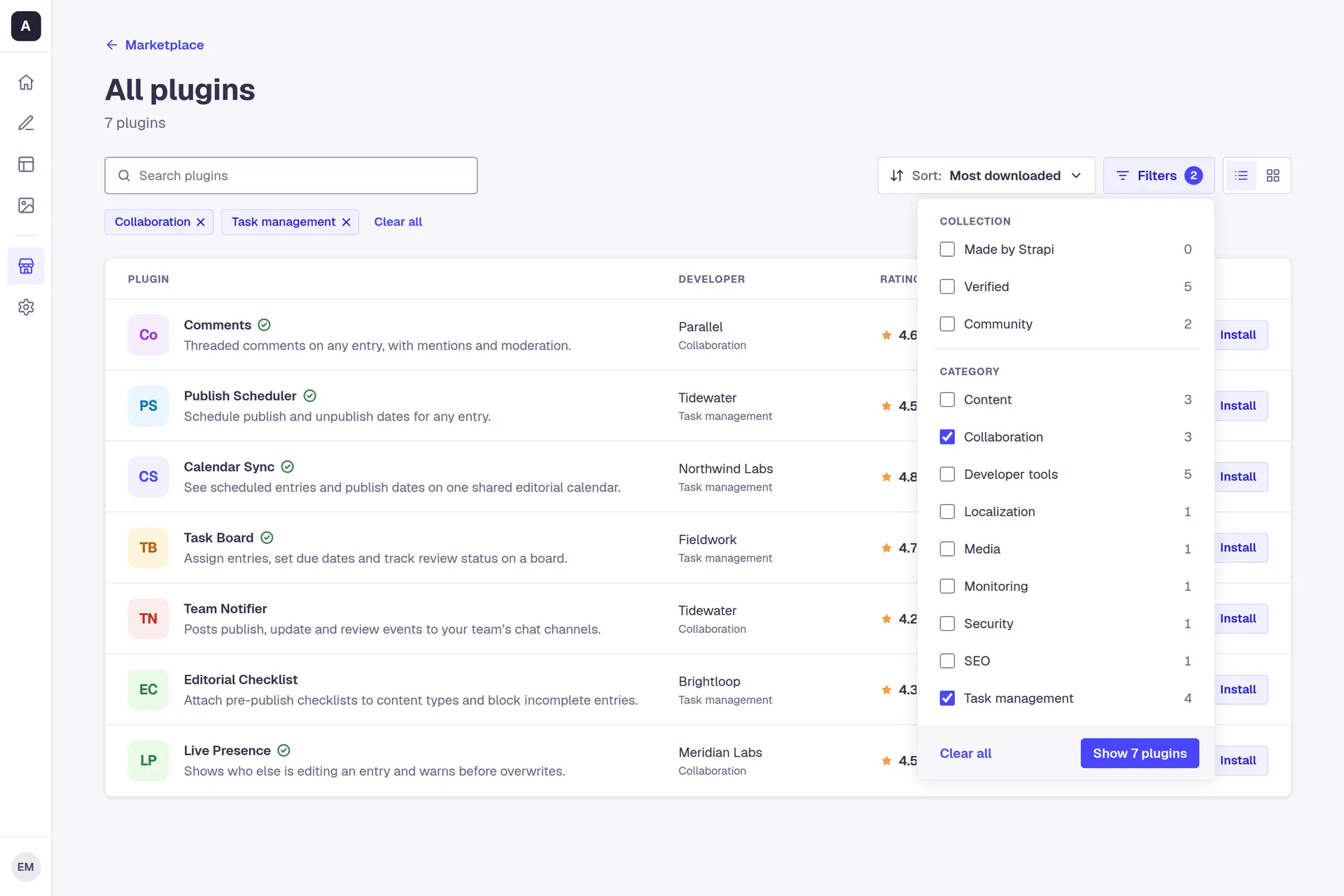
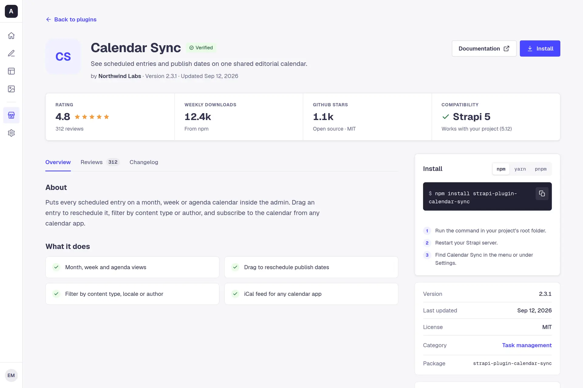
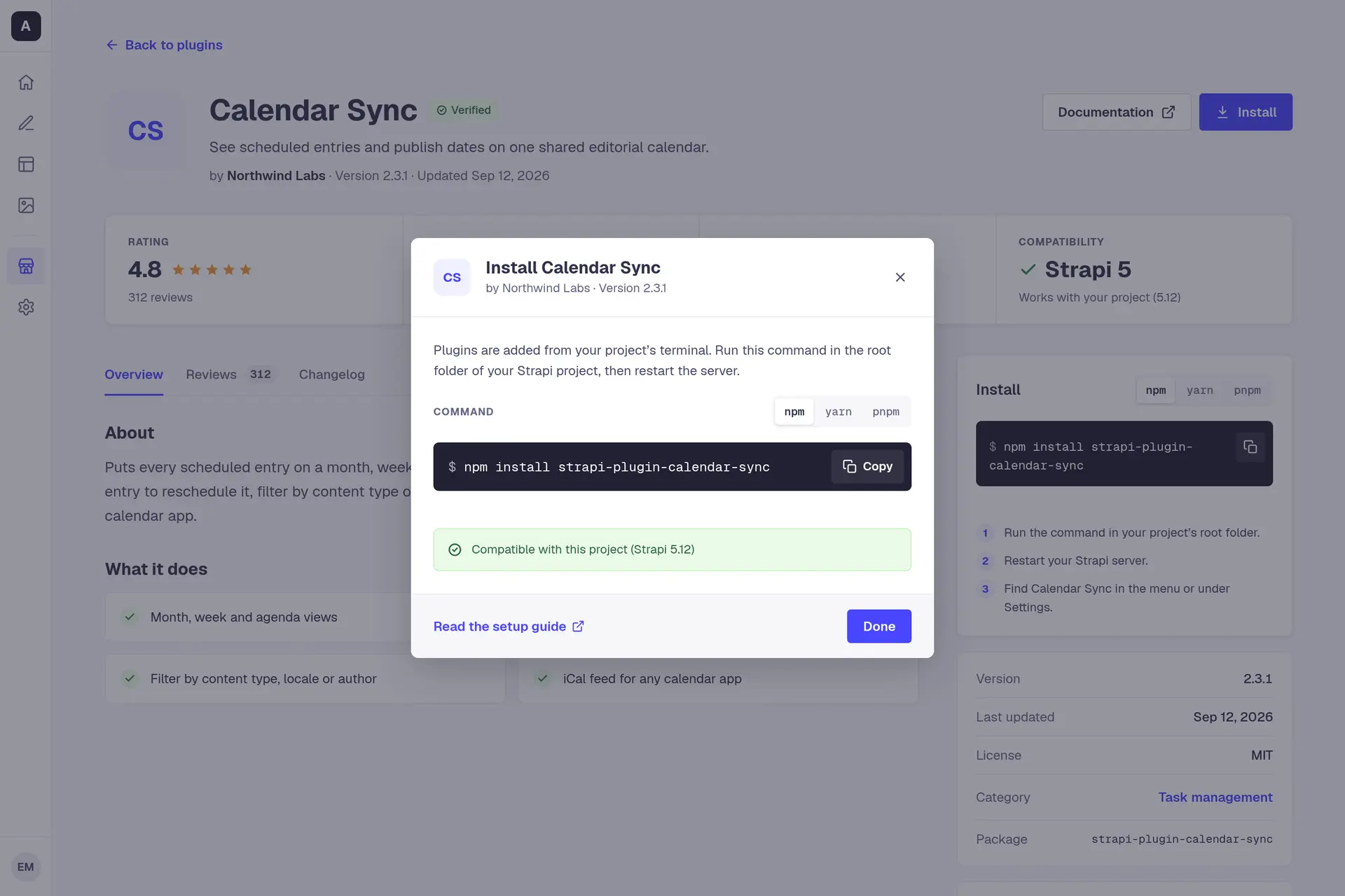
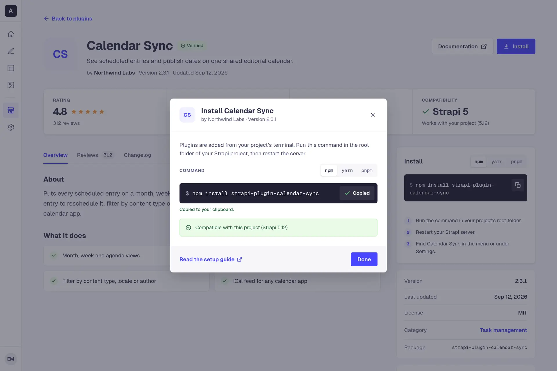
Search is the second story. Typing on the Marketplace page goes straight to results with the query kept, and the results change as you type. Filters are a popover with a count beside every collection and category, so you know what is left before you click. A plugin's page has a strip of four facts under its name: the rating with its review count, weekly downloads, GitHub stars, and whether it works with Strapi 5. Install is a dialog that shows the command, because Strapi 5 adds a plugin from the project's terminal, which is also where the third developer said they install from. Pick npm, yarn or pnpm, copy it, and the dialog says whether the plugin is compatible with your project.
One search, to install
Prototype. The plugins, their makers, ratings, reviews and download counts, and the signed-in user are invented.
Browsing is the first story. All plugins, as a list or a grid, sorted by downloads, rating, GitHub stars, last update or name. A search with nothing behind it offers three other searches, Clear search and a way to remove the filters, so there is always a next step.
All plugins
4 states
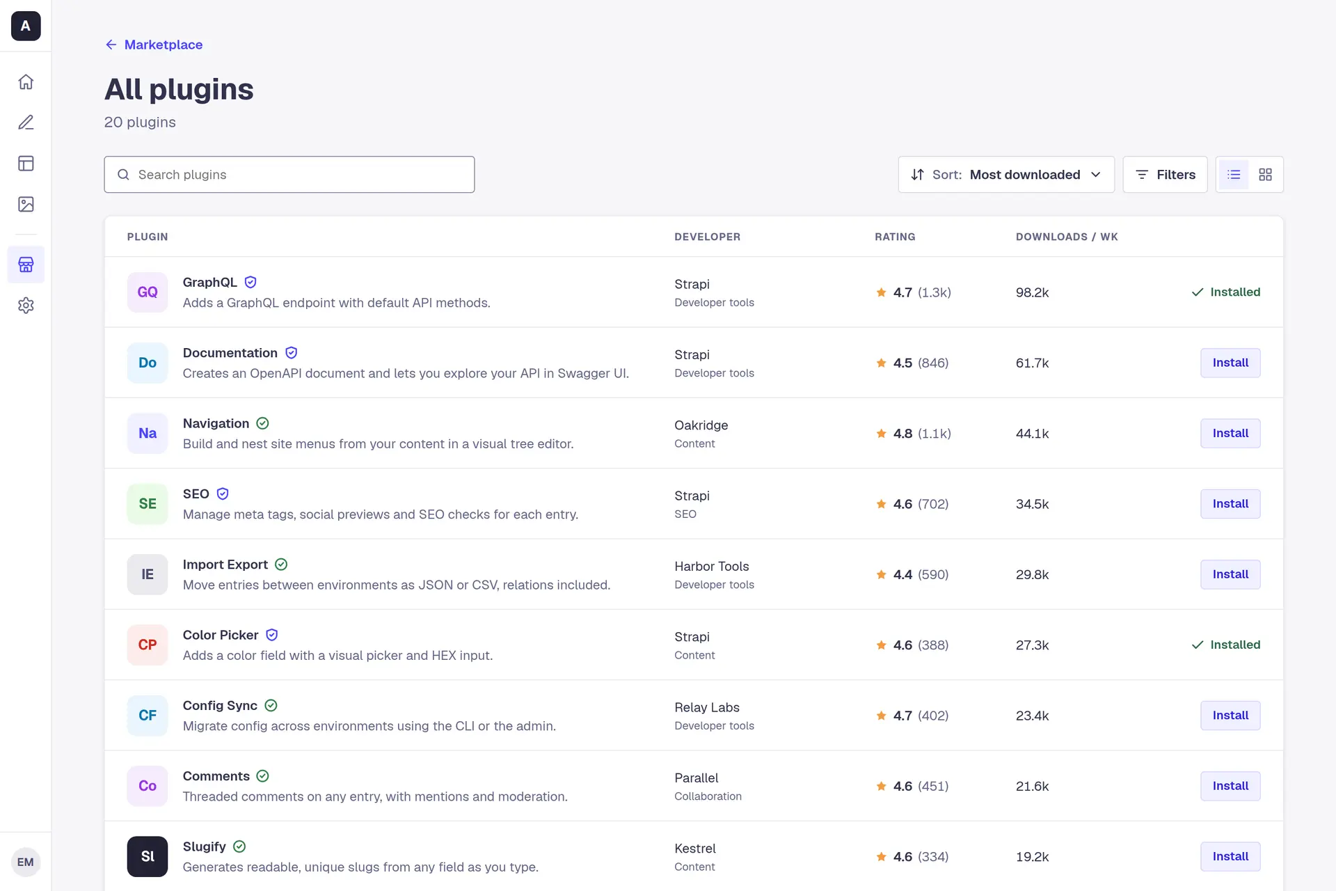
Twenty plugins, one to a row: the developer, the category, the rating with its review count and weekly downloads in columns. Two are already in the project and say so.

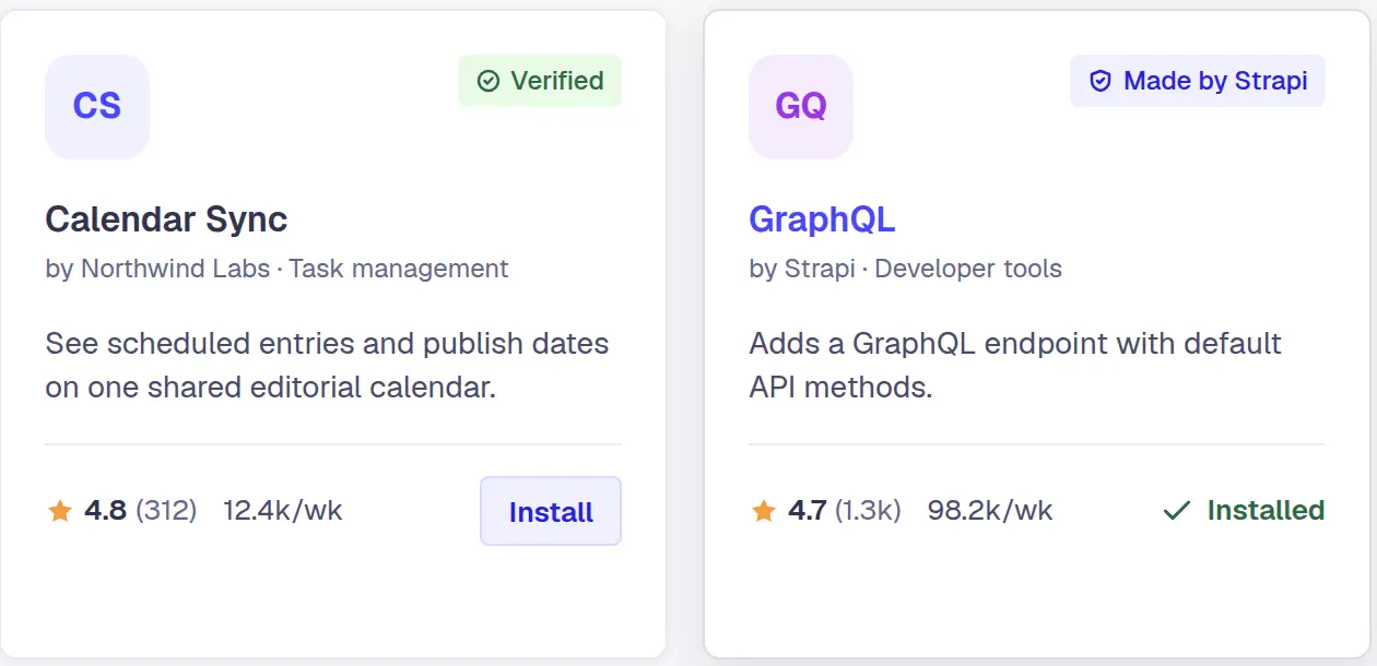
The same twenty as cards. A card reads top down: the badge, the name, who made it and its category, one line on what it does, then the rating, the downloads and the action.

Five orders: most downloaded, highest rated, most GitHub stars, recently updated, and name.

Nothing matches. The page suggests three other searches and offers Clear search.
Prototype. The plugins, their makers, ratings, reviews and download counts, and the signed-in user are invented.
A plugin's page has three tabs. Overview, with what it does and an install panel that stays beside it. Reviews, with a breakdown by star and every review with the reviewer's role, so a team can see who found it useful. Changelog, with each version and its date. Easy to maintain was one of the notes on the board. There are two badges and no more, Made by Strapi and Verified, both Strapi's own names for its trust levels. A community plugin carries neither, and nothing negative. A plugin already in the project shows Installed where the Install button would be.
A plugin's page
4 states
Four facts in a strip under the name: the rating with its review count, weekly downloads, GitHub stars, and whether it works with Strapi 5. Calendar Sync carries Verified, one of Strapi's two badges; the other is Made by Strapi, for Strapi's own plugins. A community plugin carries neither.

The average, a breakdown by star, and each review with the reviewer's role and date, and whether others found it helpful.

Each version with its date and what changed.

A plugin already in the project: Installed stands where Install would, and the badge is Made by Strapi.
Prototype. The plugins, their makers, ratings, reviews and download counts, and the signed-in user are invented.
Built on Strapi's tokens
The prototype runs on Strapi's Design System, not a palette of mine: its primary blue, its neutrals from white to near-black, its success and warning colours, a 4-pixel radius on controls and 8 on cards, and the admin's own navigation rail. The type is Geist, with Geist Mono for commands, versions and package names, and tabular figures wherever a number sits in a column.
My part was measuring it. Every ratio below is worked out from the hex values, not typed in, and two pairs came out under the line. Strapi's neutral 500 as secondary text on white reads 3.2:1, under the 4.5:1 that small text needs, so secondary text uses neutral 600 at 5.5:1 and the lighter value is kept for icons and borders. The search field's outline in Strapi's default border colour sits at about 1.4:1 against a 3:1 floor for a control's edge, so the field takes neutral 500 instead.
- neutral800#32324DTitles and primary text.12.36:1 on neutral0
- neutral700#4A4A6ABody text.8.47:1 on neutral0
- neutral600#666687Secondary text. The lightest text colour.5.50:1 on neutral0
- primary700#271FE0An action under the pointer, and the Made by Strapi badge's words.7.89:1 on primary100
- success700#2F6846The Verified badge's words, and Installed.6.10:1 on success1006.58:1 on neutral0
- primary600#4945FFActions and focus.5.87:1 under neutral04.91:1 under neutral0 at 88%
- neutral900#212134A collection card, and the command block.15.77:1 under neutral0
- neutral500#8E8EA9Icons, borders and input outlines. Never text.3.19:1 on neutral0
- warning500#F29D41Rating stars, decoration only.
- neutral0#FFFFFFCards, panels and dialogs.
- neutral100#F6F6F9The page.
- neutral150#EAEAEFDividers.
- neutral200#DCDCE4Control borders.
- primary100#F0F0FFThe Made by Strapi badge.
- success100#EAFBE7The Verified badge.
Two pairs, measured
Secondary text
Developer tools, #8E8EA9 on #FFFFFF 3.19:1, under AADeveloper tools#666687 on #FFFFFF 5.50:1The search field's outline
#DCDCE4 on #FFFFFF 1.36:1, under AA#8E8EA9 on #FFFFFF 3.19:1
Prototype.
The kit's parts, cropped from its sheet: a card in each trust level, a collection card, the command block, the badges and counts, a list row, and the small controls.
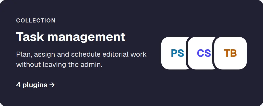
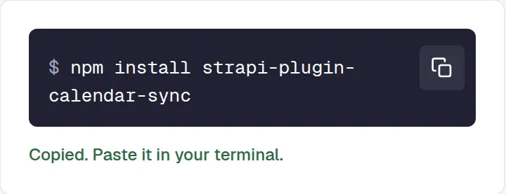



Prototype. The plugins, their makers, ratings, reviews and download counts, and the signed-in user are invented.
What is not built
This is a prototype, and a desktop one: a fixed artboard of 1440 by 960, so it does not fit a phone. The twenty plugins, their makers, ratings, reviews, download counts and dates are invented, and so is the signed-in user. GraphQL, Documentation, SEO, Color Picker and Sentry are real Strapi plugins with made-up numbers. Submit a plugin does nothing, and neither does Write a review. Documentation and resource links go nowhere. The sort menu has no arrow-key navigation, and the admin's navigation outside the marketplace is inert. Nothing shipped. The assessment was a hiring exercise, so there were no users and there are no numbers.
The prototype was made on 25 September 2026 in a Claude Design canvas. I directed it and Claude built it. The button below opens it full size in a new tab, with everything on this page live: search, sort, filters, both views, the tabs, the install dialog and its Copy button.
More case studies
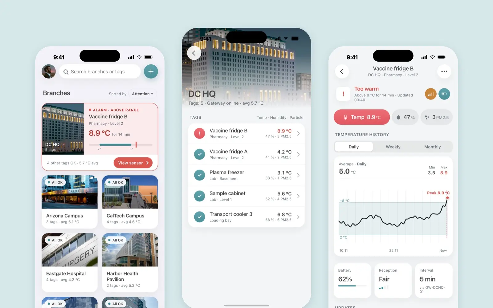
Borda Sensei
A mobile app for Borda’s temperature, humidity and particle sensors
case study · 2022 · read it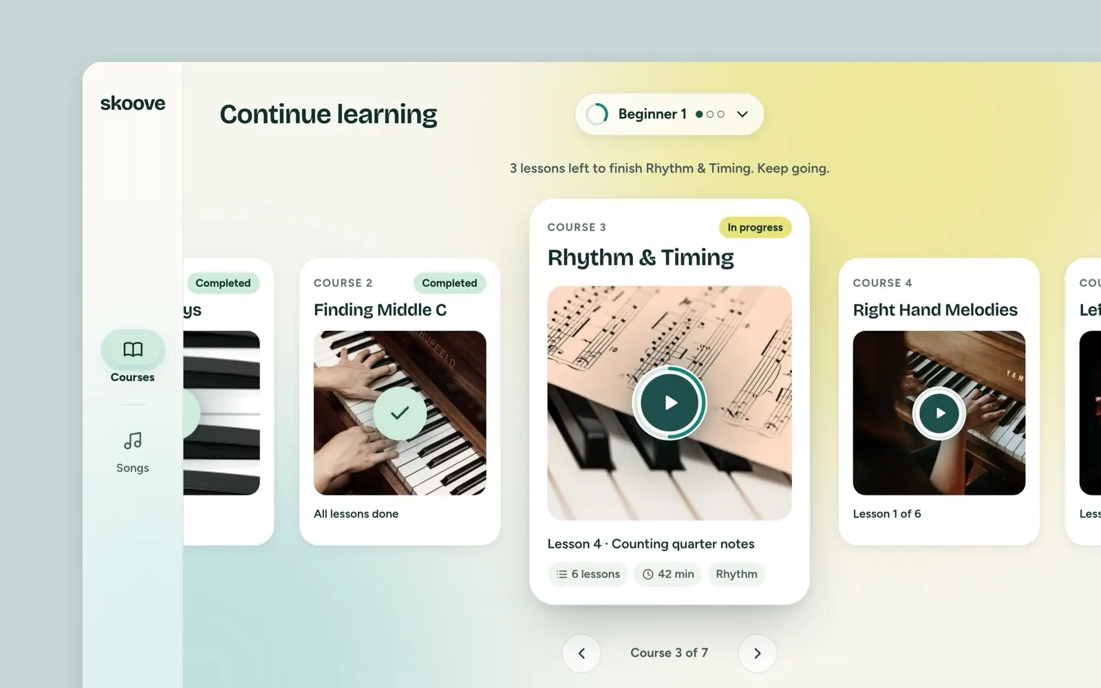
Skoove
Skoove said its iPad dashboard looked scattered. My answer, from a March 2022 task: a first page that opens on your course, Courses and Songs in a room each.
case study · 2022 · read it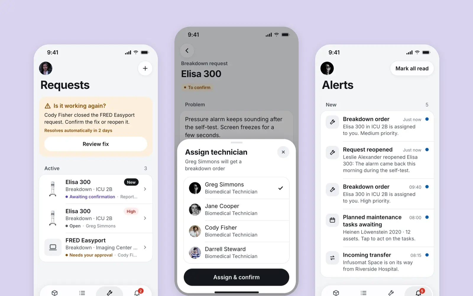
Lighthouse
A mobile app for the nurses, technicians and managers who keep a hospital's medical devices working, designed for Borda
case study · 2021 · read it