Skoove
Skoove said its iPad dashboard looked scattered. My answer, from a March 2022 task: a first page that opens on your course, Courses and Songs in a room each.
- Year
- 2022
- Track
- design
- Category
- case-study
Tools
- Figma
- Claude Design
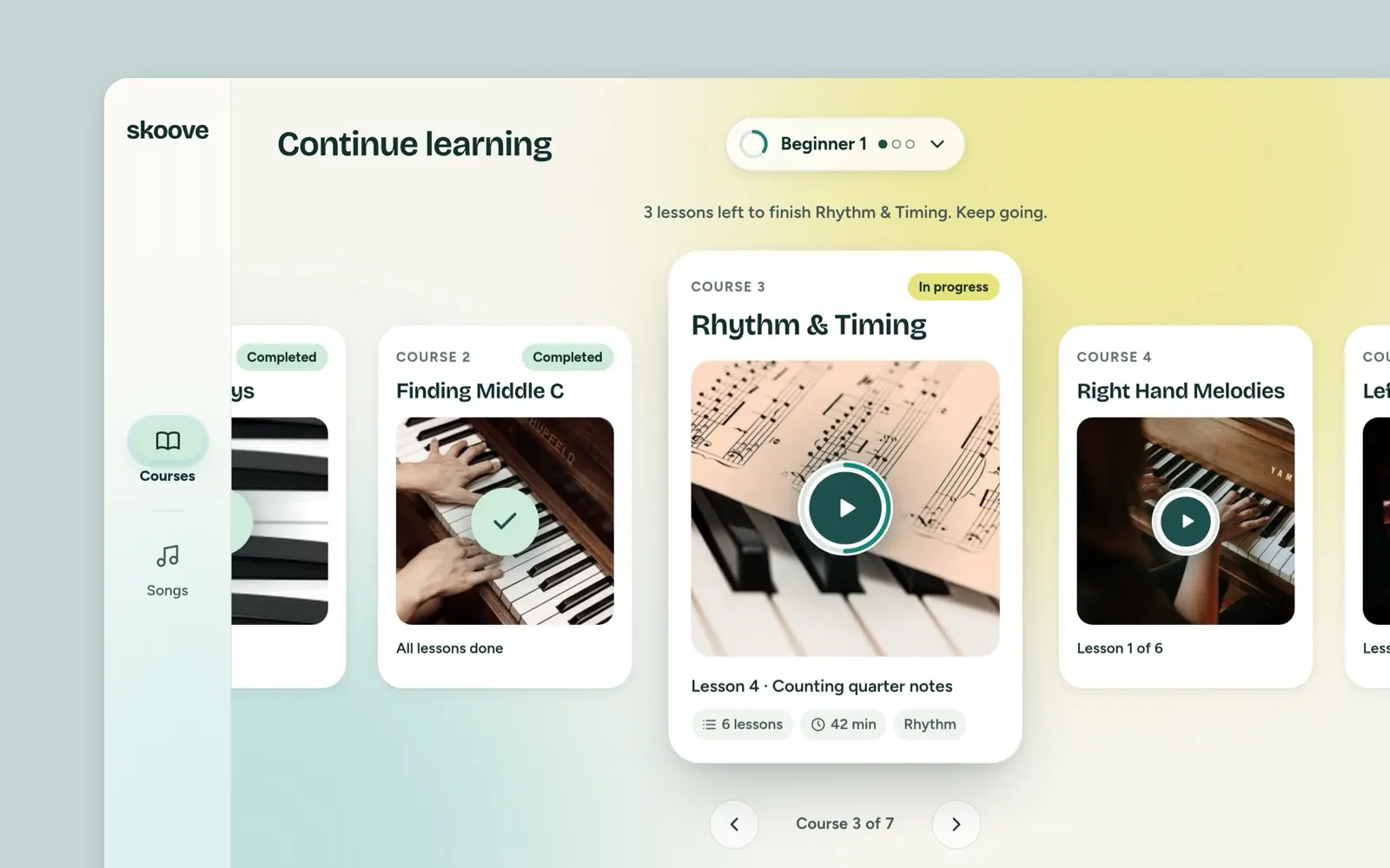
In March 2022 Skoove set me a design task. Its iPad dashboard, the brief said, looked scattered, and it asked what I would change and for a rough first draft of the first page. This is my answer: a first page that opens on the course you are in, with Courses and Songs each in a room of its own, your level at the top where you can see it and change it, and one line that says how far you are. Nothing shipped. The screens on this page are that first page as a working iPad prototype, made in a Claude Design canvas. I directed it and Claude built it.
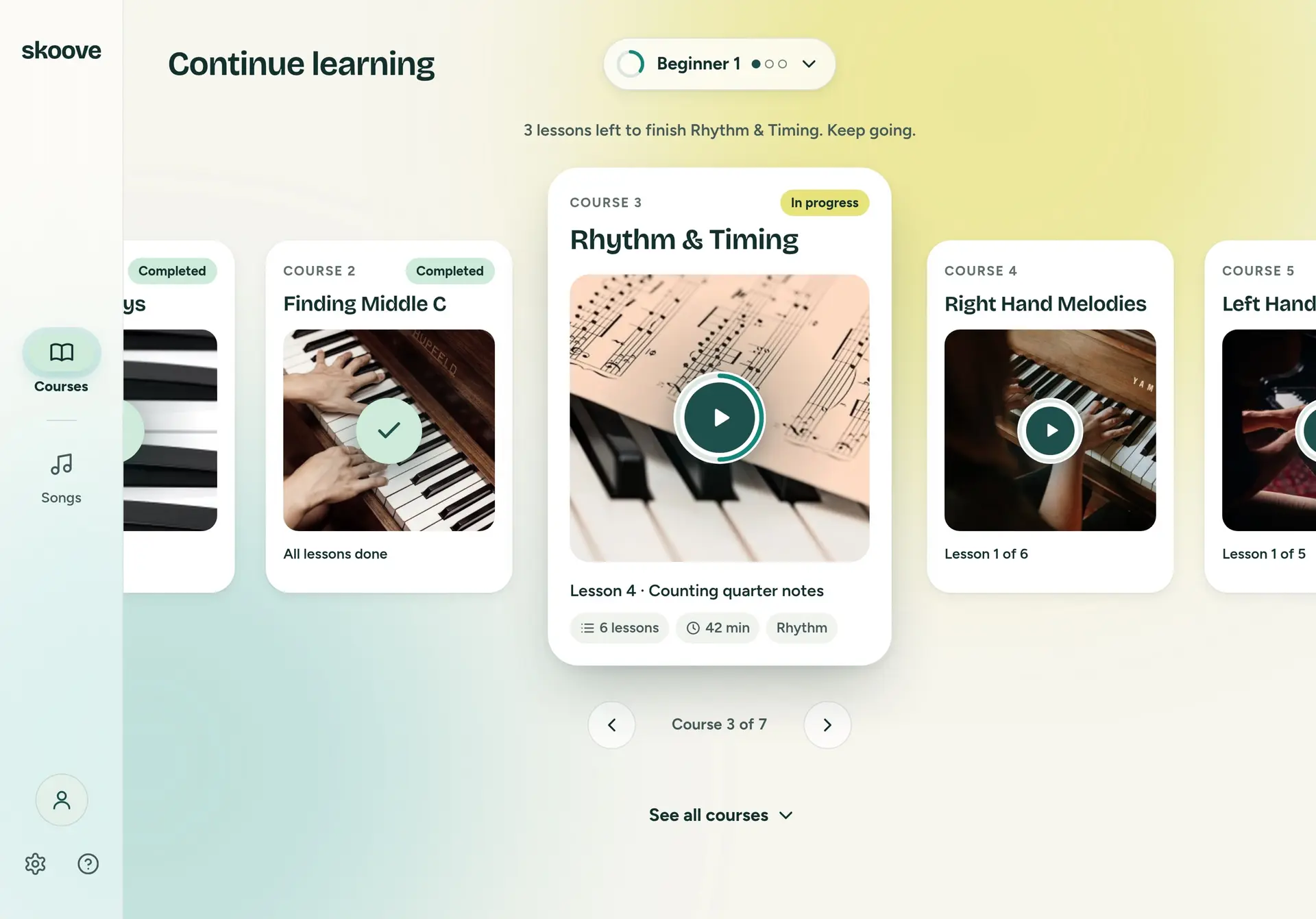
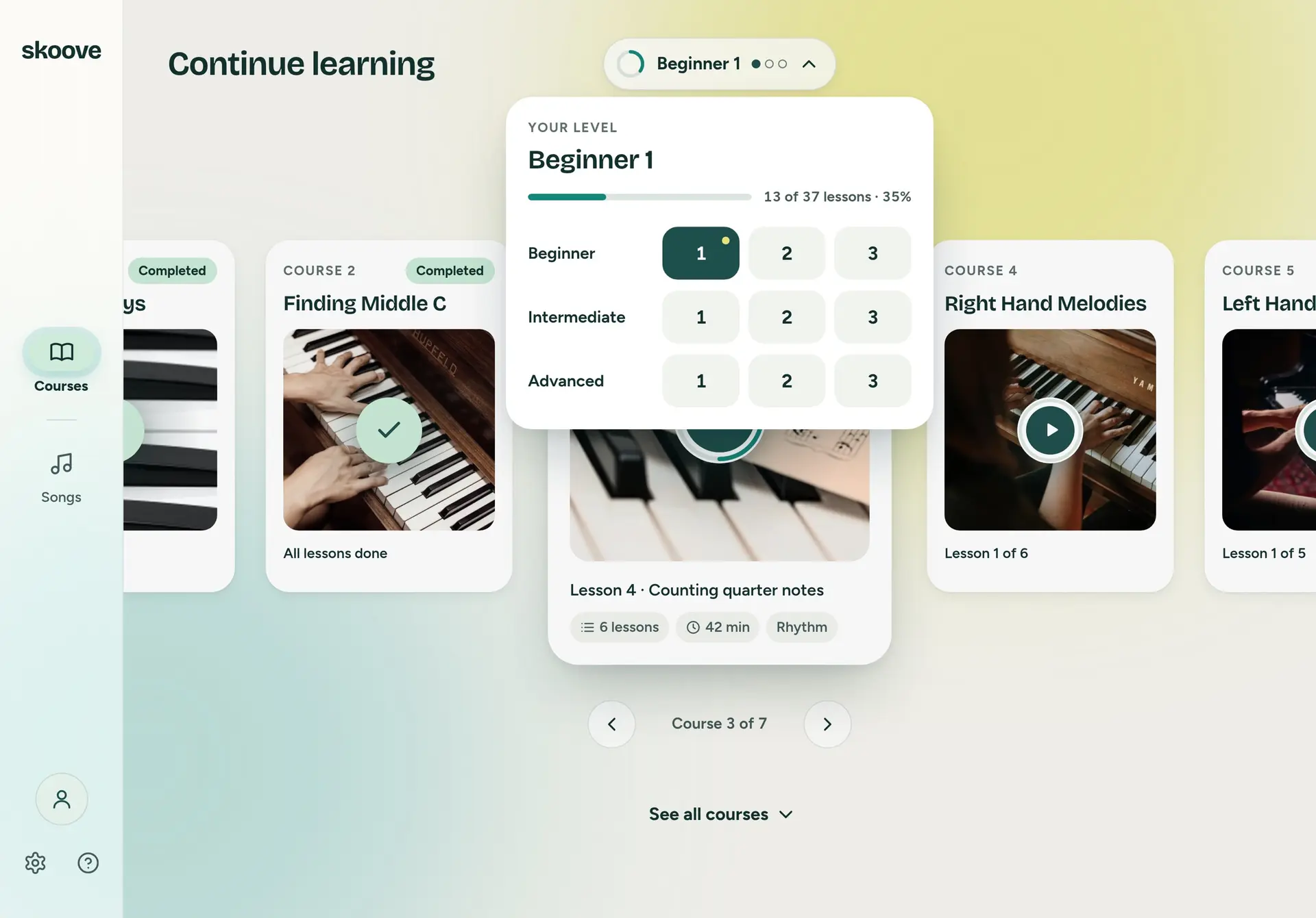
Continue learning. The course you are in, in focus, and the line above it saying what is left.
Prototype. The courses, the progress and the songs are sample data: twenty real songs by title and artist, with generated covers.
It runs. See it running, at the foot of this page, opens the prototype at its own size in a new tab.
The brief
Skoove's brief described the dashboard as it was. The main navigation sat behind a menu icon, your level in a dropdown, and a button led to the songs for that level. Under those came the lesson you were in, featured songs and a list of all courses. Then one sentence of verdict: "Currently, the UI solution of the Dashboard looks scattered." And one question: "What UI optimizations would you consider?" They wanted the answer explained, and a rough first draft of the first page viewport in Sketch or Figma. My captures of the app's dashboard are dated 6 March.
The wall
Four days later I had a wall. Thirty-nine notes, dated 10 March, under five headings: Layouts, What to Do, Progress, Encourage and Navigation. Layouts was seven pen sketches of the page with no words on them, so it is not on the board below; the three I followed are further down. Everything with words on it is here as I wrote it. My presentation summed the wall up in three words, Navigate, Encourage and Progress, and most of the notes fall under the first. Two went straight into the sketches: the levels split into Beginner 1, 2 and 3 and so on, which is where the nine steps of the level picker come from, and progress rings in the style of the Apple Watch. The wall asked for more than the first page took. A reminder, a streak, more than one profile, a button to purchase: those are still notes. What the page kept from Encourage is one line above the courses, worked out from where you are.
Before sketching I went through seven apps for their layouts: Netflix, Amazon Prime, Apple TV, MUBI, Uberchord, Simply Piano and Flowkey. I kept screenshots and no notes, so I am not going to claim what each one taught me.
Skoove Task
What to Do2
- V1. Bottom bar: Courses, Songs, Settings, Profile?
- V2. Sidebar: Courses, Songs, Setting, Profile (to the bottom)
Progress3
- Loading... DISPLAY PROGRESS (drawn: a loading bar)
- Add a progress bar (drawn: a striped bar, and a card with a face, a bar and a play button)
- Research Streaming Apps for Inspiration: Netflix, Youtube, Amazon Prime, MUBI, HBO...
Encourage8
- ENCOURAGE (drawn: a flexed arm)
- Maybe display an encouraging message here (drawn: two arrows, left and right)
- Subdivide the playing levels: Beginner 1, Beginner 2, B - 3, Intermediate 1, Int - 2, Int - 3...
- Beginner 1 ●○○, Beginner 2 ●●○, Beginner 3 ●●●
- Research the Psych behind the “Levels” → Think long-term. User needs to come back again and again
- Apple Watch Style Circles! (drawn: a ring and a checked ring)
- Weekly/Daily Reminder (drawn: a bell)
- completed (drawn: a card with a check disc)
Navigation19
- NAVIGATE (drawn: a magnifier)
- Lesson → Songs → Lesson → Songs. How do users shuffle between content...
- Continue the lesson progress
- Continue the Song progress
- Next lessons
- Featured Songs. “Why are they featured?” How
- All Courses
- CTA to Purchase
- Hamburger Menu: Current lesson, Profile, Settings, Support, FAQ
- (drawn: a header with a Beginner 1 ●○○ pill, a Songs pill and a menu icon)
- The song I was trying to learn (HISTORY?)
- Songs (All)
- Multiple Profiles (drawn: a header with a menu icon, a Beginner 1 ●○○ pill and a profile icon)
- Continue to learn ▶ (drawn: a card with a bar)
- Playing Streak/Activity Dashboard?
- Learned Songs 23 (drawn: a badge)
- Continue to Your Course (drawn: three cards, each with a ring). Continue to Learn Songs (drawn: two cards, each with a ring)
- Separate the content with Tabs (drawn: a tab pill, ♪ Songs | Courses)
- IA Change: Courses | Songs | Settings | Profile. Bottom NavBar
Two ways to learn
The brief's word was about the look of the page, and I read it as a symptom. Skoove teaches piano two ways, through courses and through songs, and both lived on the dashboard at once. Some learners go through them in step: a course, then a song, then the next course. That is the regular path. Others do two courses, then three songs, then two courses again, and come back to a song whenever they want to. That is the irregular path, and it is the one I designed for. The dashboard as it was gave both kinds of learner the current lesson, featured songs, every song and every course on one screen, and left them to find their place in it.
Regular Learning Path
- Course
- Learn Song
- Course
- Learn Song
- Course
- Learn Song
- Course
- Learn Song
Irregular Learning Path
- Course
- Course
- Learn Song
- Learn Song
- Learn Song
- Course
- Course
- Learn Song
- Learn Song
- Learn Song
- Course
- Course
- Learn Song
- Course
Two rooms
So the proposal was an information architecture before it was a layout. As it was, seven things hung off the home screen: the menu, the level selector, all songs, current songs, current courses, featured songs and all courses, and current courses and current songs pointed at each other. In mine, the home screen leads to two rooms, Courses and Songs, with settings, support and your profile beside them. Courses holds all courses and the ones you are in. Songs holds recently played, your repertoire, genres, trending and featured. Both rooms lead to the same level selector.
Current IA
Home Screen
Hamburger Menu Level Selector All Songs Current Songs Current Courses Featured Songs All Courses
Hamburger Menu
Support Account Current Lesson FAQ Settings
Current Courses and Current Songs point at each other.
Proposed IA
Home Screen
Songs Courses Settings Support & FAQ Profile
Songs
Recently Played My Repertoire Genres Trending Featured
Courses
All Courses Current Courses
Songs and Courses both lead to the Level Selector.
Sketches
Then pen. A rail on the left with Courses and Songs, the level at the top as a pill with its three dots, and the course cards in a row, a ring on the one you are in. The second sketch put one course in focus in the middle, bigger, the finished one to its left and the rest running off both edges. The third was the Songs room, cards in rows. The first page took the second.
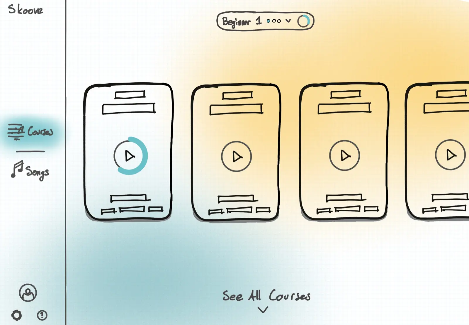
Course layout 1, pen on grid paper. From the 2022 presentation. 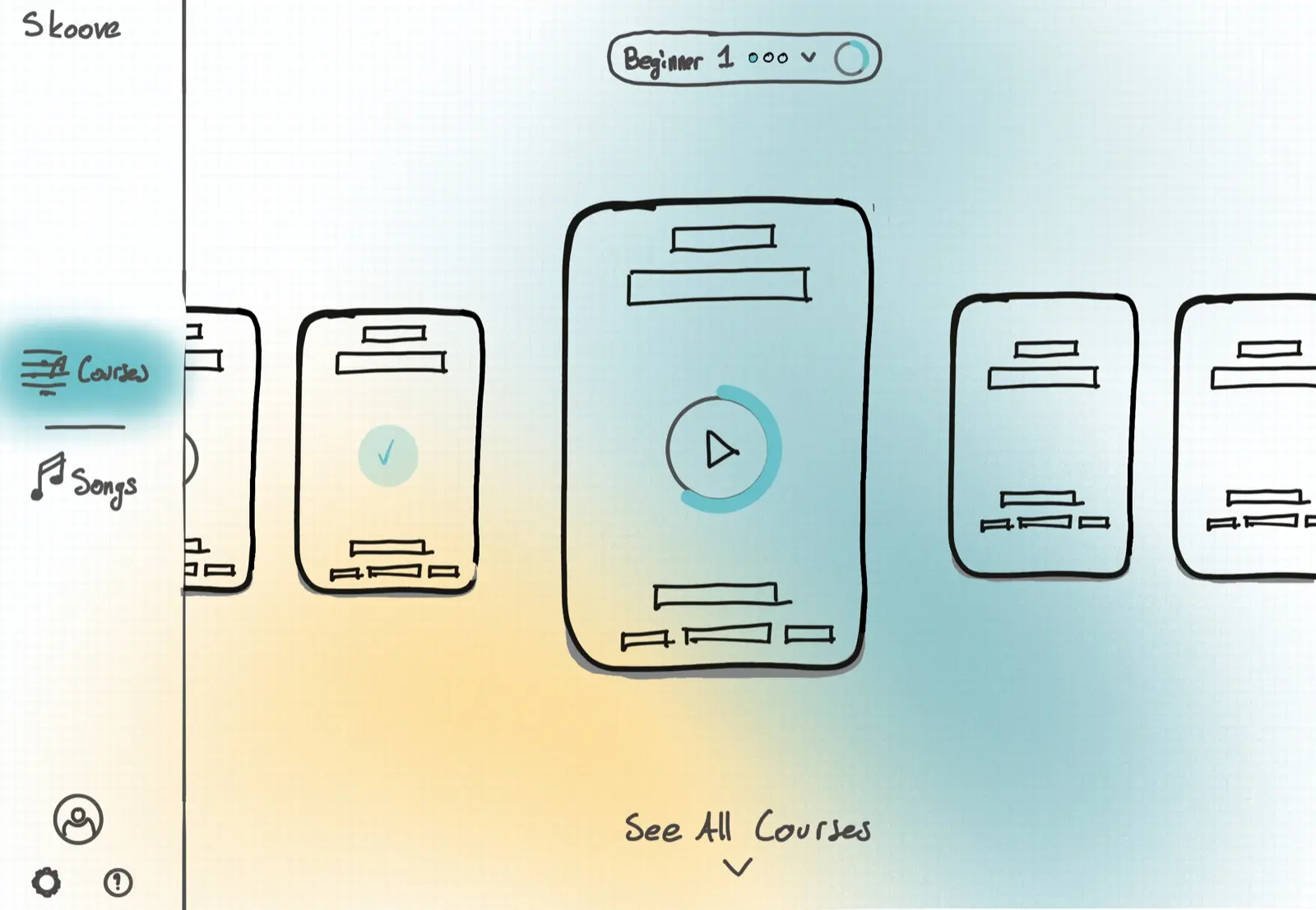
Course layout 2, one course in focus. The first page took this one. 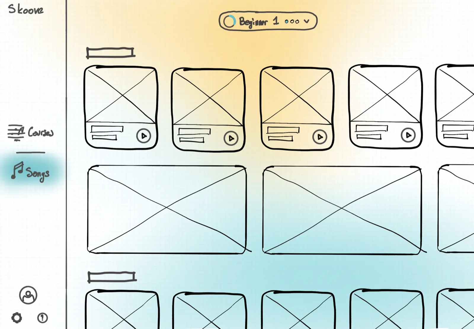
Songs layout. From the 2022 presentation.
Courses and Songs
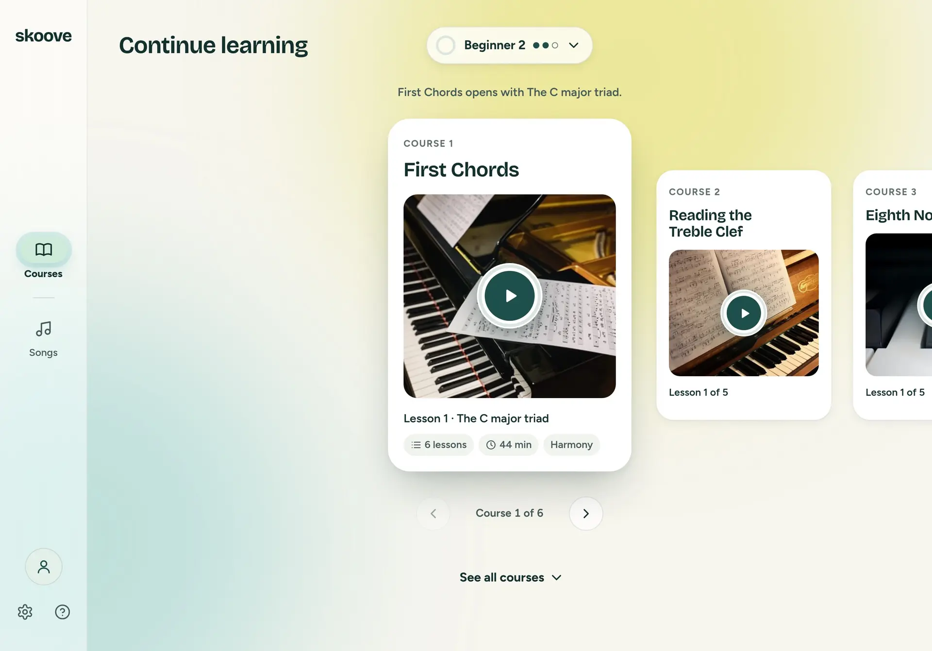
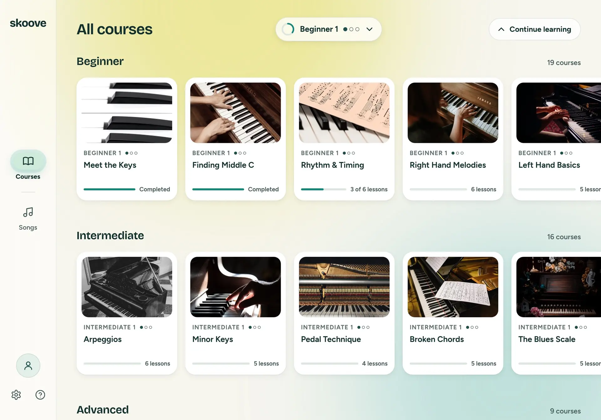
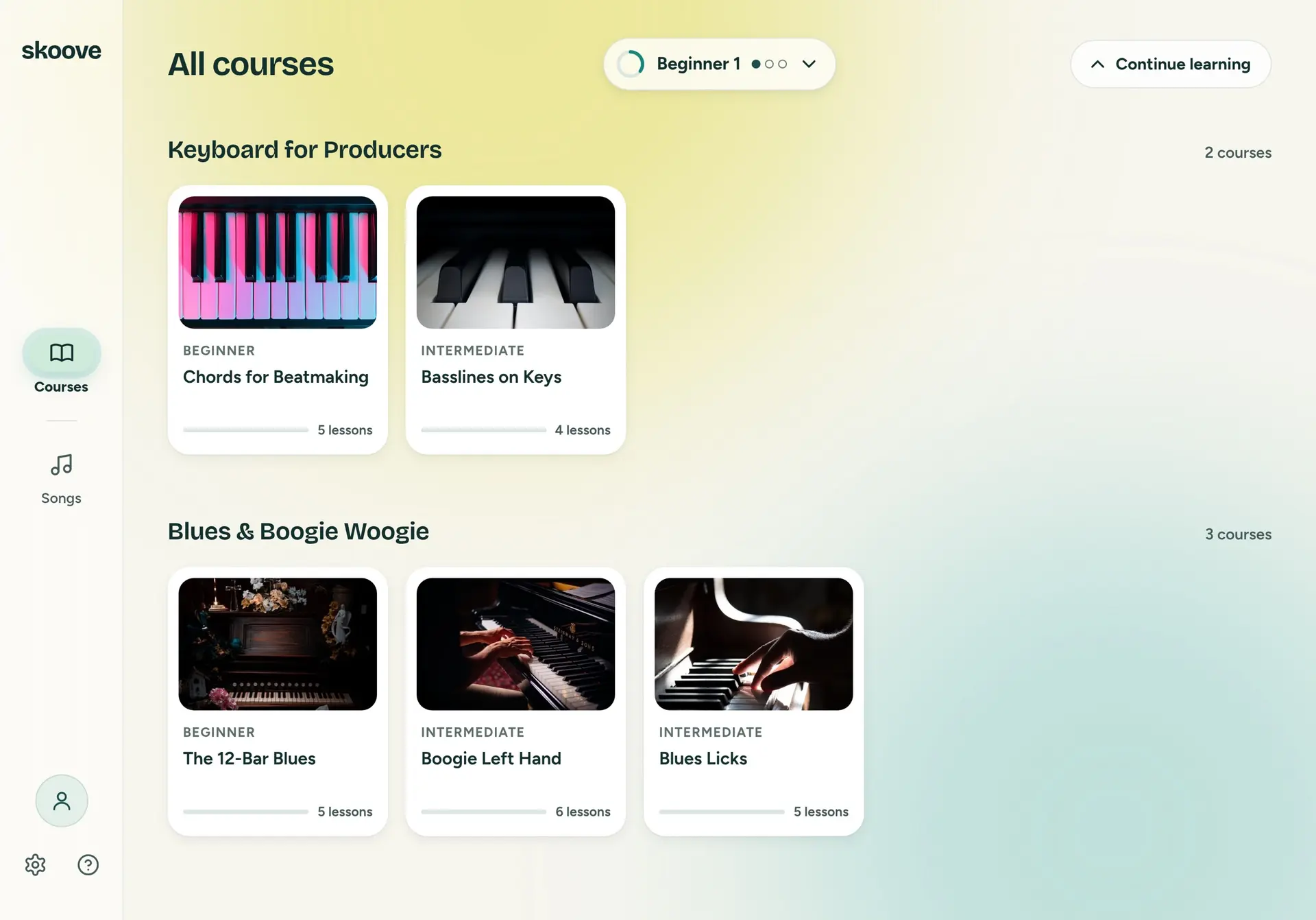
Courses opens on Continue learning. The course you are in sits in focus, and the line above it says what is left: three lessons to finish Rhythm & Timing. A finished course gets a check and Review anytime. One you have not started shows its first lesson. Play opens the lesson in Skoove's player, which is outside this page, so here it is a toast. The level pill opens a picker with nine steps, three each for Beginner, Intermediate and Advanced, and changing it changes the row. See all courses is the catalogue, by level and then by topic.
Courses
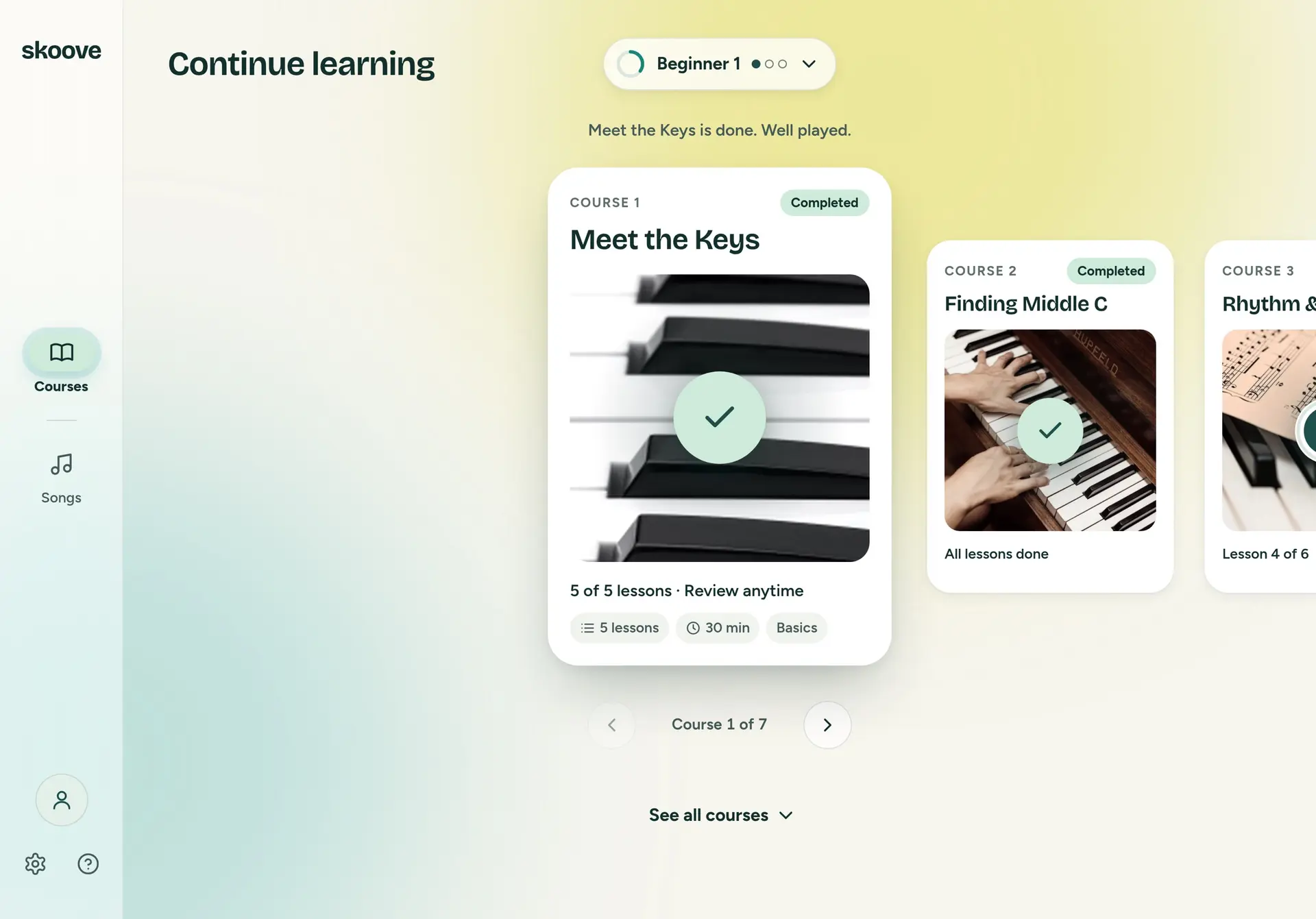
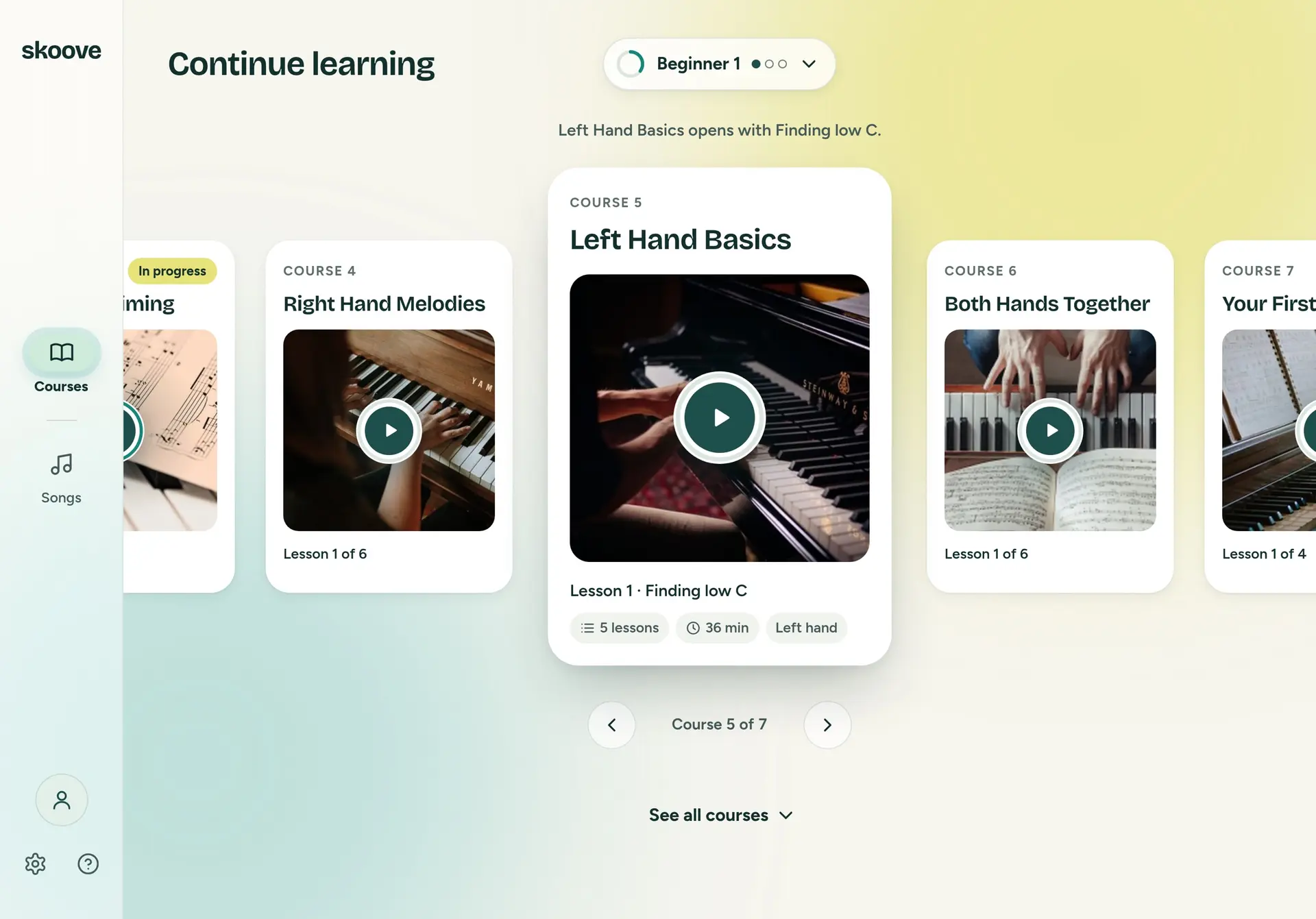
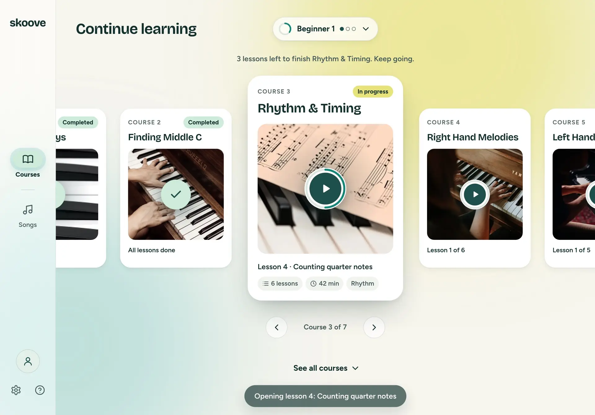
Prototype. The courses, the progress and the songs are sample data: twenty real songs by title and artist, with generated covers.
Songs is its own room: recently played with how far you got, your repertoire, genres, trending and featured, and a search that covers the whole library and not only your level. Playing a song hands off the same way.
Songs
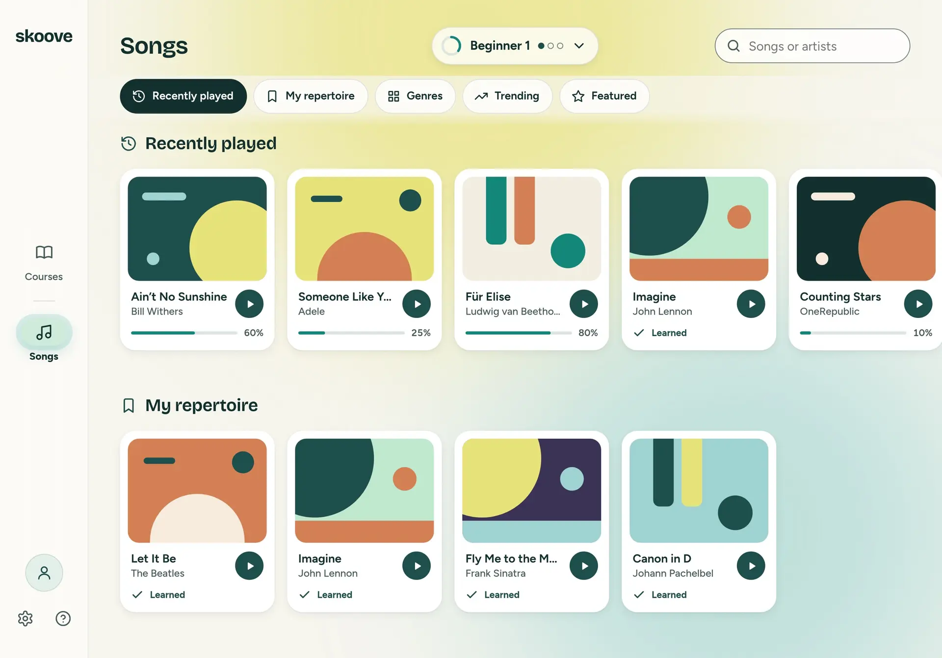
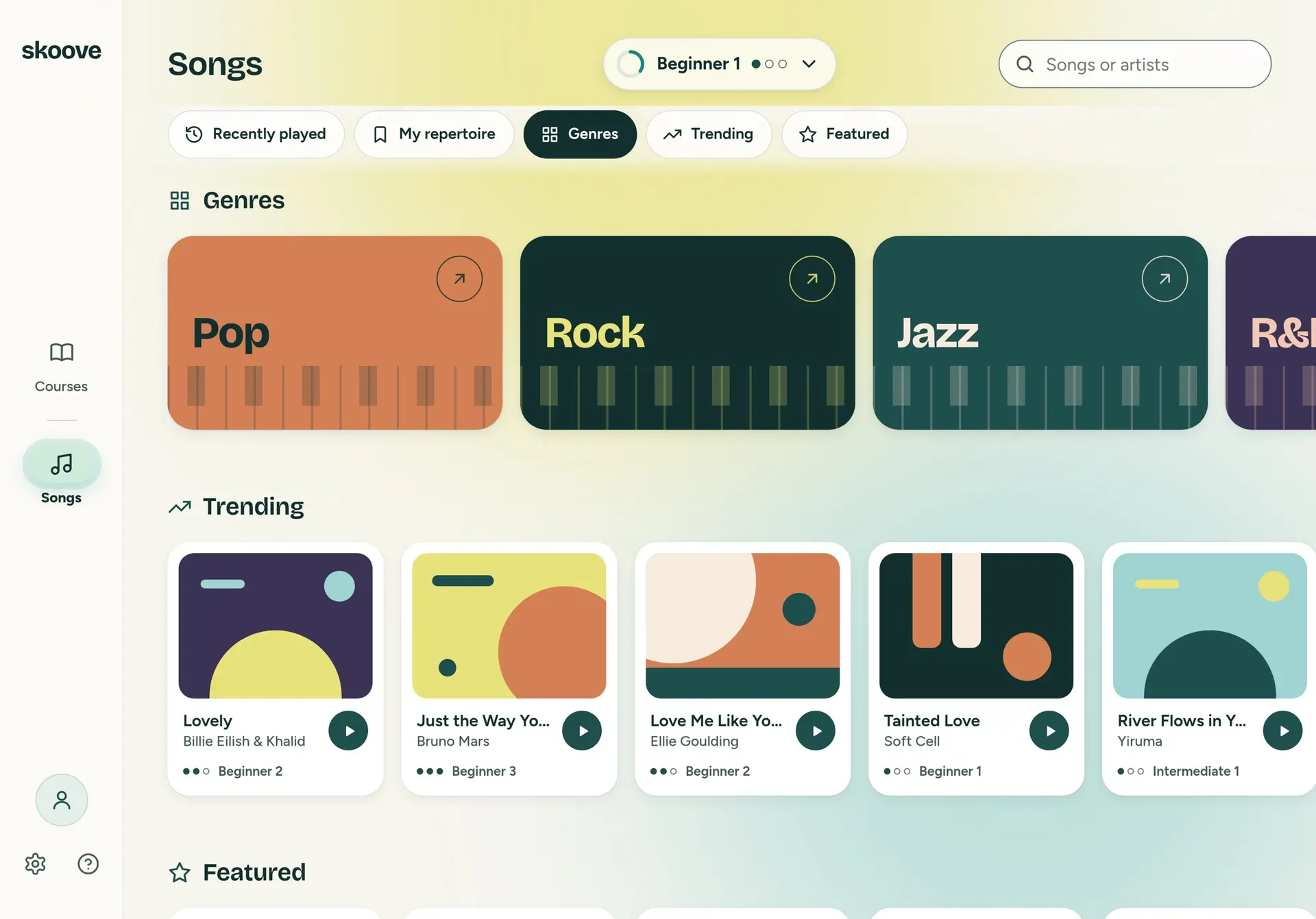
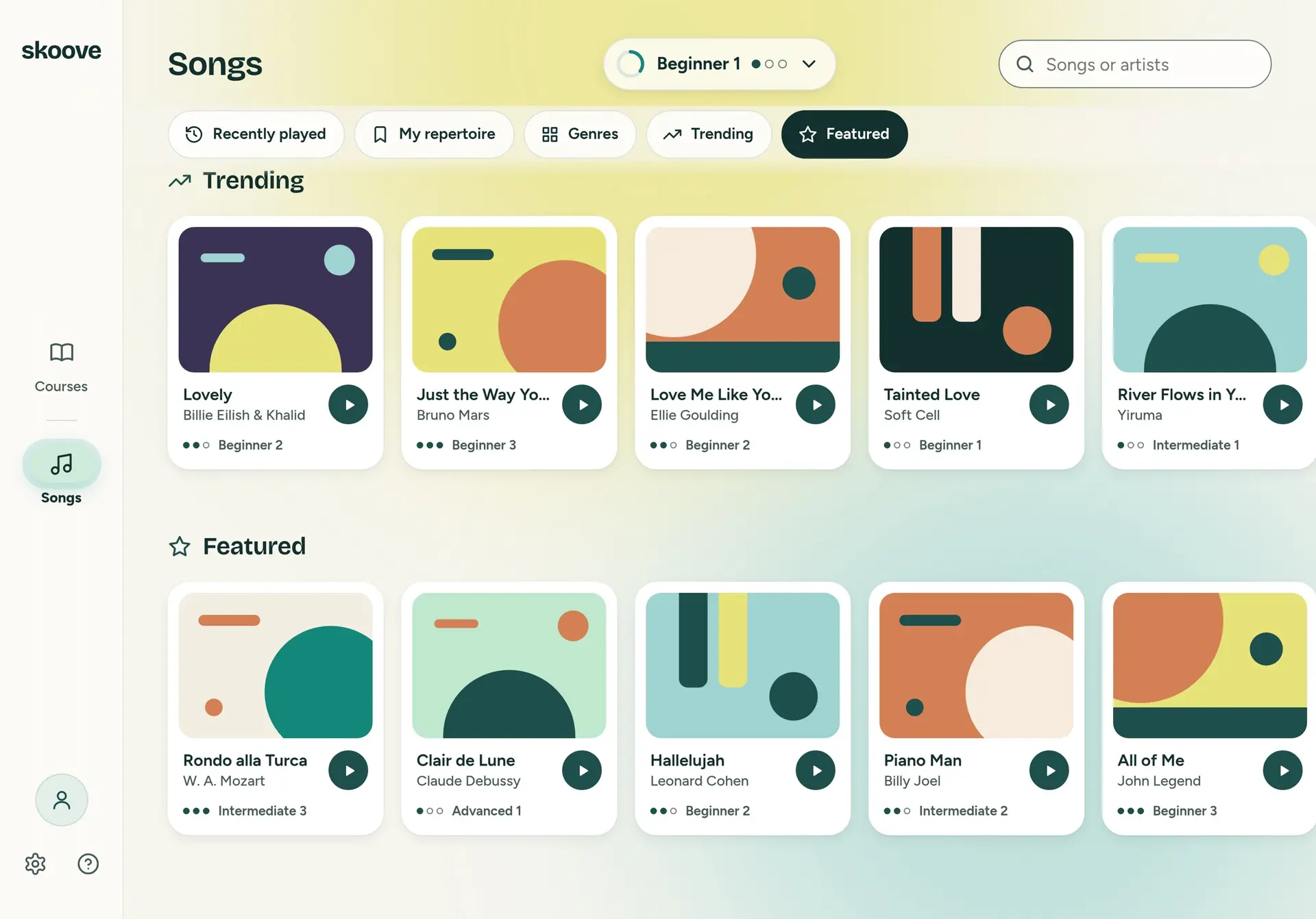
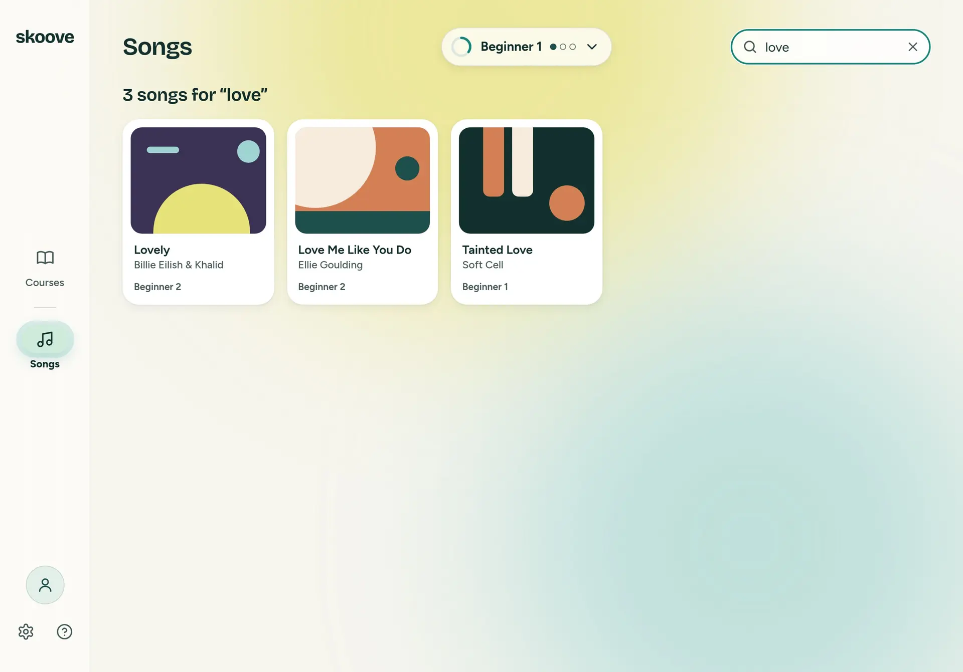
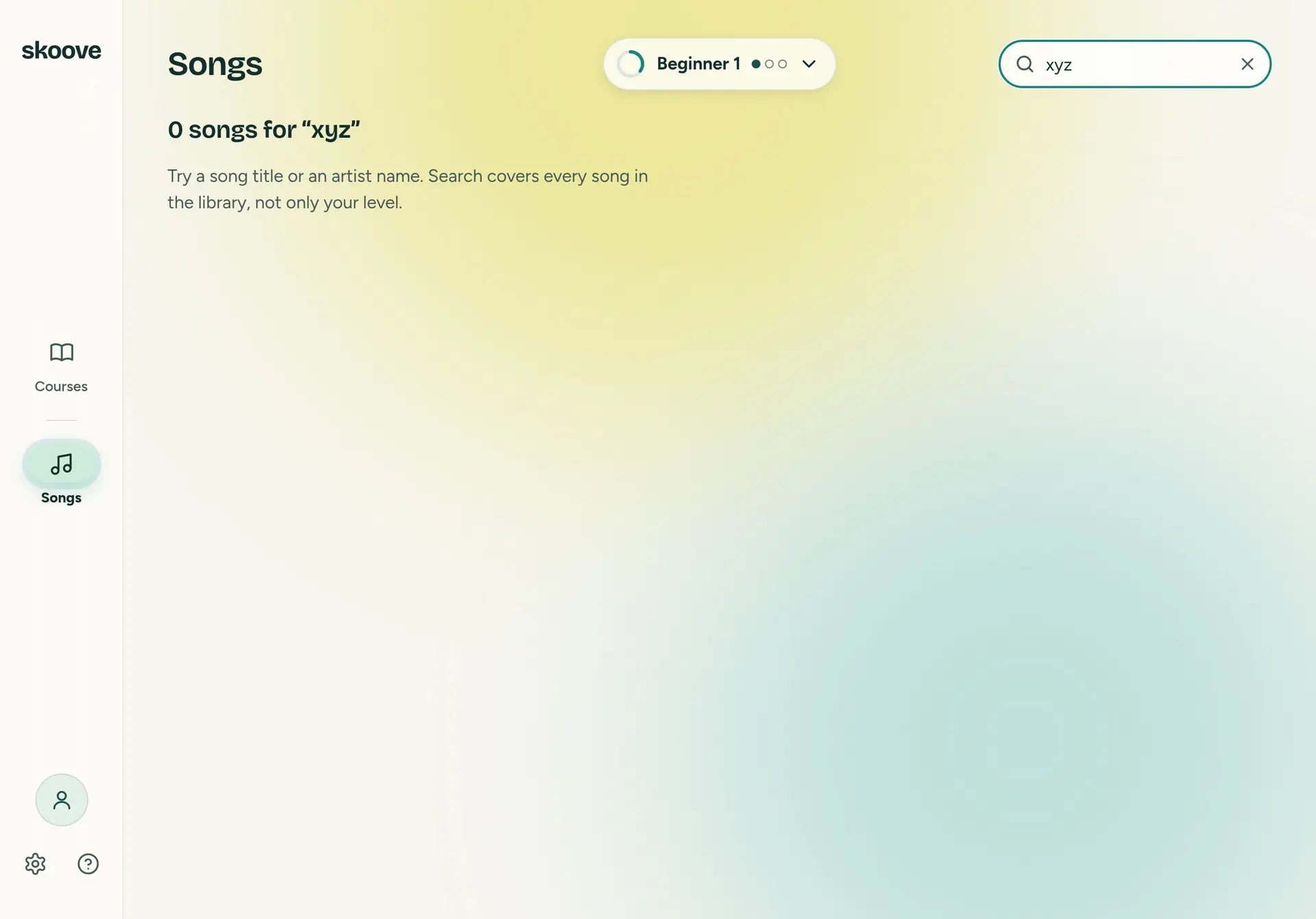
Prototype. The courses, the progress and the songs are sample data: twenty real songs by title and artist, with generated covers.
The walkthrough is silent: thirty-eight seconds through the carousel, a level switch, the catalogue, the Songs chips and a search. See it running opens the prototype itself, at its own size, in a new tab. It is made for an iPad held sideways, so on a phone it is small but whole. Everything past the first page, the lesson and the song, is Skoove's, and the prototype hands it off with a toast rather than pretending to play.
Thirty-eight seconds, silent: the carousel, a level switch, All courses, the Songs chips and a search.
Prototype. The courses, the progress and the songs are sample data: twenty real songs by title and artist, with generated covers.
This is concept work from a design task. It is not Skoove's app, and it is not affiliated with or endorsed by Skoove.
The parts
The prototype runs on a small token set made for this concept, not Skoove's design system: a pine green, a paper ground, a lime aura behind the page, and a colour for each genre. Bricolage Grotesque for display, Figtree for text. The ratios below are worked out from the hex values, not typed in. Every pair clears AA but one: tertiary text on the aura at its strongest measures under 4.5:1, and it is shown as it measures.
- text.primary#12302ETitles and body text. brand.ink-900.12.91:1 on surface.paper, AA14.11:1 on surface.surface, AA11.06:1 on surface.aura, AA
- text.secondary#455B59Secondary text.6.64:1 on surface.paper, AA7.26:1 on surface.surface, AA5.69:1 on surface.aura, AA
- text.tertiary#5E706ETertiary text.4.78:1 on surface.paper, AA5.23:1 on surface.surface, AA4.10:1 on surface.aura, under AA
- text.on-primary#FFFFFFWords and icons on the two dark fills.9.21:1 on brand.pine-700, AA14.11:1 on brand.ink-900, AA
- brand.pine-700#1F4F4CThe play button, and the level picker's chosen step.
- brand.ink-900#12302EThe chosen section chip.
- status.in-progress#E8E27AThe In progress badge.10.48:1 under text.primary, AA
- status.completed#CDEBD8The Completed badge.11.07:1 under text.primary, AA
- status.selected-nav#CDEBD8The chosen room on the rail.
- progress.fill#13877AThe ring on a course's play button, and a bar's fill.3.45:1 on progress.track, AA for a mark4.40:1 on surface.surface, AA for a mark
- progress.track#DCE6E1Under the fill.
- surface.paper#F6F5EEThe page.
- surface.surface#FFFFFFCards.
- surface.fill-subtle#F1F3EEA card's chips.
- surface.media-placeholder#E6EAE4Behind a photo.
- surface.glass#FFFFFF 72%Glass surfaces.
- surface.rail-glass#FFFFFF 50%The rail's glass.
- surface.aura#ECE79AThe aura behind the page, at its strongest.
- line.default#12302E 12%Hairlines.
- line.subtle#12302E 8%Fainter hairlines.
- line.strong#6F827FThe search field's edge.4.06:1 on surface.surface, AA for a mark3.18:1 on surface.aura, AA for a mark
- expressive.coral#D48055Pop, and covers.4.72:1 under text.primary, AA at 40 pt
- expressive.sun#E8E27ARock's name, and covers.10.48:1 on brand.ink-900, AA at 40 pt
- expressive.cream#F3EEE2Jazz's name.7.95:1 on brand.pine-700, AA at 40 pt
- expressive.plum#3B3355R&B, and covers.
- genre.rnb#F3C9B4R&B's name. Not in the token file.7.72:1 on expressive.plum, AA at 40 pt
- expressive.lagoon#9FD3D1Covers.
- expressive.sand#F6EBDDCovers.
Prototype.
The components, from the same board: the rail, the level pill and its picker, a course card in its three states, the play control, a catalogue card, the section chips, a song card, a genre card, and the buttons and the toast.
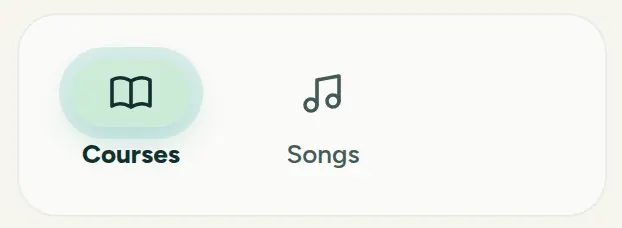
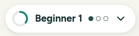
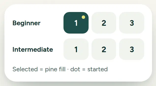
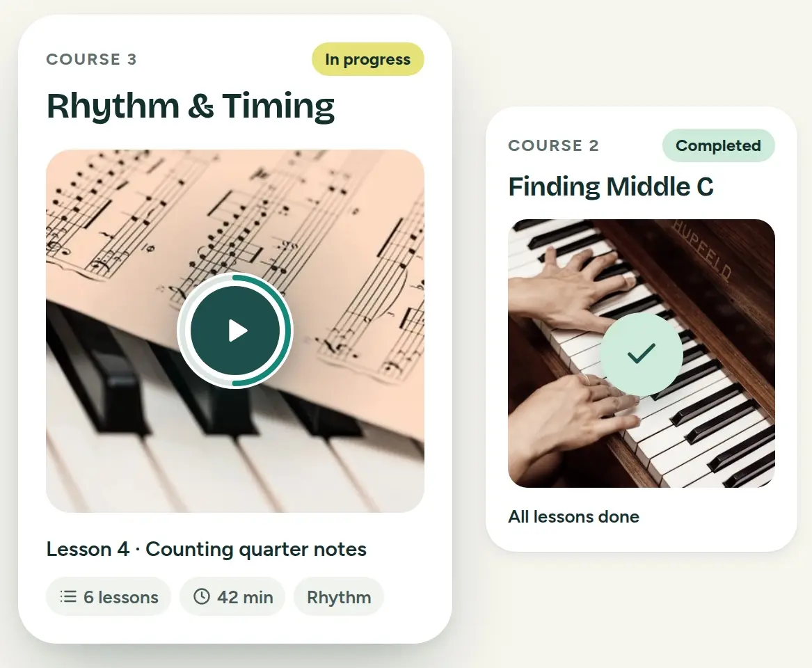
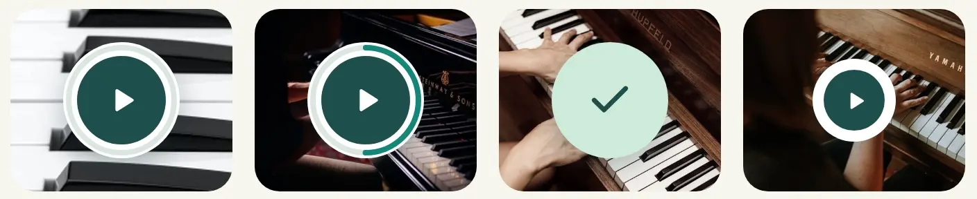
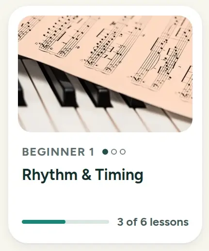
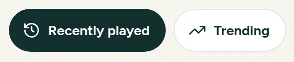
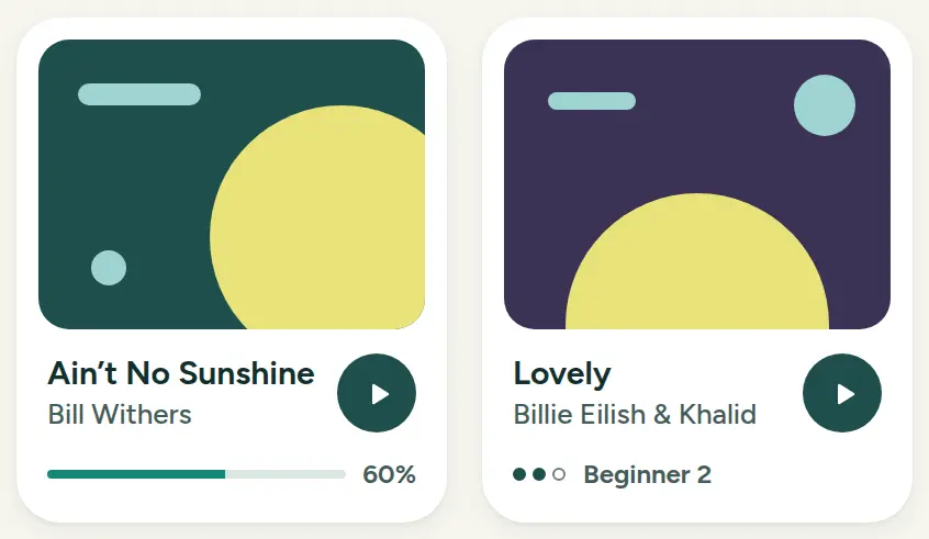
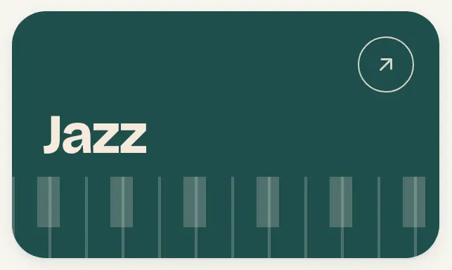
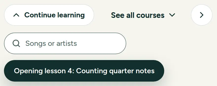
Prototype. The courses, the progress and the songs are sample data: twenty real songs by title and artist, with generated covers.
More case studies
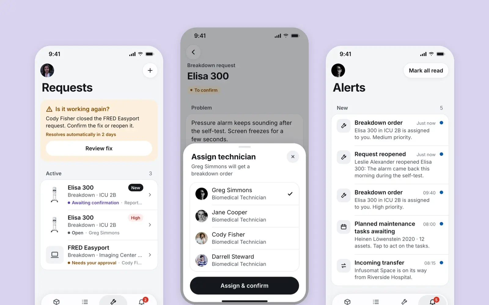
Lighthouse
A mobile app for the nurses, technicians and managers who keep a hospital's medical devices working, designed for Borda
case study · 2021 · read it
Flight Planning
A planner for three aircraft, from a December 2019 take-home task: today's plans beside one map, every crossing shown, only the close ones in time a conflict.
case study · 2019 · read it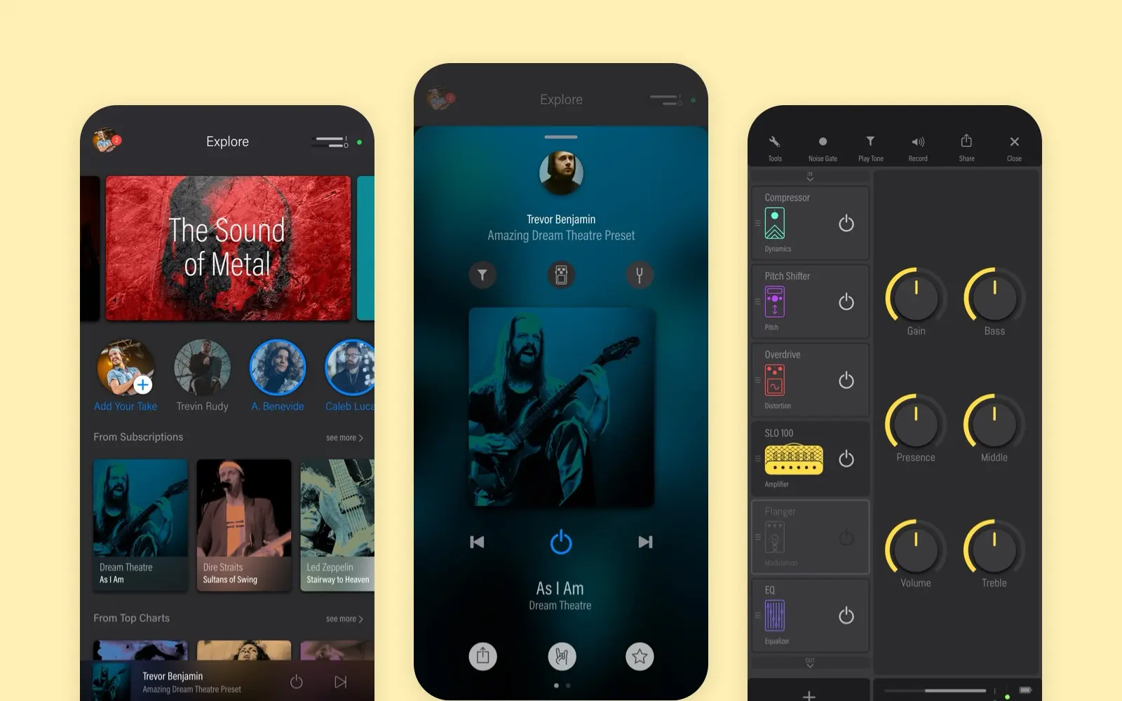
Solo
A social app for guitar tones, shipped on iOS and Android. Every pedal and amp is drawn, and the studio knob is rebuilt live on this page.
case study · 2019 · read it