Course Chat
The take-home that got me hired at Studocu in 2022: a live chat with voice rooms on the course page, chosen after asking students what they already do.
- Year
- 2022
- Track
- design
- Category
- case-study
Tools
- Figma
- Claude Design
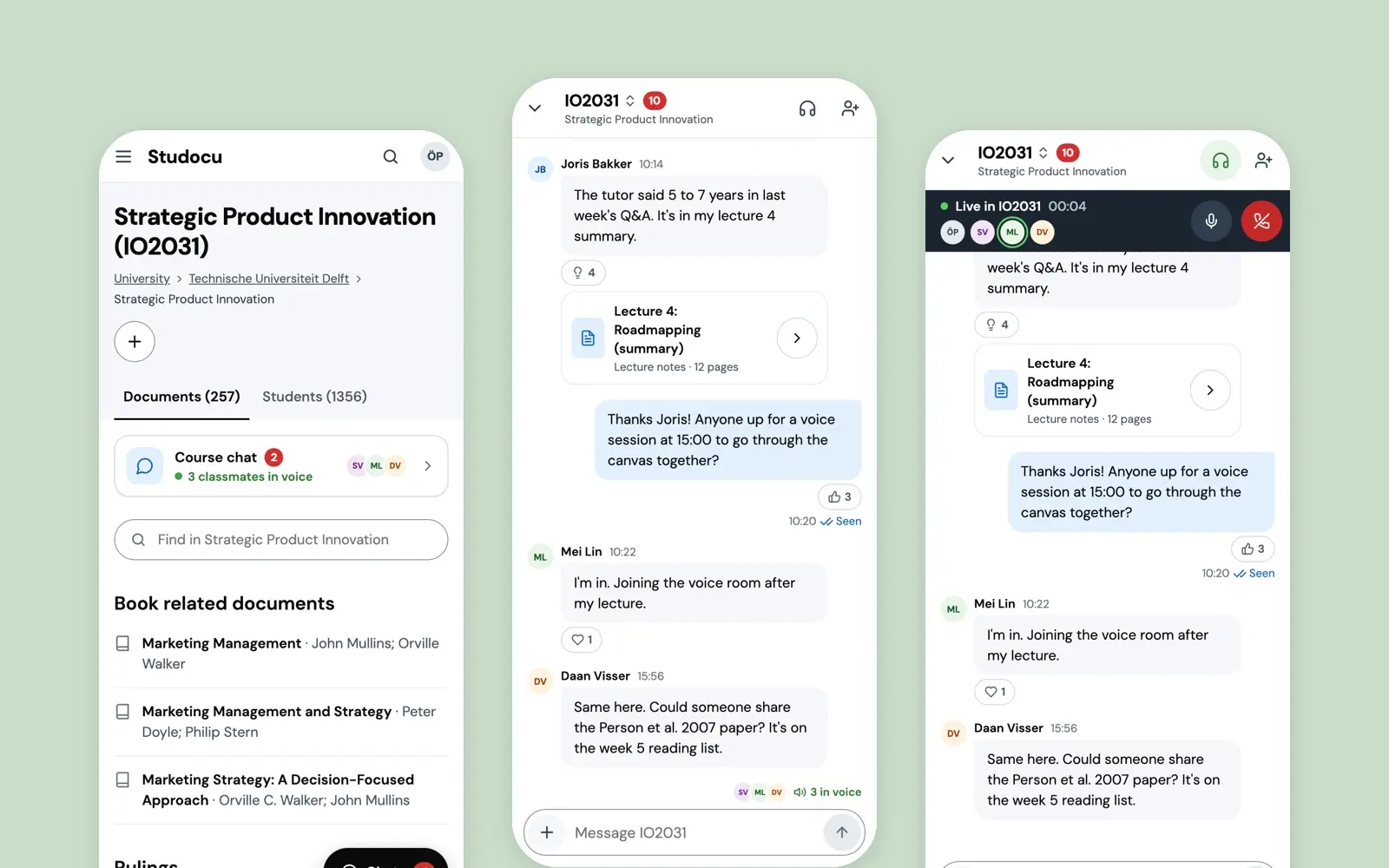
In May 2022 I did Studocu's design take-home, and it got me the job. I started that August. The brief was open, so I went to students first and then chose one thing: the course page's Messages tab, a board where a post waited for replies, turned into a live chat for each course, with voice rooms and a view of who is there right now. The screens on this page are that chat as a working prototype, made in September 2026 in a Claude Design canvas. I directed it and Claude built it.
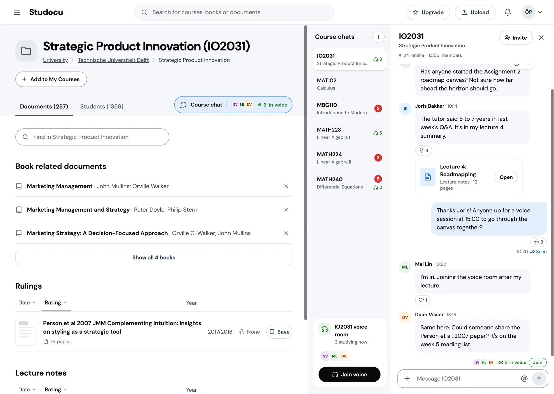
Prototype. The course page around it is Studocu's product, shown muted and unchanged. Only the chat is mine. The classmates and their messages are scripted, and the voice room is simulated.
The brief
Studocu asked me to pick any page or component of the product and redesign it where it would make a real difference, weighing the business, the students and the devices they use. They wanted the thinking shown and not only the result, kept reasonably simple, and they said the visuals would be judged. Part one of the assignment was a design critique. This is part two.
I had the public product, a company deck to read for the business goals, and no inside knowledge. The files run from 4 to 12 May 2022. I did not start from the product. I had never used it as a student, and a redesign from the outside would have been a guess.
- 4 May 2022Three student interviews.
- 7 May 2022A survey of 38 students, the Post-it board, the persona, and screenshots of the course page's Messages tab.
- 8 May 2022The whiteboard, with two branches: course videos, set aside, and messaging.
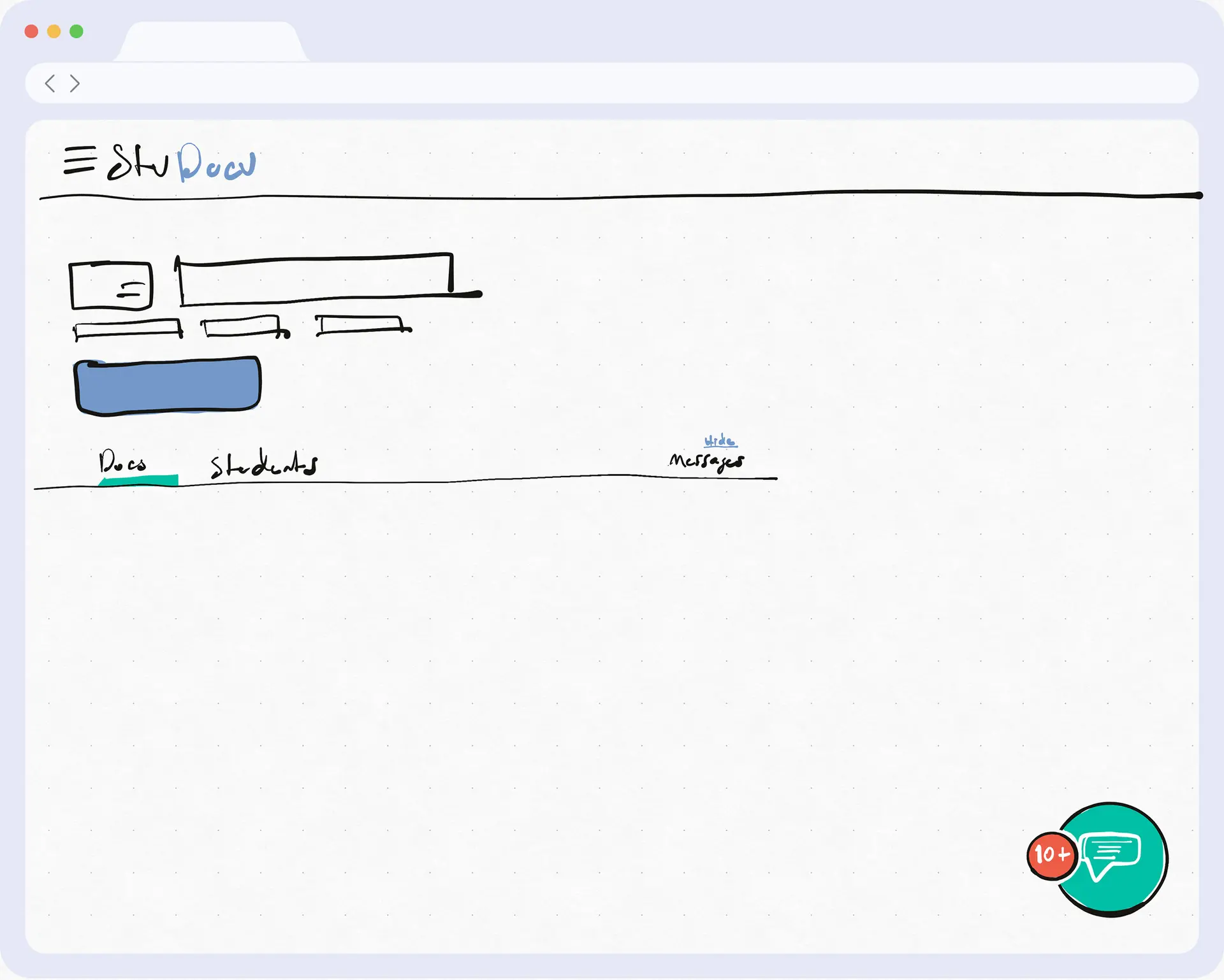
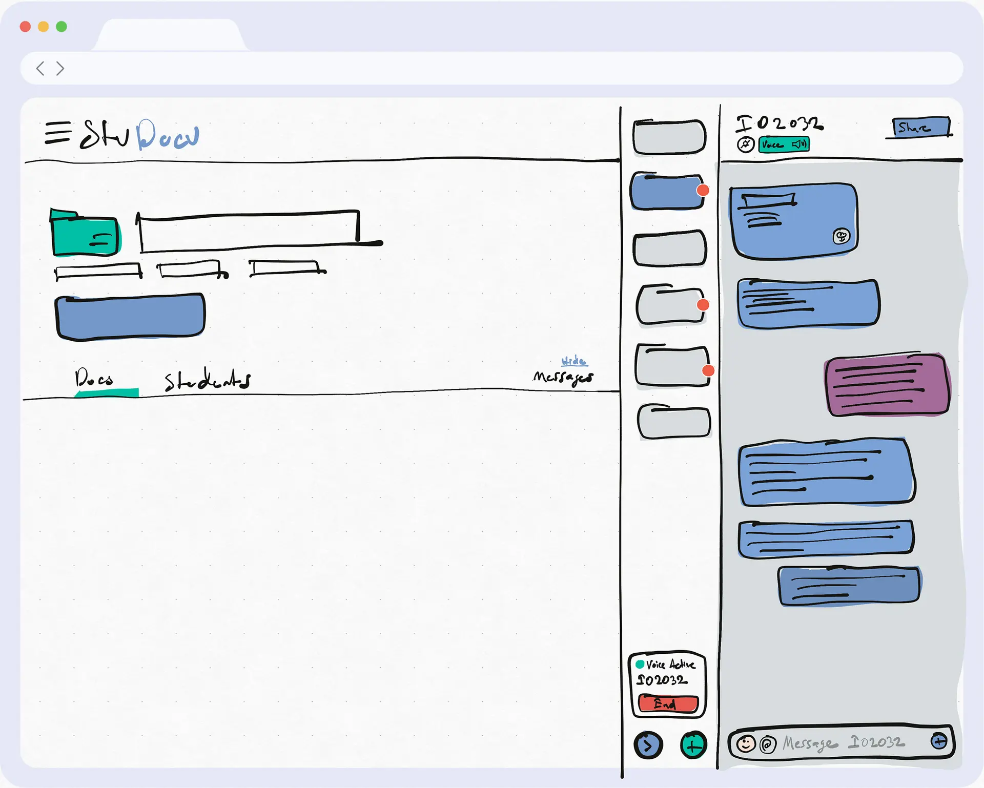
- 9 May 2022Two sketches, the entry and the panel.
- 10–11 May 2022The finals in Figma.
- Aug 2022I started at Studocu.
What students told me
I interviewed three students first, to find out what to ask a larger group. The guide had seven questions:
- How do you keep up with taking notes during courses?
- Have you ever been asked to share your notes? If so, how do you share them?
- What extra resources do you look for in your courses?
- How do you find your study resources?
- Which subjects need a lot of external resources?
- How do you judge whether a resource is reliable?
- How do you store and organise the resources you find?
One participant said they sometimes arranged Zoom sessions where a student who knew a subject explained it to the others. I wrote down that this could be a live session, on demand.
Then a survey: 21 questions, 38 respondents, most of them studying in Turkey. It is a small sample and I said so at the time. Six of the charts are below, the ones my notes drew on. The rest are in the write-up.
What stood out. Only 2 of 38 were in no messaging group for a course, and 15 were in more than five. Cloud folders went the other way: 16 of 38 were in none. WhatsApp was used by all 38, Google Drive by 37. When a chapter would not land, 30 asked a friend and 31 searched the web, about the same. And 32 of 38 wanted lecture videos.
So classmates already talk to each other, in tools that were never built for it, and they turn to each other before anything official. The course page I was looking at said 1,356 students, and its Messages tab was a board of posts.
Six questions from my survey of 38 students, most of them in Turkey, the ones my notes drew on. Counts and shares are as my charts printed them. Where a question took more than one answer, the shares add up past 100%.
How many groups opened by students to share lecture materials are you involved in (WhatsApp, Telegram groups etc.)? Answer People, of 38 Share None 2 5% 1 5 13% 2 5 13% 3 7 18% 4 1 3% 5 3 8% more than 5 15 39% How many cloud storage links opened by students to share lecture materials are you involved in (Google Drive, Dropbox links etc.)? Answer People, of 38 Share None 16 42% 1 9 24% 2 3 8% 3 9 24% 4 0 not printed 5 0 not printed more than 5 1 3% Which services are being used to provide community cloud storage for students to share lecture material? Answer People, of 38 Share Google Drive / Google Docs 37 97.4% Dropbox 4 10.5% Others 3 7.9% Messaging apps used for the same groups Answer People, of 38 Share WhatsApp 38 100% Telegram 11 28.9% Discord 14 36.8% What kind of content type do you need? Answer People, of 38 Share Lecture videos 32 84.2% Slideshows 23 60.5% Problem solving tips 26 68.4% Lecture notes 27 71.1% Articles 17 44.7% Books 17 44.7% Schematic / Drawing / Diagram 15 39.5% Which resources do you refer to when you could not grasp a chapter or not able to solve a question? Answer People, of 38 Share Ask a friend 30 78.9% Ask lecture's messaging group 11 28.9% Message to the lecturer 12 31.6% Search on web 31 81.6%
Thelma
One persona, based on one of the participants and supported by the survey, and kept to what she does. I drew her.
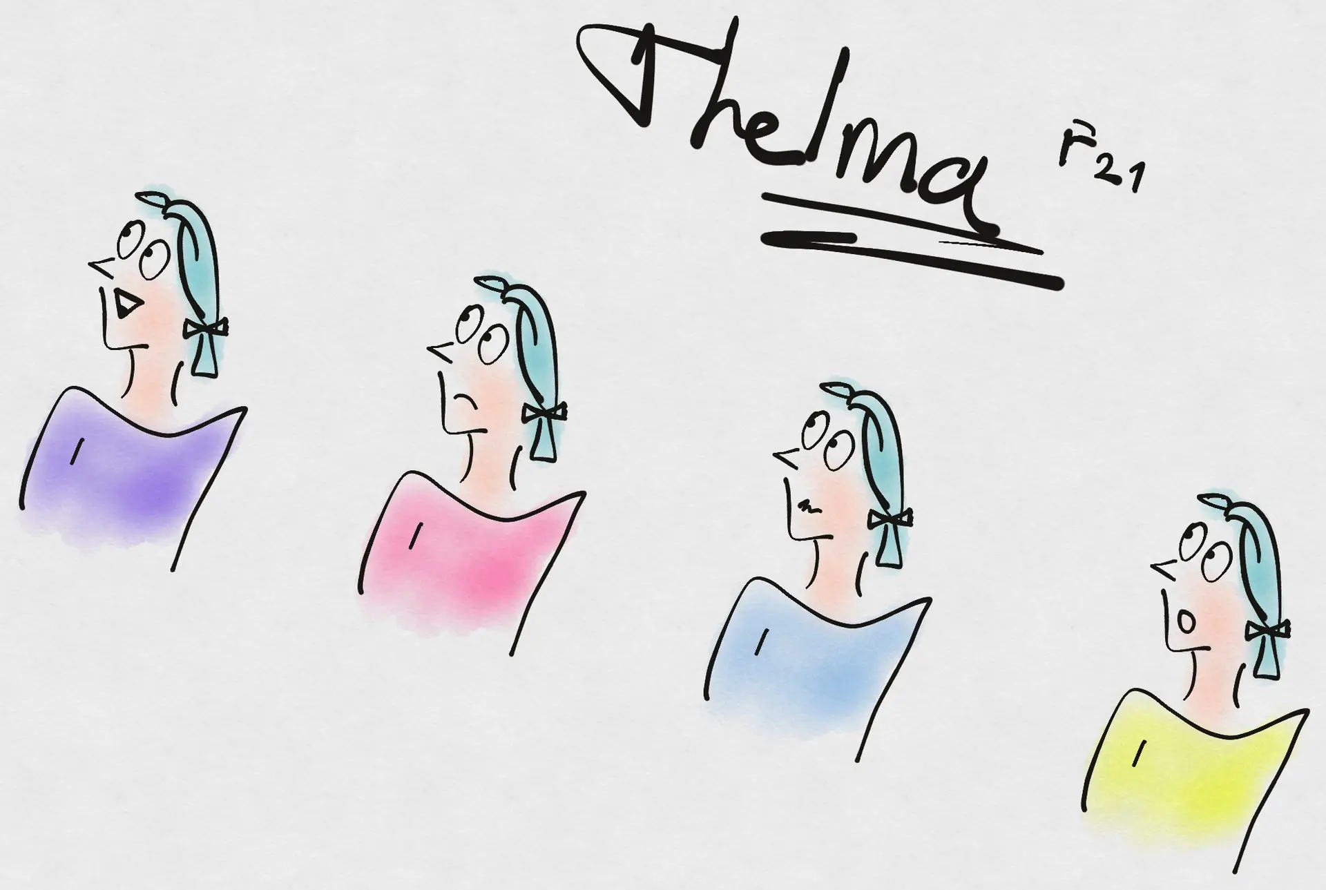
Thelma
F 21 · Sophomore · Math Engineering
A sophomore whose subjects got hard this year. She takes notes on paper as fast as she can, organises them after class, photographs them to share with friends, and looks for lecture videos to fill the gaps.
She is the one who opens the WhatsApp group for a lecture. Right now she is in 7 WhatsApp groups, 2 Telegram groups and 2 Google Drive folders, most of which she started, and keeping track of material spread across all of them is what wears her down.
Choosing what to design
I put everything on a Post-it board and sorted it: where students get material, how they work, how they share, and what the company wanted from the product, which came from the deck. The two sides of the board had to meet somewhere.
Free ideation session and affinity grouping
Resources7
- Lecture by a Student via Zoom
- School Library
- A Sharing Community: Whatsapp, Telegram Groups
- Forums, Repos such as Stackoverflow, GitHub
- Watch a Lecture Video
- A common cloud Folder
- University's Lecture Page: info on Lecture, files about it, Exam program etc.
Methods3
- Write down Rapidly, Organize later
- Study on the GO
- Store the Docs on the Cloud
Supplementary3
- MILESTONE: Pandemic COVID-19, Catalyst for Digital Transformation
- Quality of the Material
- Course Structure
Sharing4
- Share Docs to Messaging App Groups
- Share Docs Directly to other people
- Create a Messaging Group
- Create a SHARED Cloud Folder
StuDocu Goals5
- Attract New Content
- Drive More Traffic
- Guide Enough People to Premium
- Encourage More Schools
- Create New Opportunities
On the whiteboard I worked two branches. Course videos: 32 of 38 wanted them, but hosting video means bandwidth, storage, design and development, a lot of investment. Messaging: students were already in groups, the pattern was already learned and the apps were already on every phone. The product had a messaging system too, so this was not starting from zero. The question I wrote at the end was how to turn that into a living community.
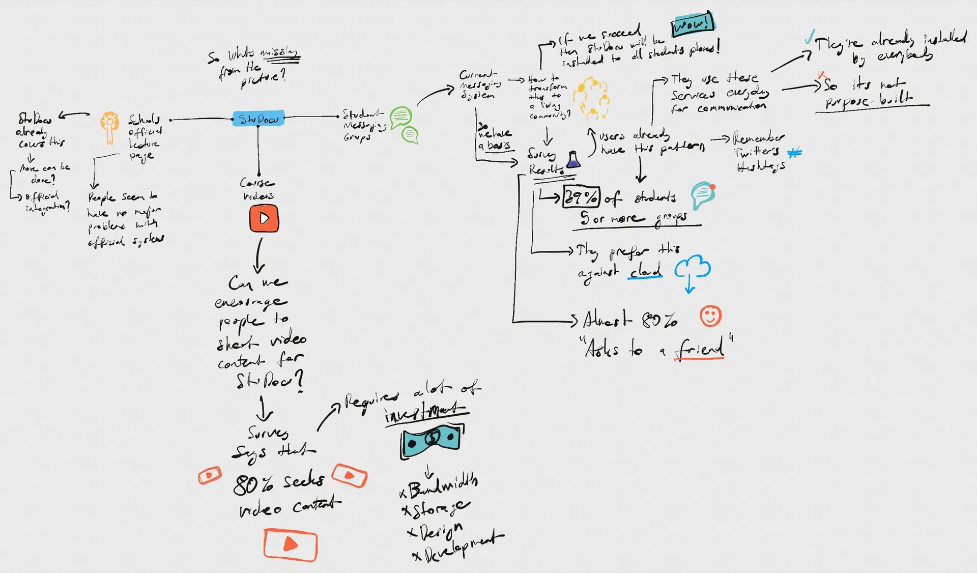
Three candidates were on the table, and I chose the third, for the reasons I gave at the time. Most students were in messaging groups and many in more than five, so WhatsApp and Telegram were the competition, in a domain that is specifically about students. Community messaging beat cloud drives in the survey. A place where students already share files could feed new content into the product, which was one of the company's goals, though that was a hope and not something I could show. There was an existing Messages tab to build on. And my reading was that switching would cost students little, since the pattern was one they used every day.
Search
- A smart search that understands context better.
- Aware of where the student is, and of her previous searches.
Content
- Everything starts with content.
- Lecture videos made by the community.
Communitychosen
- Turn the message board into instant messaging.
- WhatsApp and Telegram are the competition.
- Feed what is shared there back into the product.
The story and the flows
I wrote the story for Thelma and drew three flows: sharing a file, sending a message, and sharing the channel so a group fills up. For the look I collected screens from WhatsApp, Telegram, Discord and Slack, and a few Dribbble shots. Then two sketches: the entry on the course page, and the panel open.
The main user story
Thelma wants to open messaging groups that also handle files, so that a sharing community can help each other with the lectures that are hard to grasp.
Today she cannot do that on Studocu, so students go elsewhere, to WhatsApp and Telegram groups.
Share a file
- Press Add in the message area at the bottom of the Messages pane.
- The existing Upload a Document dialog opens.
- Upload the file.
- The course and university are filled in; the student fills in the rest.
New message
- Go to the course page.
- Click the message area at the bottom of the Messages pane.
- Write the message.
- Click Send or press Return.
Or, from anywhere
- Click the sticky Messages button at the bottom right.
- Pick the course group's tab in the Messages pane's drawer.
Then on from step 2.
Share the channel
- Click the sticky Messages button at the bottom right.
- Find Share at the top right.
- A dialog copies the link to the clipboard.
- Share it anywhere.
Designed in states
A chat is mostly states. Someone is typing, a message is pending, a voice call is starting. So the Figma file was built as a component library first, and the frames came out of it: message bubbles incoming and outgoing, a channel selected or not, the composer from empty to typed, the voice widget closed, starting and active on desktop and on mobile, and frames of animation for the typing dots, a spinner and a blinking cursor. The frames were made to match Studocu's look at the time. The hand-in, four frames and two click-through prototypes, is in the write-up.
- Message
- incoming · outgoing · default · hover
- Channel
- not selected · hover · selected
- Composer
- default · hover · clicked · input received
- Voice
- closed · starting · active · desktop · mobile
- Typing
- four frames of dots
- Pending
- four frames of a spinner
- Cursor
- two frames of a blink
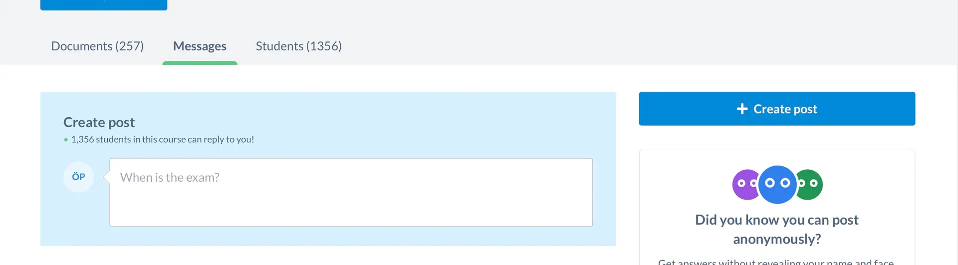
This is what the tab was in May 2022: a Create post box, a line saying 1,356 students in this course can reply to you, and a tip about posting anonymously. A board, not a conversation.
The chat
What follows is the chat as a working prototype, desktop and mobile, made on 25 September 2026 in a Claude Design canvas. I directed it, Claude built it, and I audited the result and fixed what a render check found: cut-off document titles, a toast covering a read receipt, a wrong icon. Nothing shipped. The course page around the chat is Studocu's product, shown muted and unchanged, and only the chat is mine. The classmates are scripted and the voice room is simulated.
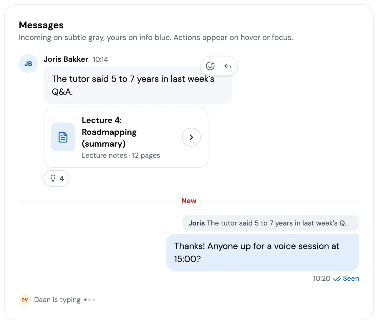
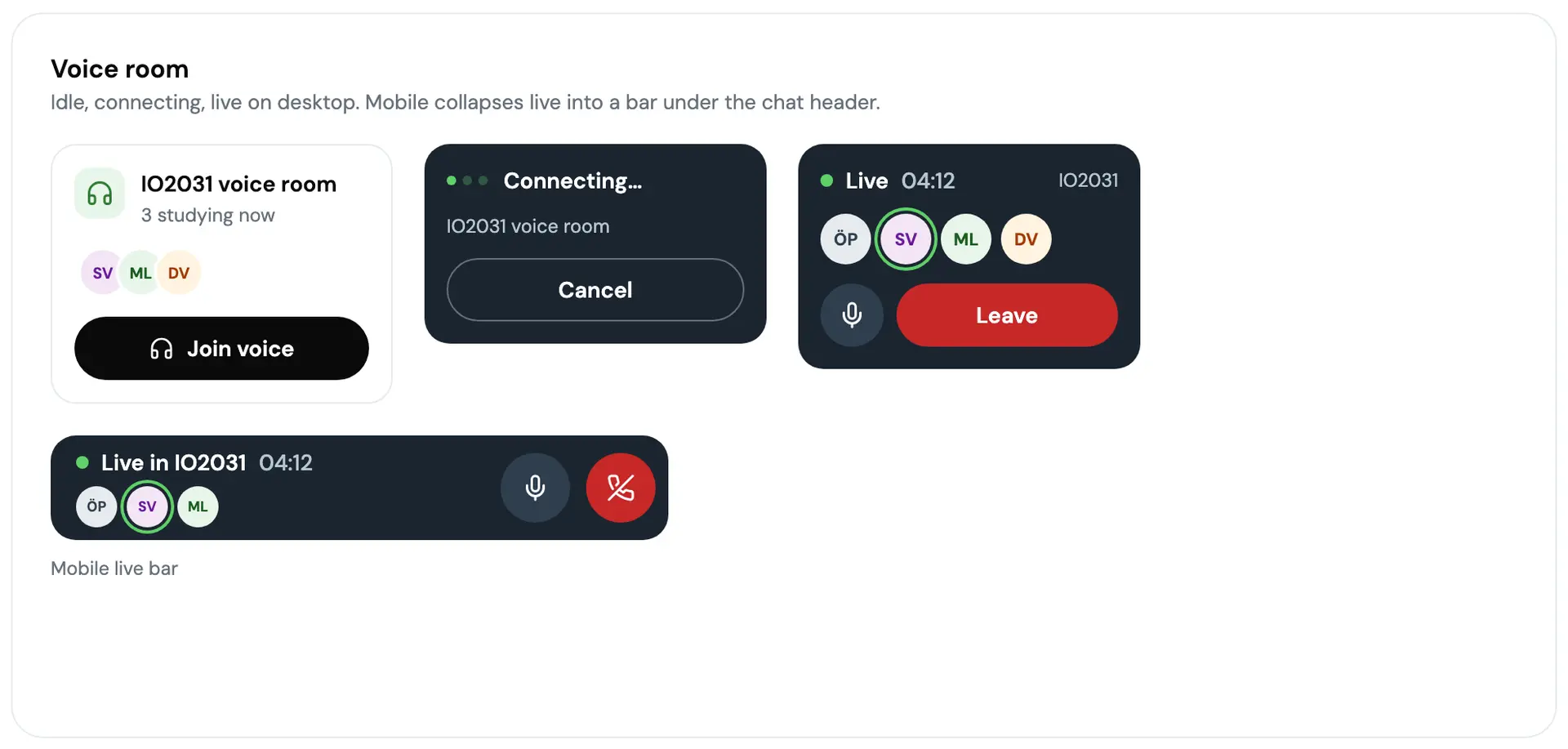
On desktop, one Course chat button at the end of the tab bar carries the unread count and how many people are in voice, because someone being there right now is the strongest reason to open it. The panel docks under the header. On the left, every course you follow, with unread badges and a headset count. On the right, the thread, messages grouped by author, your own marked Sent and then Seen. The voice room card is white while it waits and turns dark only while you are in it, with a timer, a ring around whoever is speaking, Mute and Leave. Reactions are three icons: thumbs up, heart, helpful. Reply quotes the line it answers. The composer's plus shares a document from the course into the chat, which is what ties it back to the page it sits on.
The panel
6 states

One Course chat button carries the unread count and who is in voice. The black Chats pill shows only while the panel is closed.
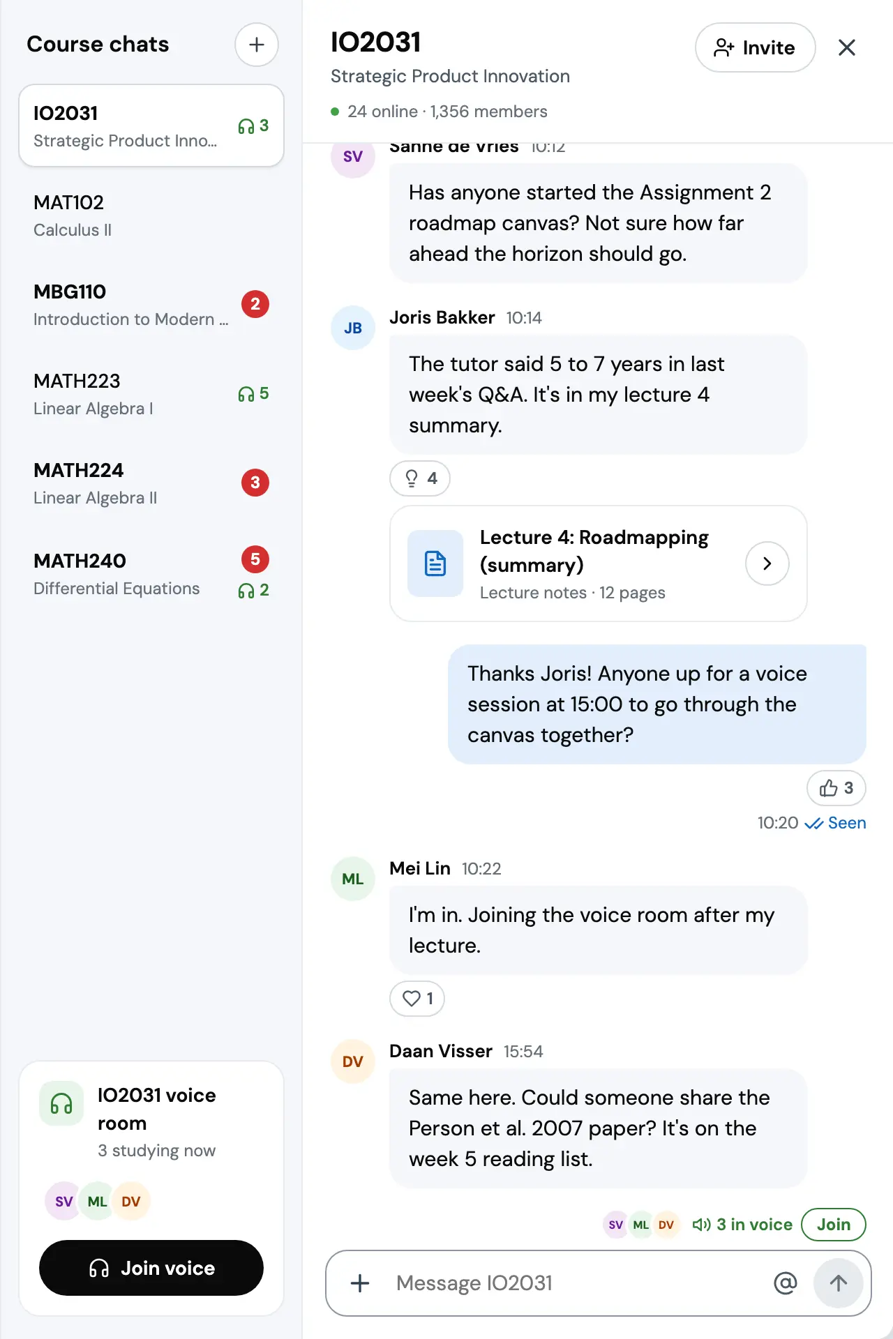
Docked under the header, so the page's own chrome stays put. The course list shows who is in voice in every course. The thread groups messages by author, and a shared document lands as a card.

The card turns dark only while you are live: a timer, a speaking ring round whoever talks, Mute and Leave. The header says You're in voice.

The composer's + shares a document from the course, or one from the device, which ties the chat to the documents the page is for.

Reply quotes the line it answers. The sent message reads Sent until someone sees it.

Hover or keyboard focus shows react and reply. Three reactions, thumbs up, heart and helpful, as icons so they render the same everywhere.
Prototype. The classmates and their messages are scripted, and the voice room is simulated.
On a phone the chat takes the whole screen. A card under the tabs is the way in, with the same two facts, unread and in voice. The course code in the header opens a sheet to switch courses, so no rail of course tiles eats the width. A headset button joins voice, and a bar under the header shows the live room. Tap a message for its actions. Every control is at least 44 pixels.
The phone
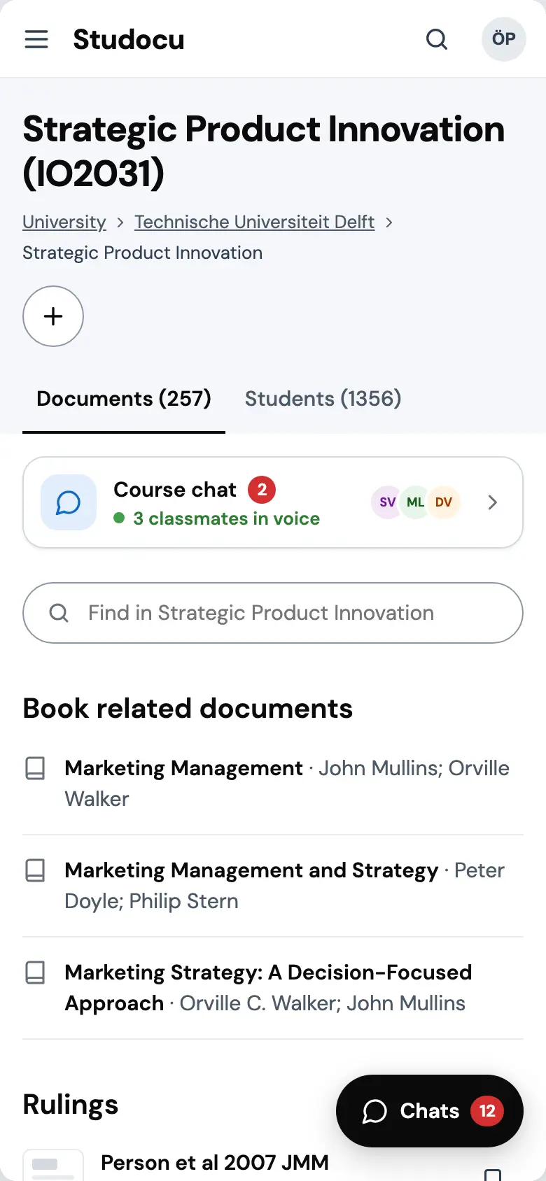
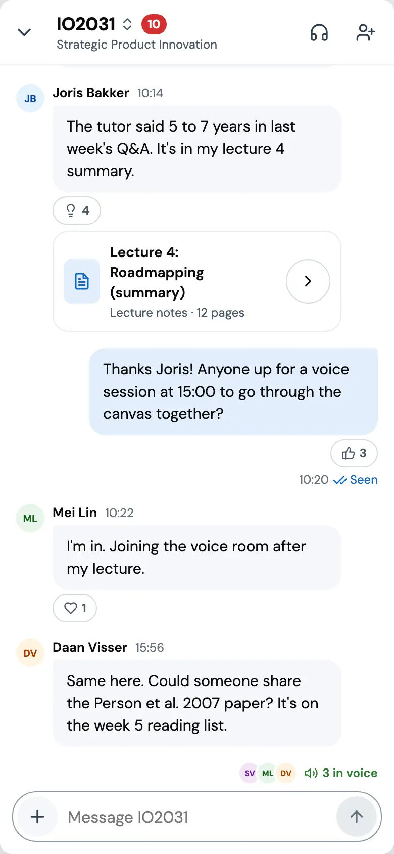
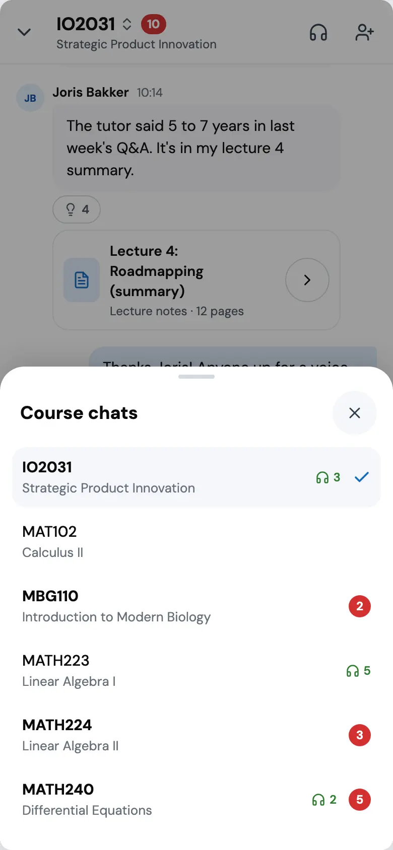
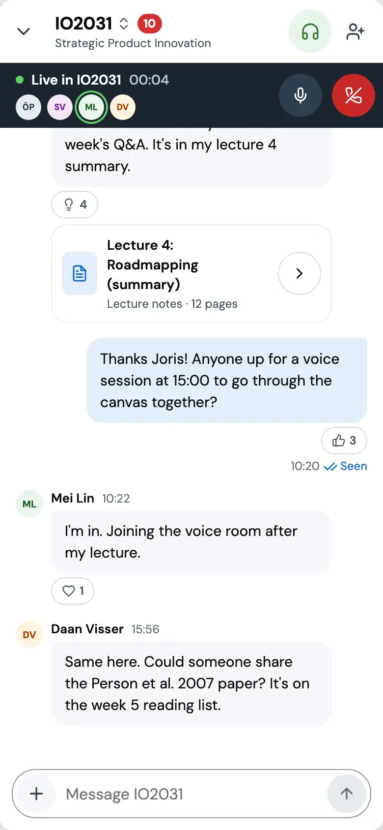
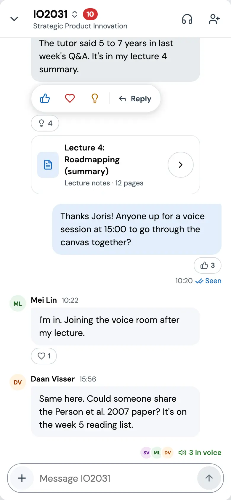
Prototype. The classmates and their messages are scripted, and the voice room is simulated.
The phone runs live below. Send something and a classmate will reply. Join voice and the bar comes up. Start over resets it.
Prototype. The classmates and their messages are scripted, and the voice room is simulated. The concept was only designed in light, so the phone stays light in both themes.
A small system, measured
The prototypes run on a small token set made for this concept: colours, DM Sans at a few sizes, radii of 12 and 20 pixels, 4-pixel spacing. It starts from the product's current look, its blue, its pill-shaped actions and its flat surfaces, so the chat still belongs on the page. The ratios below are worked out from the hex values, not typed in.
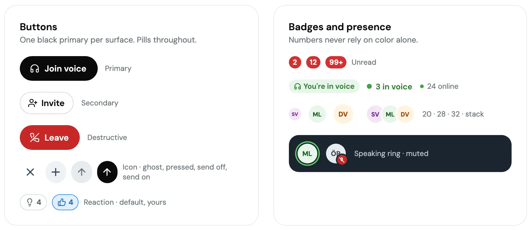
Five of the values I started from failed WCAG 2.1 AA when measured. Brand blue under white text reads 3.17:1, so primary buttons went to ink and the blue is kept for fills, focus rings and selected states. Blue as link text failed the same way and got a darker blue. Timestamps and captions got a darker grey. The default border, used as an input outline, sat at 1.42:1 against a 3:1 floor for a control's edge, so inputs got their own border colour and the light one stays for dividers. And the presence green failed as text, so it is only a dot now, with a darker green for words like 3 in voice.
- ink#0A0A0ATitles, primary buttons.19.80:1 on surface.default18.49:1 on surface.subtle16.97:1 on info.ground
- text.strong#2F3E4EIcons, emphasis.10.94:1 on surface.default
- text.default#4C5966Secondary copy.7.17:1 on surface.default6.70:1 on surface.subtle
- text.meta#66707ATimestamps, captions.5.04:1 on surface.default4.71:1 on surface.subtle
- link#1168C3Blue text, read receipts.5.54:1 on surface.default4.75:1 on info.ground
- live.text#2E7D323 in voice, Join.5.13:1 on surface.default4.56:1 on live.ground
- brand#3092FAFills, focus rings, selected borders. Never body text, never under white text.3.17:1 on surface.default
- border.control#8A96A3Input outlines and outline buttons that stand alone.3.01:1 on surface.default
- live.dot#43A047Presence dots only.3.30:1 on surface.default
- danger.default#D32F2FUnread badges.4.98:1 under inverseText.default
- danger.strong#C62828Leave, the New divider's text.5.62:1 under inverseText.default
- surface.default#FFFFFFPage, thread, cards.
- surface.subtle#F6F7FBCourse hero, chat list, incoming bubbles.
- surface.hover#EEF1F5Hover fills, reply quotes.
- surface.strong#E6EBEFSubtle borders, disabled send, avatar ground.
- border.default#D3D9E0Dividers. Decorative only.
- info.ground#E2EFFDOutgoing bubbles, the selected entry pill, your own reactions.
- live.ground#E8F5E9The You're in voice tag, the voice icon tile.
- surface.inverse#1B2530Live voice only.
- inverseText.default#FFFFFFText on the live card and its mute button.15.51:1 on surface.inverse10.94:1 on text.strong
- inverseText.muted#B8C5D0Secondary text on the live card.8.82:1 on surface.inverse
- live.onInverse#5FD068The live dot and speaking ring on the live card.7.91:1 on surface.inverse
Five fixes, after measuring
Primary button
Join voice, #FFFFFF on #3092FA 3.17:1, under AA#FFFFFF on #0A0A0A 19.80:1Blue text
Seen, #3092FA on #FFFFFF 3.17:1, under AASeen#1168C3 on #FFFFFF 5.54:1Meta text
Today, #7A838C on #FFFFFF 3.85:1, under AAToday#66707A on #FFFFFF 5.04:1An input's outline
#D3D9E0 on #FFFFFF 1.42:1, under AA#8A96A3 on #FFFFFF 3.01:1Green as text
3 in voice, #43A047 on #FFFFFF 3.30:1, under AA3 in voice#2E7D32 on #FFFFFF 5.13:1
The components page: buttons and badges, a message with its actions and a document card, the voice card in its three states, and the phone's share sheet.
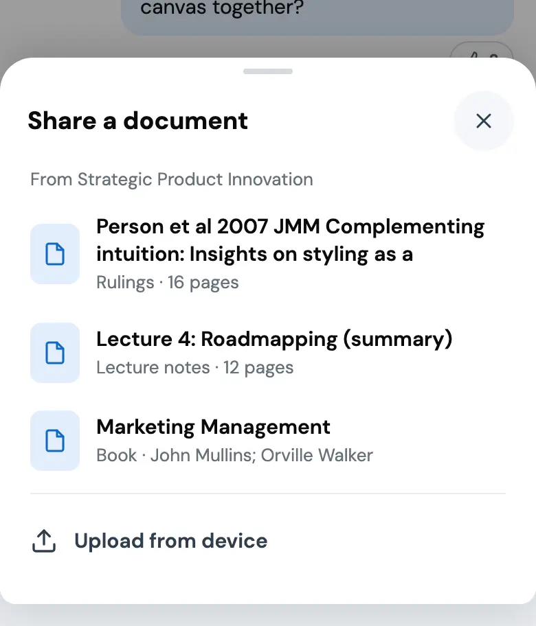
Prototype. The classmates and their messages are scripted, and the voice room is simulated.
What is still open
The prototype has gaps I know about. It does not respond to a reduced-motion setting, so the panel slide and the typing dots always run. The course switcher sheet does not trap focus or return it when closed. There is no dark mode, since the concept was only specified in light. Voice rooms would need captions or a transcript before any real student joined one.
The product questions are bigger, and the concept never answered them. Who moderates a live chat with 1,356 people in it. What happens to anonymity, which the old board offered and a chat does not. What a notification is worth when you follow six courses. And none of this has been put in front of a student.
So, to be plain about what this is. Nothing shipped, and the only outcome is that I was hired. The survey was 38 people, mostly in Turkey, and the persona is a drawing based on one of three interviews. The page around the chat is Studocu's and I have not changed it. The token set was made for this concept and is not the company's design system. The classmates, the replies and the voice room are all scripted. What is real is the reasoning, the screens, and the fact that you can try it. The product questions are bigger, and the concept never answered them. Who moderates a live chat with 1,356 people in it. What happens to anonymity, which the old board offered and a chat does not. What a notification is worth when you follow six courses. And none of this has been put in front of a student.
So, to be plain about what this is. Nothing shipped, and the only outcome is that I was hired. The survey was 38 people, mostly in Turkey, and the persona is a drawing based on one of three interviews. The page around the chat is Studocu's and I have not changed it. The token set was made for this concept and is not the company's design system. The classmates, the replies and the voice room are all scripted. What is real is the reasoning, the screens, and the fact that you can try it.
What it became
In August 2022 I started at Studocu, and the chat I had pitched met Groups, a product the company was taking apart that autumn to see why its first version had not worked. I was its product designer for the next two years. In May 2024 I drew where I thought it should go next: the groups on the page a student is studying from, with Stuwie, Studocu's assistant, answering in the group when nobody else does. Groups was switched off in November 2025. The screens below are that vision as a working prototype, made in September 2026 in a Claude Design canvas. I directed it and Claude built it.
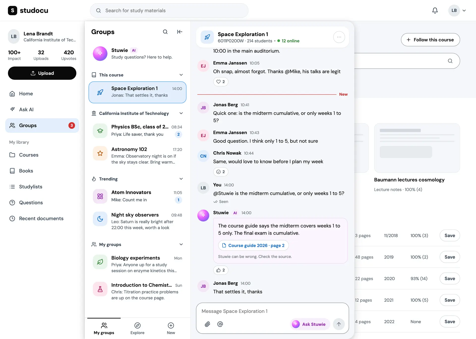
Prototype. Stuwie answers in the group, in front of everyone, with its source under the answer and a line saying it can be wrong. The course page around it is Studocu's product, shown unchanged. Only the panel is mine. The classmates and their messages are scripted, and so are Stuwie's answers.
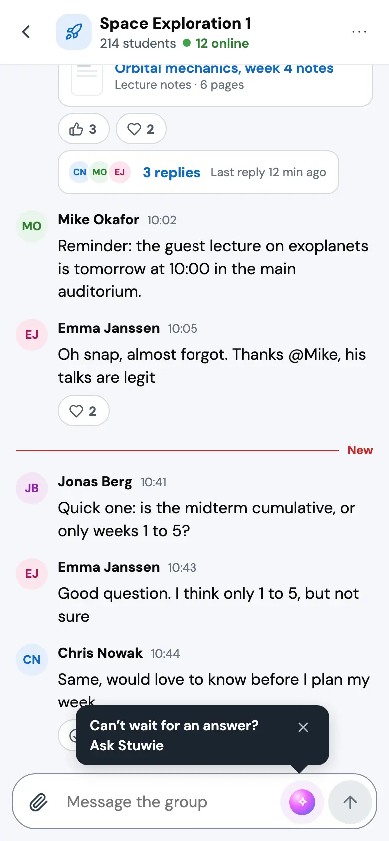
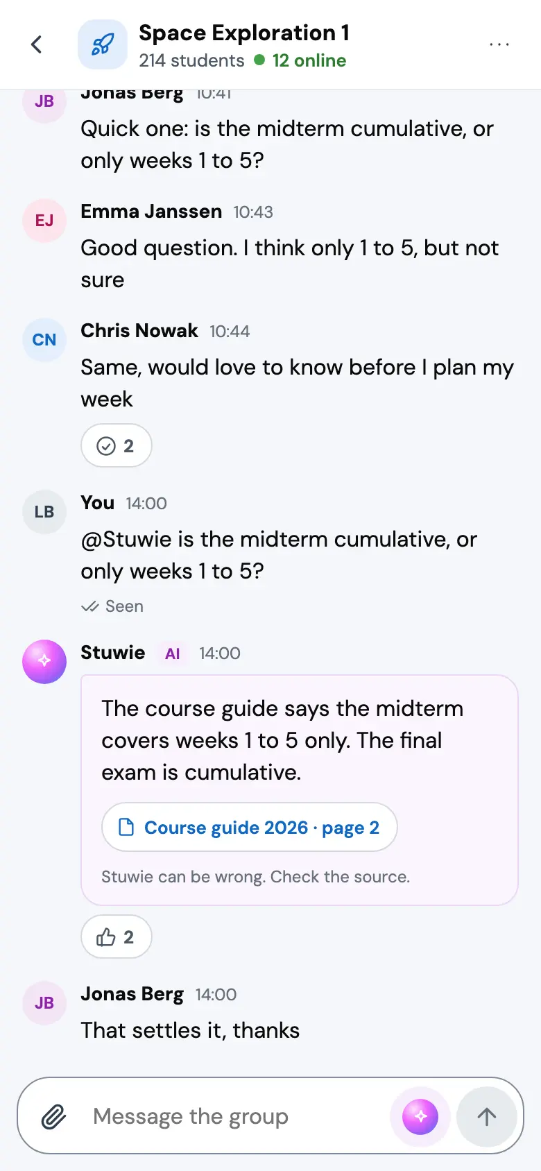
Prototype. The classmates and their messages are scripted, and so are Stuwie's answers.
More case studies
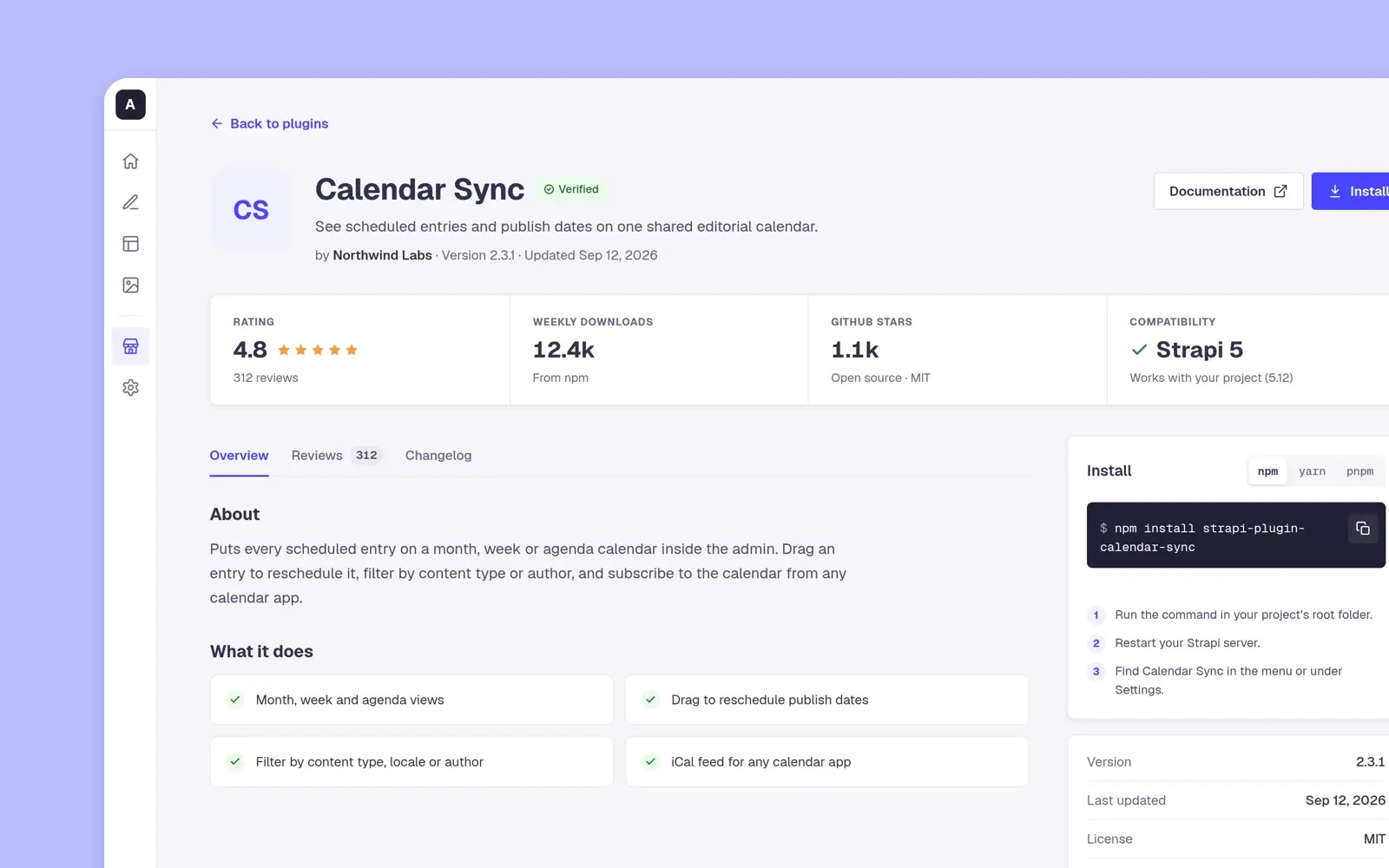
Strapi Marketplace
Strapi's design assessment, April 2022: a plugin marketplace for its admin where a developer sees who made a plugin and what others think before installing it.
case study · 2022 · read it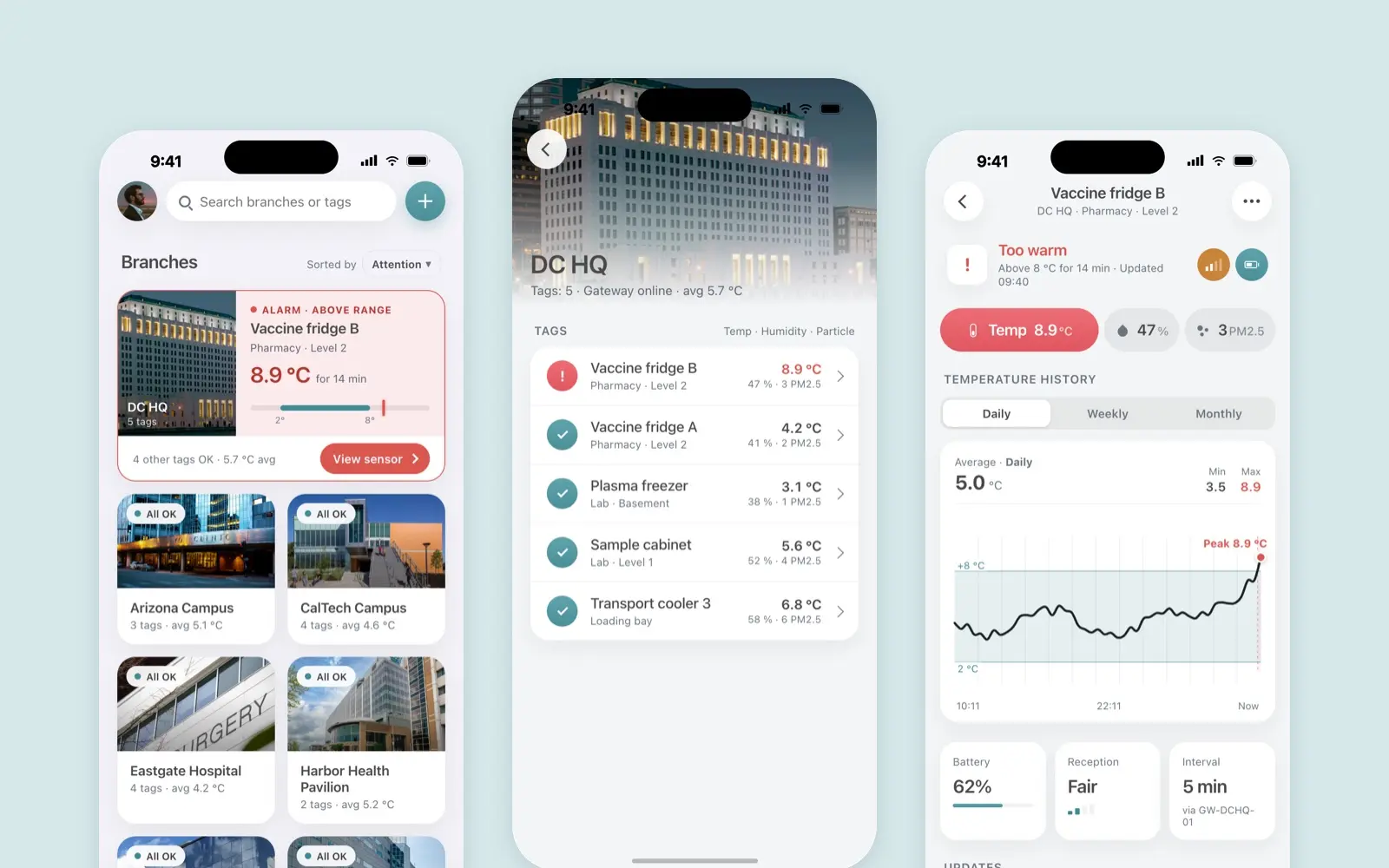
Borda Sensei
A mobile app for Borda’s temperature, humidity and particle sensors
case study · 2022 · read it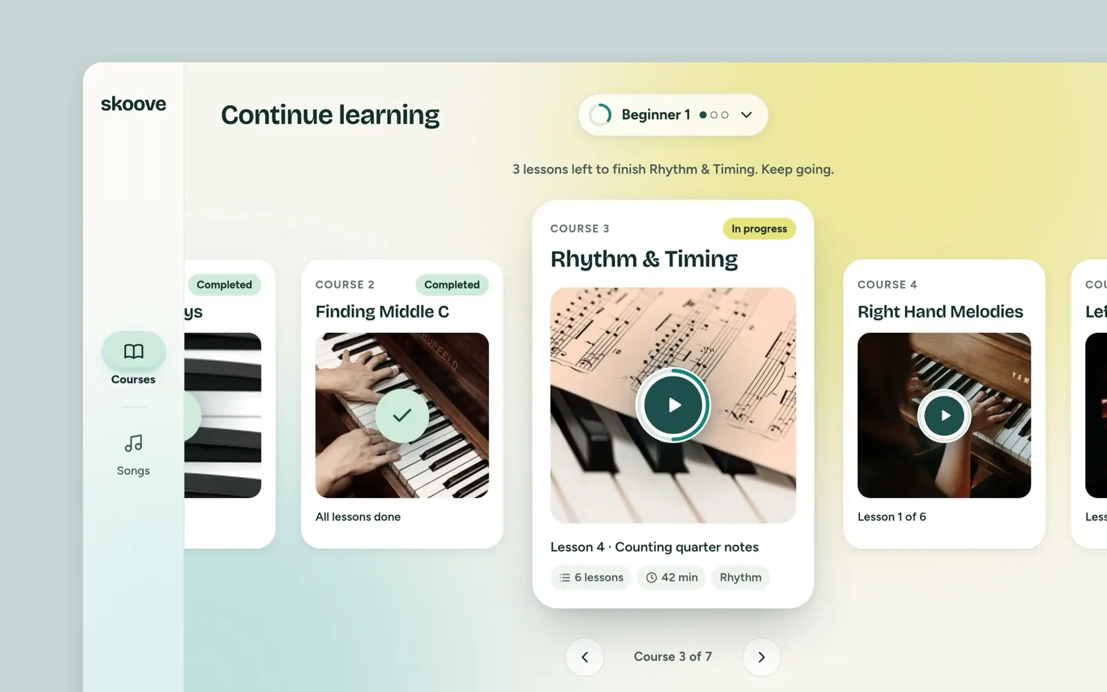
Skoove
Skoove said its iPad dashboard looked scattered. My answer, from a March 2022 task: a first page that opens on your course, Courses and Songs in a room each.
case study · 2022 · read it