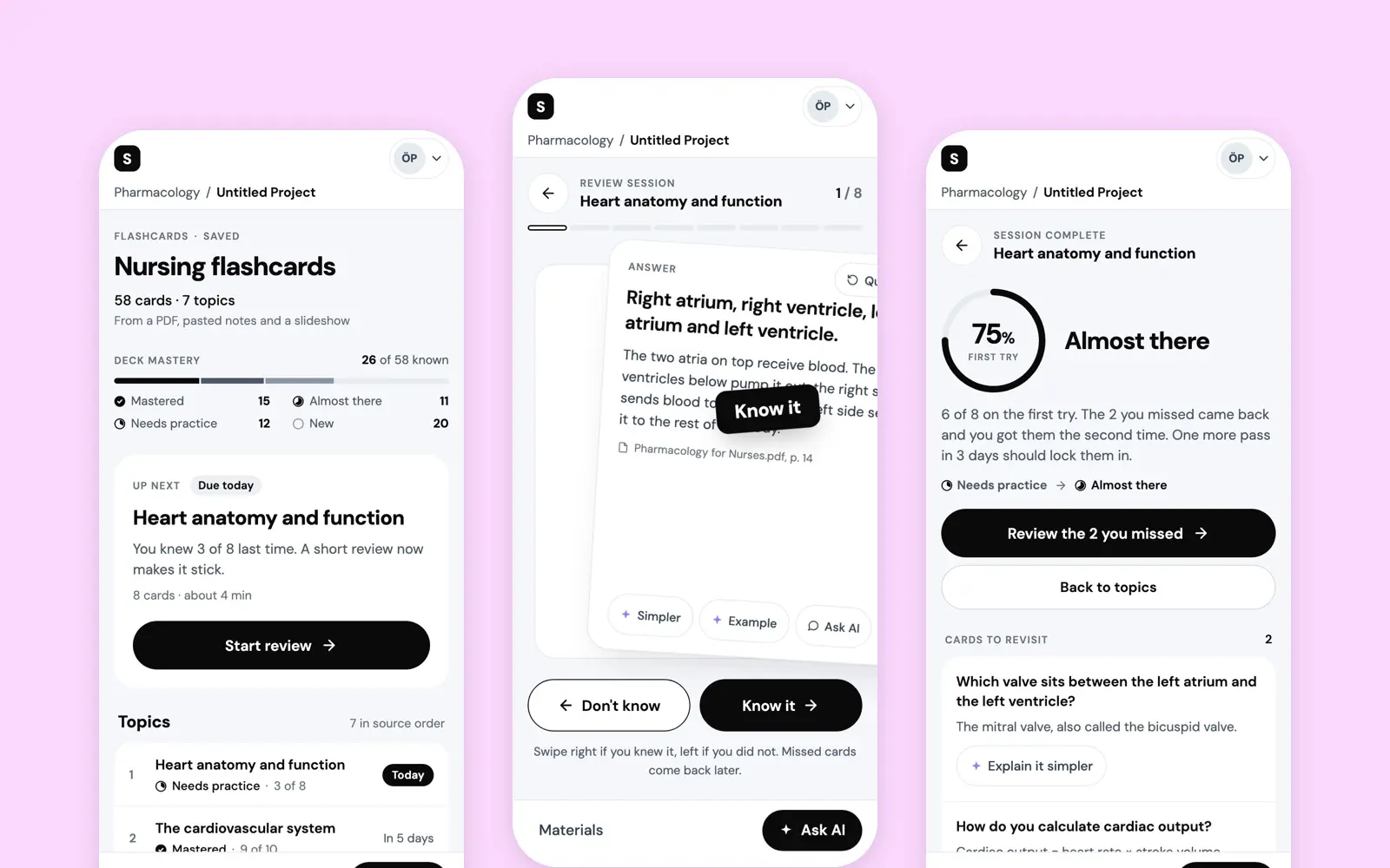
AI Flashcards
A short-term vision for the flashcards in Studocu AI: a deck made from a student's own sources, one rating per card, and a deck that says what to study next.
- Year
- 2025
- Track
- design
- Category
- case-study
Tools
- Figma
- Claude Design
Studocu AI makes flashcards from a student's own material, and they shipped. What I designed for them in 2025 was a short-term vision, not the version that went out: a deck built from the sources you already uploaded, one rating per card, and a deck that tells you what to study next. The screens here are that vision as working prototypes. I directed them, Claude built them in a Claude Design canvas, and I fixed what a render check turned up.
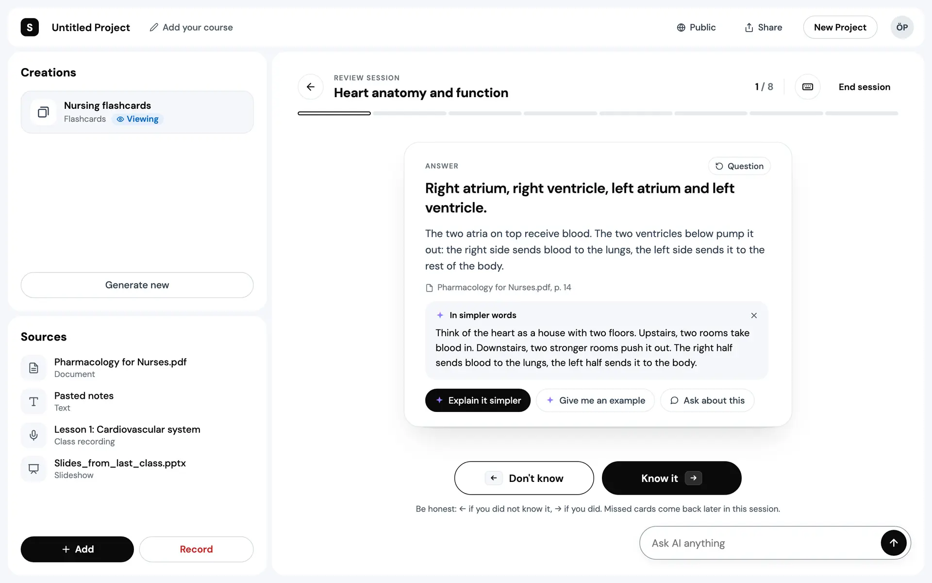
Prototype. The deck and its sources are seeded, and the AI's answers are text written in advance, streamed on a timer.
How students were studying
The research was screen-share interviews. Students at undergraduate and graduate level shared their screen and studied the way they normally do, ChatGPT included, to see how they used AI tools and where it went wrong. Each interview became a short snapshot, and the snapshots fed an opportunity solution tree. Two things came up nearly every time: can I trust this answer, and does it fit my course.
ChatGPT was already open. Students used it to get through hard concepts, check what they knew and make study material. An engineering student put it in four words: "ChatGPT is always open." They liked the speed and did not quite trust it, so many checked its answers against their notes or old exams. A maths student said it "does not provide accurate answers for math problems". They wanted to test themselves rather than read: one had ChatGPT quiz them and grade the answers. Getting output that fit the course took work, and rephrasing prompts to get the right level ate time. Equations and graphs went badly. And a few wanted to share progress with classmates, one of them in the words "trying ChatGPT in a social environment".
What the research set out to design, in its own five points:
- Accuracy that comes from context: learn from the documents a student has uploaded.
- Ways to test yourself: active recall over passive reading.
- Customising: difficulty, and how deep a subject goes.
- Better maths and visual content, step by step.
- Room to collaborate: sharing and studying together, on the roadmap.
A deck from your own sources
The first version was scoped to one thing: help students test themselves on the documents they had already uploaded. That covered reliable study aids and self-assessment, the two asks the interviews kept coming back to, and a card written from a specific document can be checked against it. The rest of the list stayed on the list.
So the deck starts from the sources, and you watch it being made. Each source is read and marked as read, the cards are written a topic at a time with a counter, and a big deck is split into topics small enough for one sitting. You can open the first topic while the rest is still being written.
Making the deck
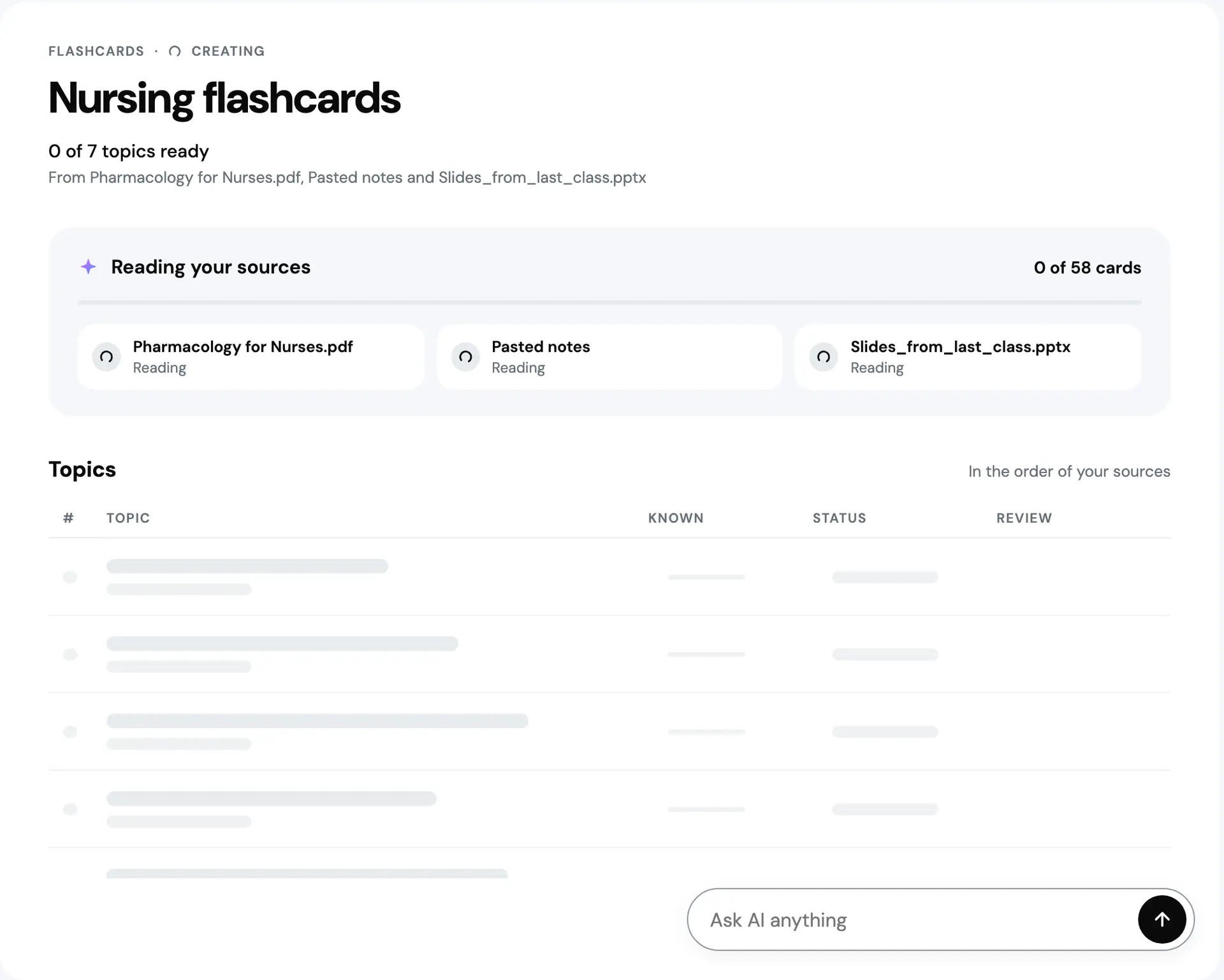
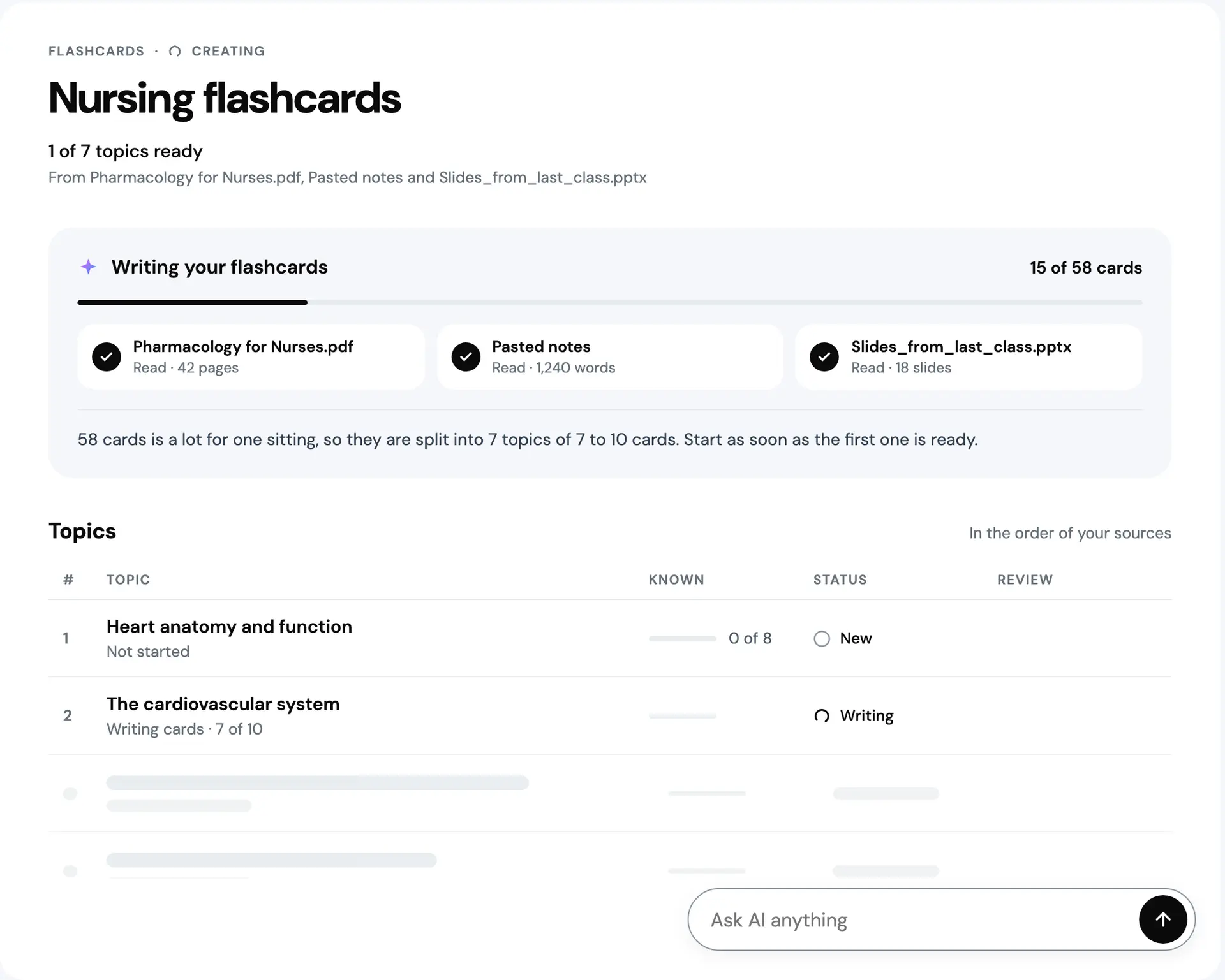
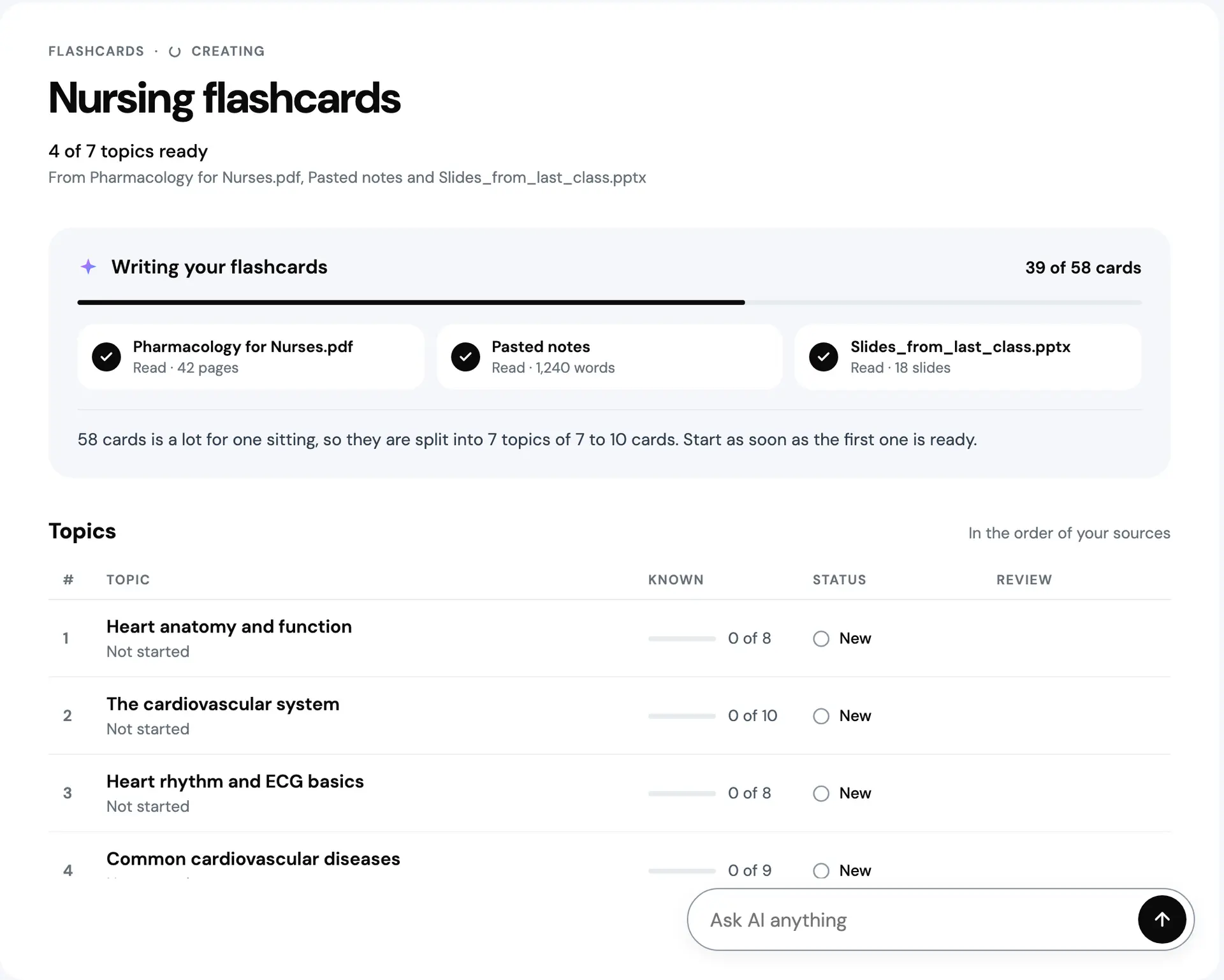
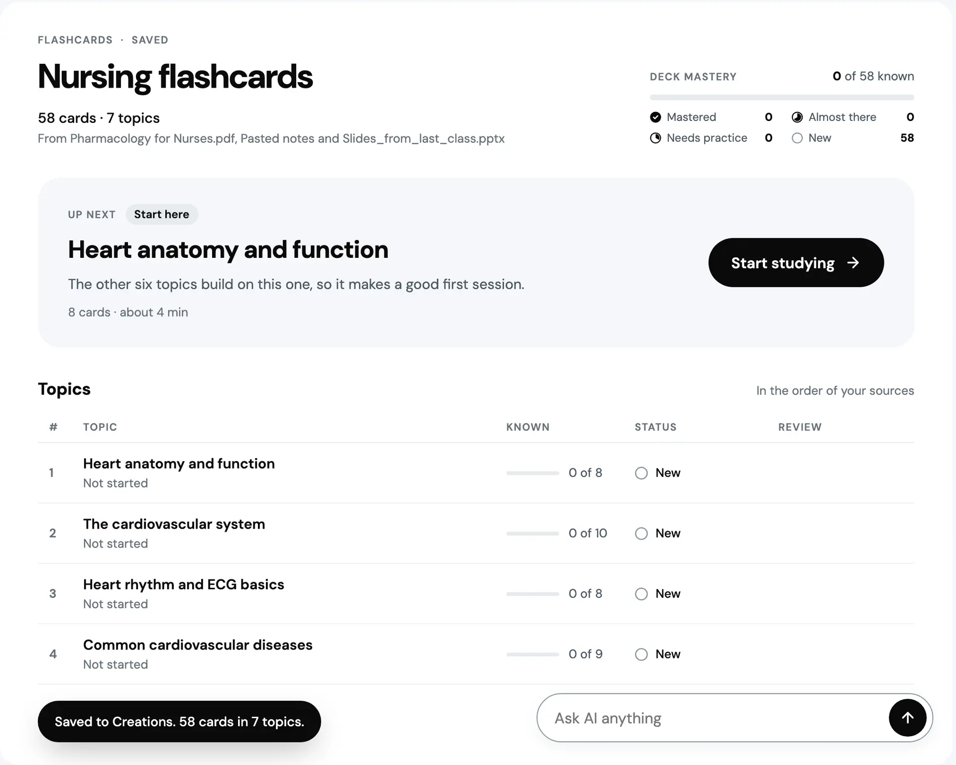
Prototype. The deck and its sources are seeded, and the AI's answers are text written in advance, streamed on a timer.
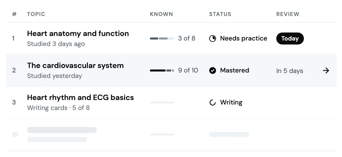
The deck opens on one recommendation and its reason, not a grid of equal tiles. Up next picks, in order: a topic due today, the least known first; on a fresh deck, its first topic; a topic due tomorrow; otherwise the first topic you have not opened. The reason is written from the data, so on a return it says how many you knew last time. Under it, the topics in a table: known cards, state, and when each comes back.
The deck
2 states
Nobody has studied the deck yet, so Up next is the first topic, because the others build on it.

On a return, the topic due today comes first, and the reason says how many you knew last time.
Prototype. The deck and its sources are seeded, and the AI's answers are text written in advance, streamed on a timer.
One card, one rating
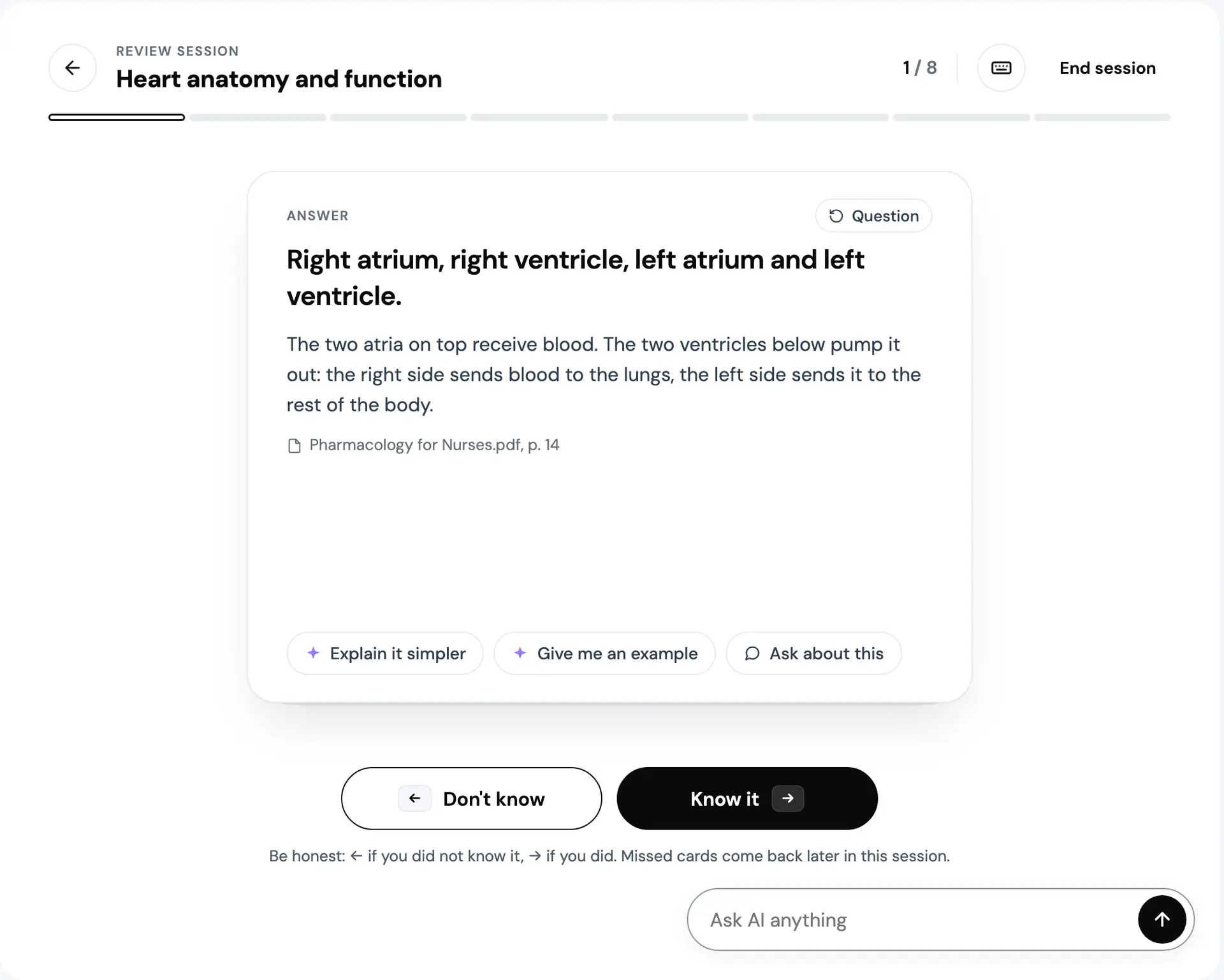
A card asks its question and nothing else. You show the answer with Space or the button, and only then can you rate it. Press a rating too early and the buttons stay muted while a line tells you to show the answer first. My reasoning is that rating before checking inflates Know it. That is a guess, and worth testing.
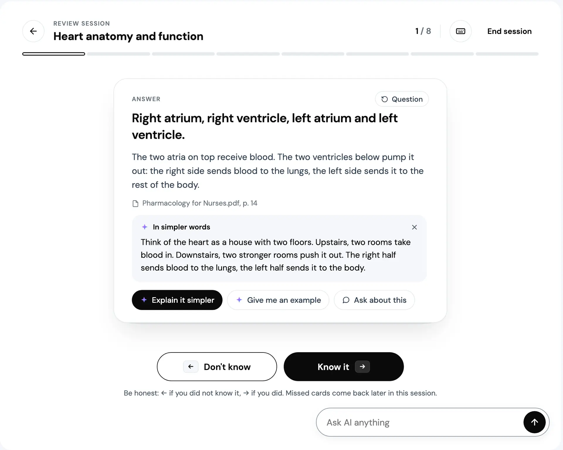
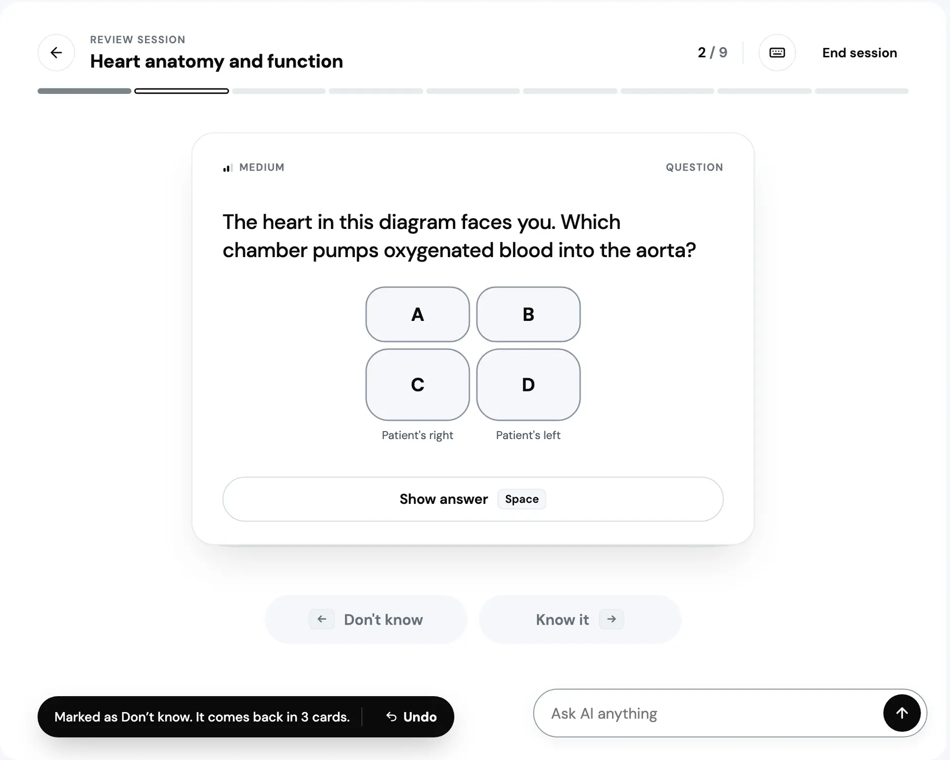
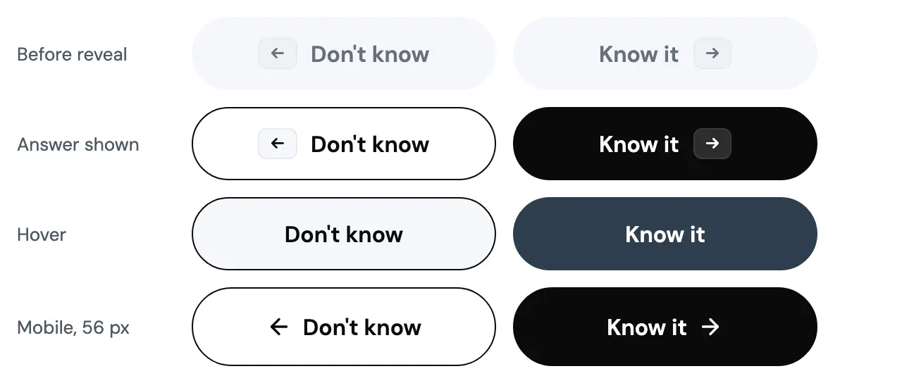
Left is Don't know and right is Know it, on the buttons, the arrow keys and a swipe, so one mental model covers all three. A Don't know puts the card back in the queue three cards later, marked Second try, and the session rail grows by one. A toast offers Undo. Every answer carries its source, the file and the page, so an AI-written card can be checked against your own material.
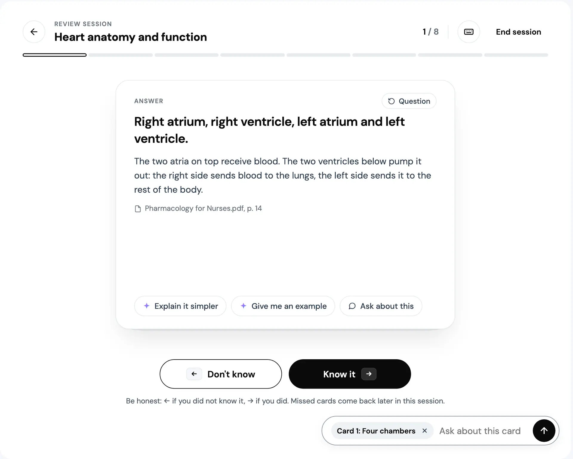
The AI help sits inside the card. Explain it simpler and Give me an example stream their text under the answer, with dots while it thinks and a caret while it writes. Ask about this hands the card to the Ask AI dock as context, so you can ask without leaving the session. In the prototype those answers are written in advance and streamed on a timer.
The keys, on the session only: Space shows the answer, left and right arrows rate, U undoes, E explains it simpler, ? opens the shortcuts and Esc closes them.
A review session
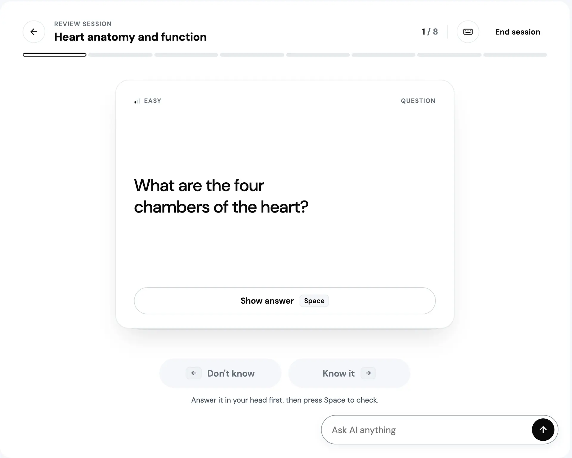
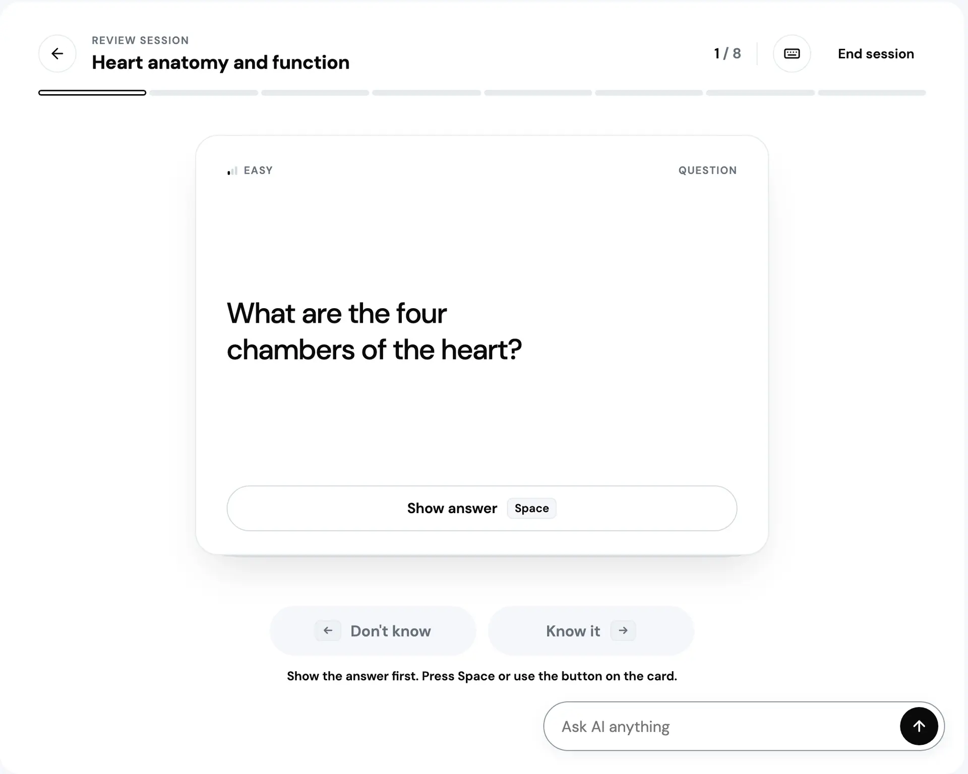
Prototype. The deck and its sources are seeded, and the AI's answers are text written in advance, streamed on a timer.
The answer can turn the card over or open beside the question. Same card, same states, and which one you get is a preference.
Showing the answer
2 states
The card turns over.

The answer opens beside the question, on a wide screen.
Prototype. The deck and its sources are seeded, and the AI's answers are text written in advance, streamed on a timer.
A card can carry a diagram. This one is a four-chamber grid lettered A to D, drawn for the concept, and it asks which chamber does what rather than whether you recognise a picture. A small answer to the research's ask for visual material.
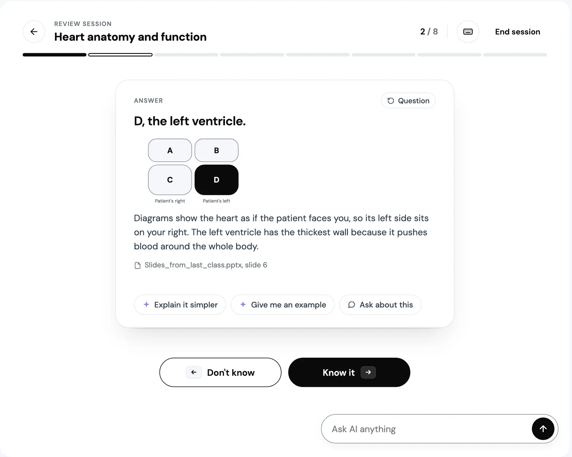
Prototype. The deck and its sources are seeded, and the AI's answers are text written in advance, streamed on a timer.
What the deck does next
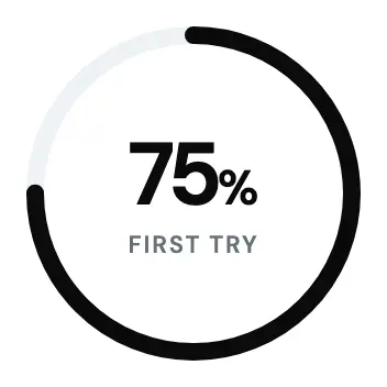
A session ends on a decision, not a score. The ring shows how many you knew first try, the state says where the topic stands, and there is one primary action: review the cards you missed, or move on to the weakest topic. The topic comes back on a date you can plan around: tomorrow if it needs practice, in three days if it is almost there, in a week if it is mastered.
After a session
3 states
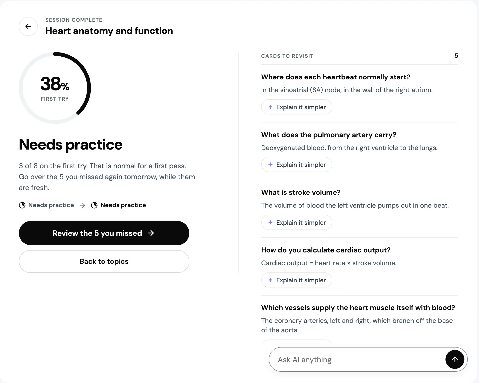
Under 60% known: the missed cards are the next step, and the topic is back tomorrow.

From 60%: one more pass, in three days.

From 85%: on to the weakest topic, and a check in a week.
Prototype. The deck and its sources are seeded, and the AI's answers are text written in advance, streamed on a timer. Each result is a scripted run through the same seeded topic, with three, five and seven of its eight cards known on the first try.
The figure draws the whole loop with the prototype's own numbers. There is no spaced repetition algorithm behind it, only these rules.
From one rating to the next session
Every value is the prototype's own rule. Prototype.
A rating
Know it or Don't know, the same by key, click or swipe.
A Don't know comes back after 3 more cards, in the same session.
The card's level
Known on the first try: a new card goes to level 2, any other card up one, to 3 at most.
Missed on the first try: level 1.
The results ring is the share known on the first try.
The topic's state
The share of its cards at level 2 or 3.
- New
- not studied yet
- Needs practice
- under 60%
- Almost there
- from 60%
- Mastered
- from 85%
When it comes back
- Needs practice
- tomorrow
- Almost there
- in 3 days
- Mastered
- in 7 days
Up next
What the deck offers first, in this order.
- Due todayTopics due today, the one with the least known first.
- Start hereOn a deck nobody has studied yet, its first topic.
- Due tomorrowTopics due tomorrow, the one with the least known first.
- Not startedOtherwise, the first topic not opened yet.
Studying it starts again at 01.
The same rating on a phone
On a phone you swipe. After the answer is shown the card follows your finger and tilts, a stamp fades in and is full at 60 pixels, and letting go past 96 pixels rates it, right for Know it and left for Don't know. Short of that it snaps back. The buttons stay for anyone who does not swipe, undo reverses a wrong one, and the first card you flip nudges left and right once to show the stamps.
On a phone
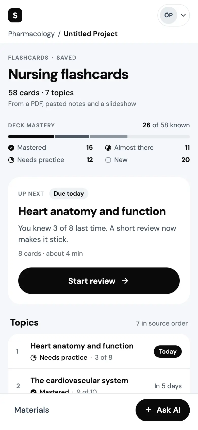
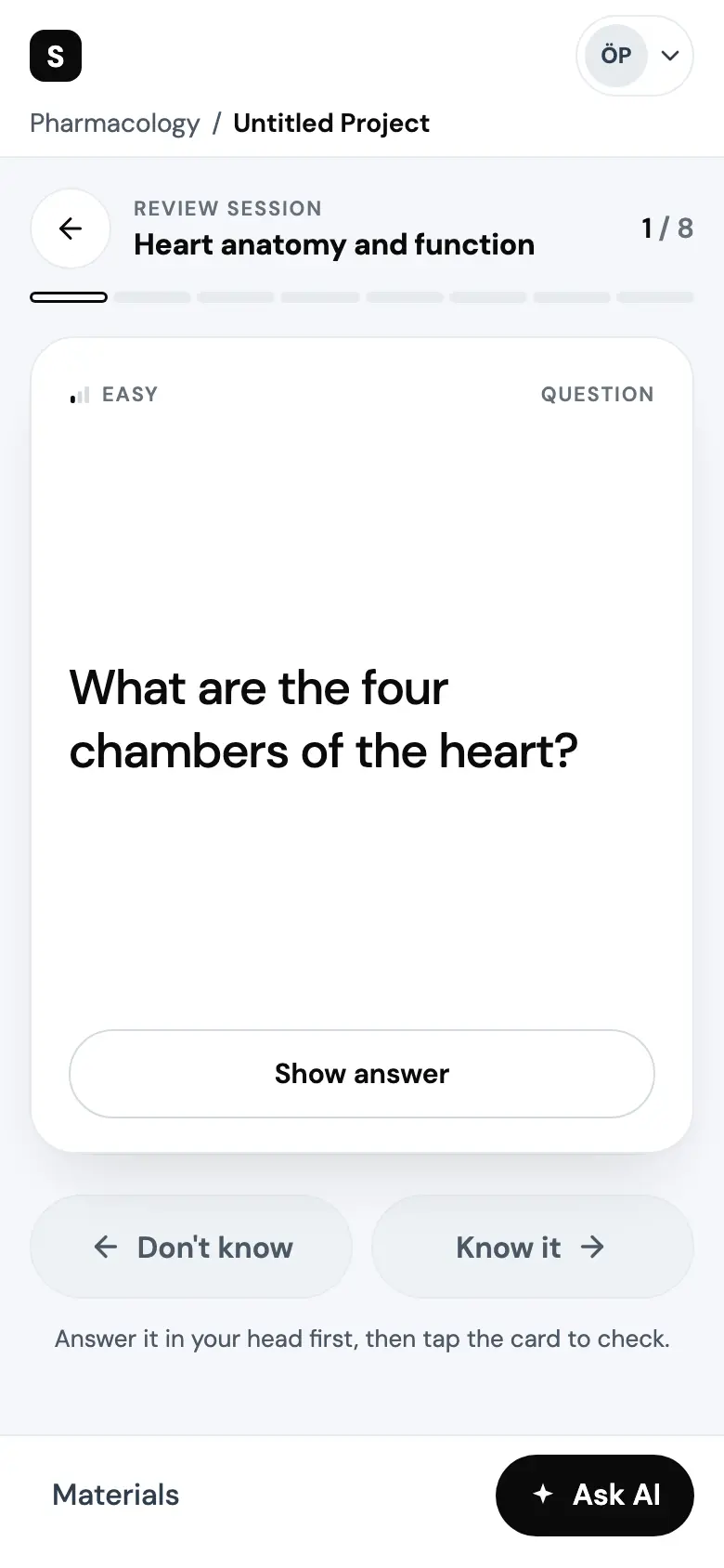
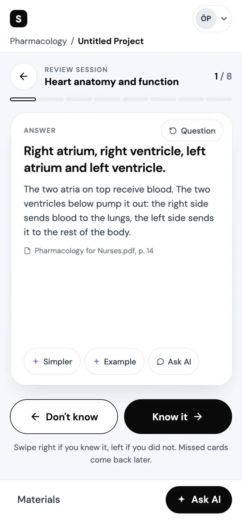
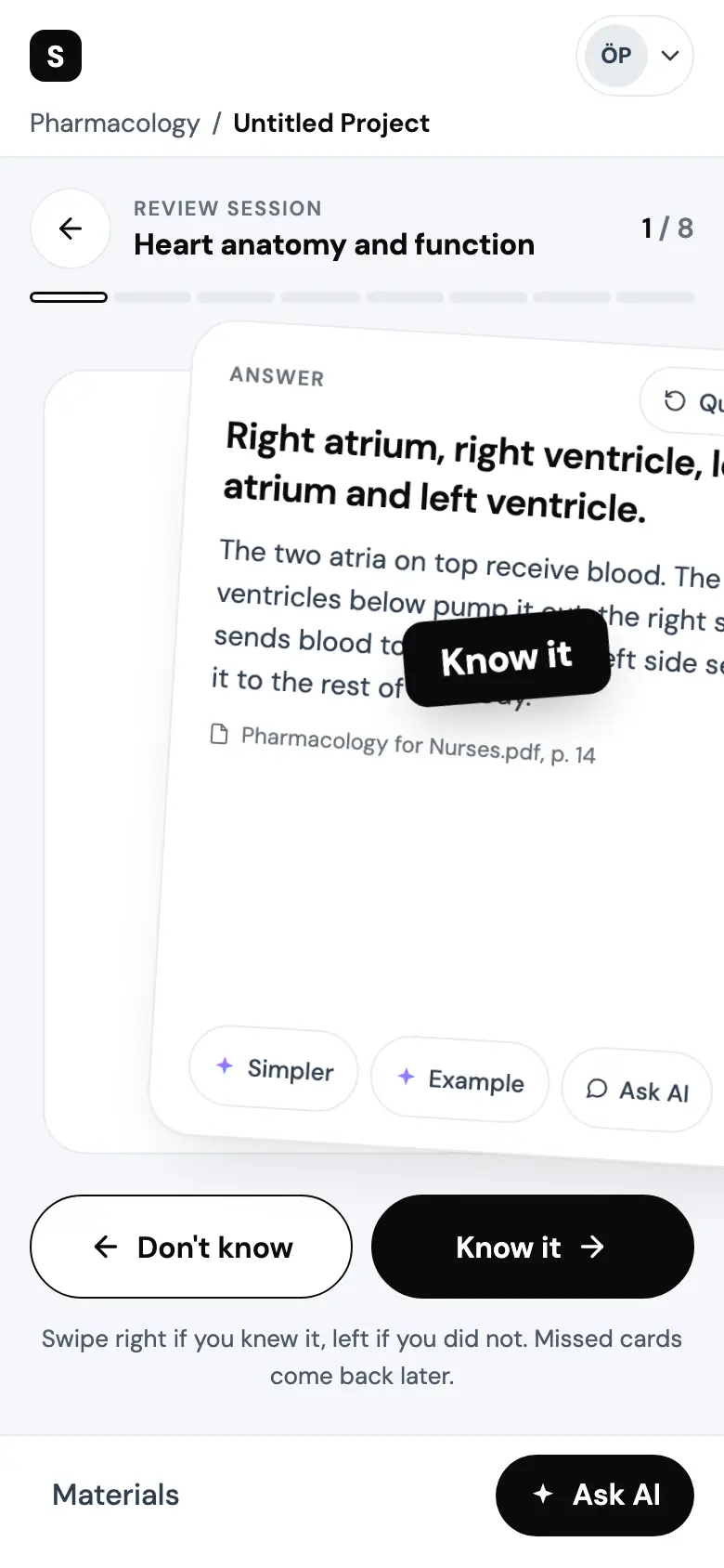
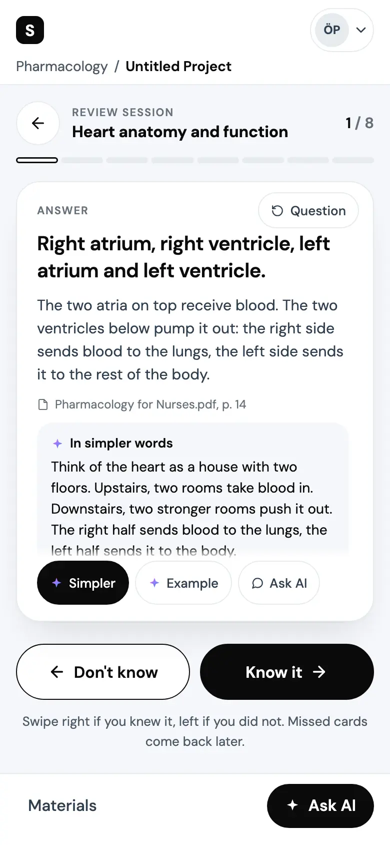
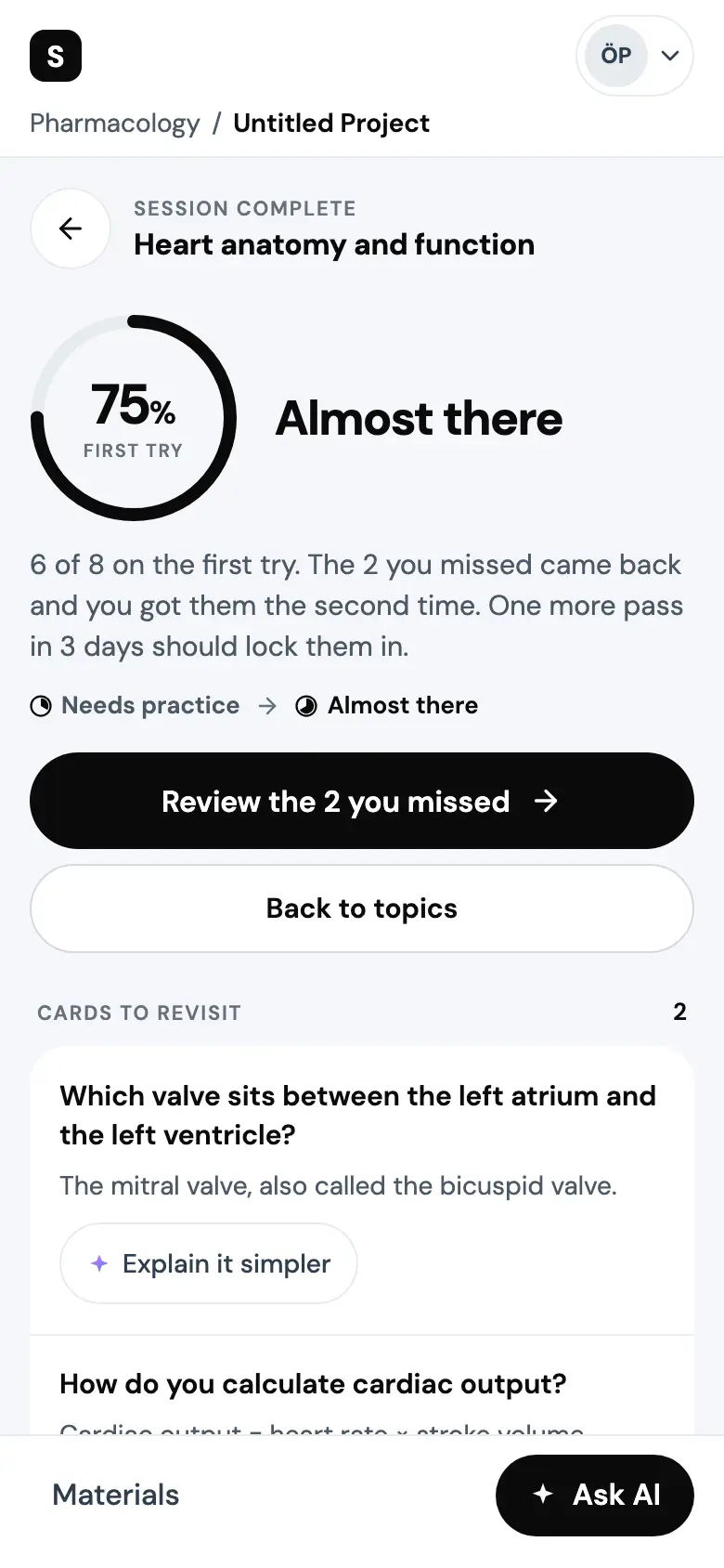
Prototype. The deck and its sources are seeded, and the AI's answers are text written in advance, streamed on a timer.
The phone runs live below. Flip a card, swipe, get to the results. Start over resets it.
Prototype. The deck and its sources are seeded, and the AI's answers are text written in advance, streamed on a timer. The concept was only designed in light, so the phone stays light in both themes.
Mastery in greys
The prototypes run on a small colour layer made for this concept on top of Studocu AI's tokens. It is monotone: ink, greys and white carry everything, mastery included. Blue is left for the focus ring and the AI gradient lives only in the sparkle. I wanted nothing on a study screen to need decoding, and I did not want red used to grade a student.
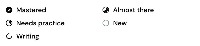
So every signal is fill, weight or position. Know it is filled ink, Don't know is white with an ink outline. Mastery is a ramp of greys and an ink ring that fills up, so the level never depends on hue. The session rail is steps of lightness. Due today is a filled pill, later dates are plain text.
A few of the values I started from failed WCAG AA when measured, so the meta grey went darker, primary buttons went to ink, and links and the focus ring took a darker blue. The ratios below are worked out from the hex, not typed in. Two marks pass 3:1 narrowly and ship as measured: the Needs practice step, and the missed tick on its track.
- text.ink#0A0A0ATitles, the primary button, the Know it fill.19.80:1 on surface.page, AA18.49:1 on surface.workspace, AA17.46:1 on surface.tint, AA
- text.strong#2F3E4ELabels and icons.10.94:1 on surface.page, AA10.22:1 on surface.workspace, AA
- text.body#4C5966Explanations, reasons, later review dates.7.17:1 on surface.page, AA6.70:1 on surface.workspace, AA
- text.meta#66707ACounts, dates, overlines, placeholders.5.04:1 on surface.page, AA4.71:1 on surface.workspace, AA
- text.inverse#FFFFFFWords on ink: Know it, the toast, the Today pill.19.80:1 on on-ink.surface, AA13.97:1 on on-ink.chip, AA
- on-ink.surface#0A0A0AThe toast, Know it, the Today pill.
- on-ink.chip#2C2C2CThe key cap on Know it.
- surface.page#FFFFFFCards and panels.
- surface.workspace#F6F7FBThe workspace, the AI answer block, a rating before the answer shows.
- surface.tint#EEF1F4The context chip, row dividers, loading blocks.
- line.divider#E6EBEFHairlines, and the empty track.
- line.border#D3D9E0A secondary button's edge, where the label names the control.
- line.input#8A96A3An input's outline and the empty glyph's ring.3.01:1 on surface.page, AA for a mark
- mastery.new#E6EBEFNot studied yet, the track.
- mastery.needs-practice#8A96A3Needs practice.3.01:1 on surface.page, AA for a mark
- mastery.almost-there#4C5966Almost there.7.17:1 on surface.page, AA for a mark
- mastery.mastered#0A0A0AMastered.19.80:1 on surface.page, AA for a mark
- signal.rail-missed#7A838CA missed card's tick on the session rail.3.85:1 on surface.page, AA for a mark3.21:1 on line.divider, AA for a mark5.14:1 on text.ink, AA for a mark
- focus#1168C3The focus ring, the only blue.5.54:1 on surface.page, AA for a mark5.17:1 on surface.workspace, AA for a mark
- New#E6EBEF
- Needs practice#8A96A32.51:1 from New
- Almost there#4C59662.38:1 from Needs practice
- Mastered#0A0A0A2.76:1 from Almost there
The concept's own colour layer, built on Studocu AI's tokens. Every ratio is worked out from the hex. Prototype.
The components on the prototype's white: the rating pair, the mastery marks, topic rows, the swipe stamps and the result ring.

Prototype.
What is still open
This is a vision as a prototype. The deck and its cards are seed data, the AI's answers are written in advance, and the results were reached by script. None of these screens is the shipped product. There is no spaced repetition behind the loop, and rating after checking is a guess nobody has tested.
The research asked for more than this takes up: customising, studying together, and maths beyond a diagram card.
Accessibility is computed, not tried. Nothing was tested with a screen reader or with students who use one, the artboards are fixed at 1440 and 390 pixels so zoom and reflow were not tested, and the concept is light only. Whether streamed text is harder to take in than text that appears at once is untested too. A show full answer option would be the first thing to try.
More case studies
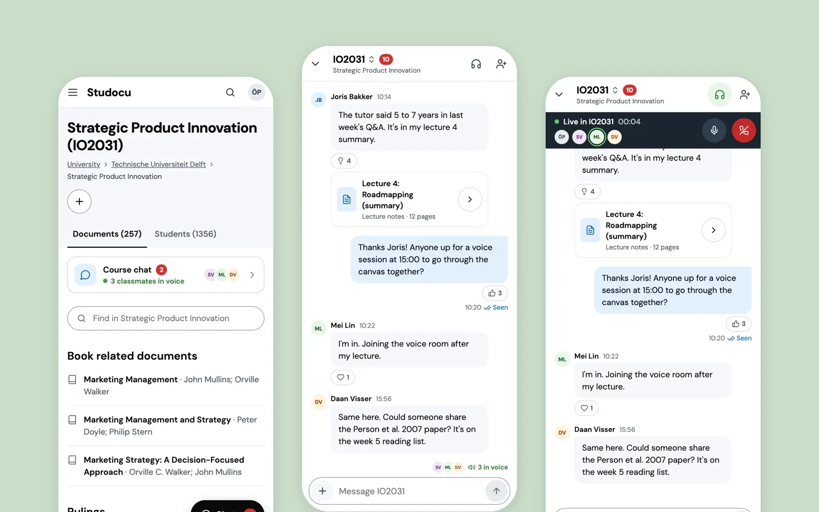
Course Chat
The take-home that got me hired at Studocu in 2022: a live chat with voice rooms on the course page, chosen after asking students what they already do.
case study · 2022 · read it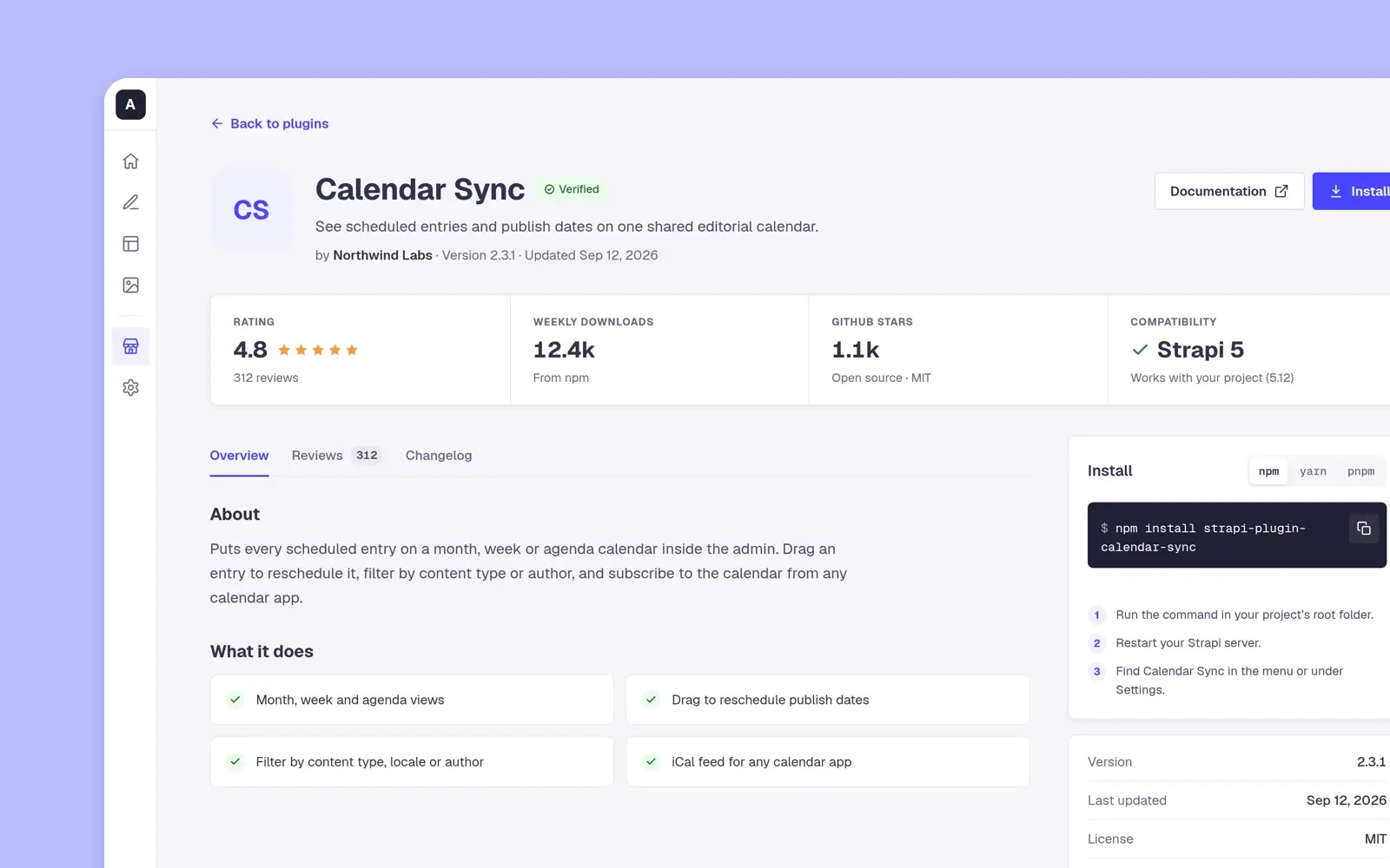
Strapi Marketplace
Strapi's design assessment, April 2022: a plugin marketplace for its admin where a developer sees who made a plugin and what others think before installing it.
case study · 2022 · read it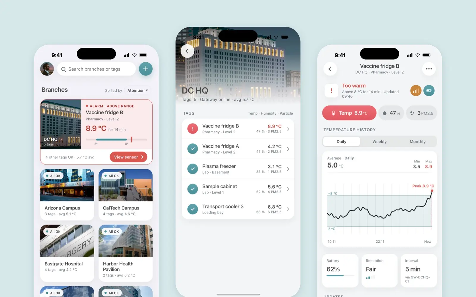
Borda Sensei
A mobile app for Borda’s temperature, humidity and particle sensors
case study · 2022 · read it