Study Guide
Share your syllabi and it builds the day by day plan. Then it asks the one thing a syllabus cannot tell it: pass, succeed, or excel.
- Year
- 2025
- Track
- built
- Category
- prototype
Tools
- Next.js
- Tailwind CSS
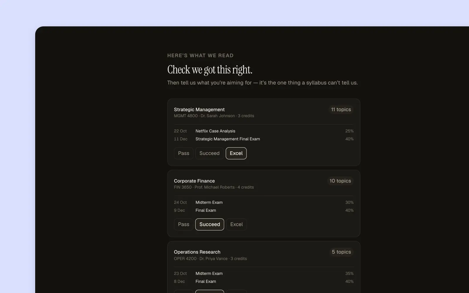
You hand it your syllabi and that is the entire setup. It reads them, finds every deadline and what each one is worth, works out what you need to do on each day, and hands you the first session.
Then it asks the only question the documents cannot answer. Pass, succeed, or excel. A syllabus knows when the exam is and how much it counts. It does not know how much you want, and the same five courses produce a completely different plan depending on the answer.
After that the job is showing up. The day says how many things are left and how long they take, and it does not make you choose which one to start, though you can. Sessions go full screen and the design gets out of the way.
The sharpest screen is the one that grades you. You close the book, write what you remember, and then it shows you the points you were meant to make and asks which ones you actually made. It tells you to be strict, and says why: the score decides when this comes back, so flattering yourself now costs you later.
Drawn without the design system on purpose, so the idea could be judged on its own rather than on how well it matched the product it would live in.
Screens
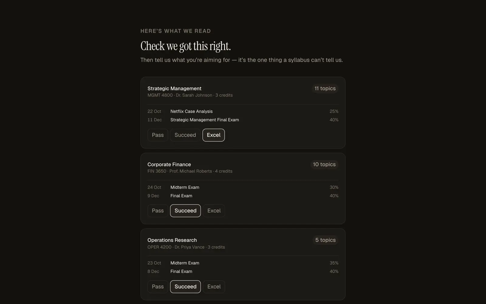
The only question the documents cannot answer, asked once per course. 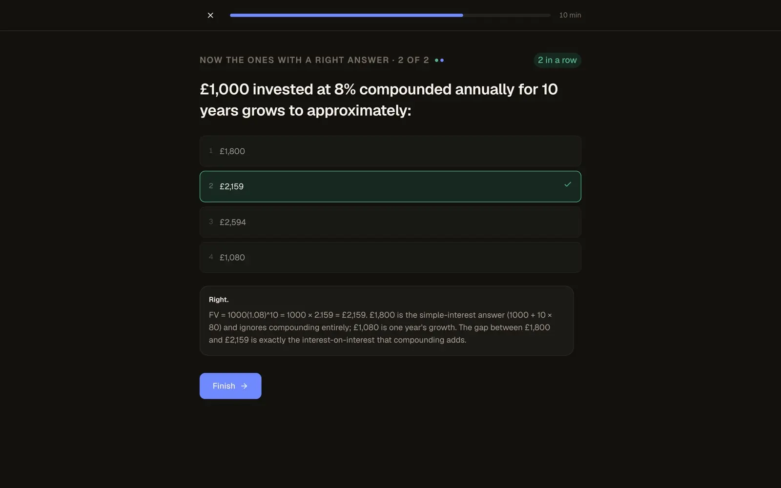
Sessions go full screen, and the explanation says why the other options are wrong. 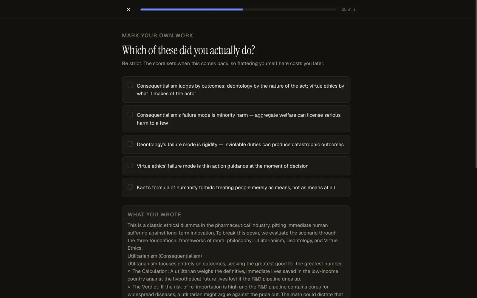
The sharpest screen, and it says out loud why it is worth being honest with.
More prototypes
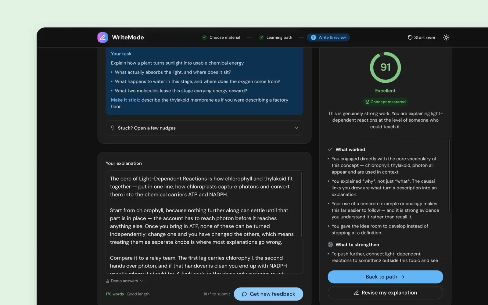
WriteMode
Hackathon winner. Working AI that reads your answer to an open question, tells you what is missing, and hands it back to try again.
prototype · 2024 · read it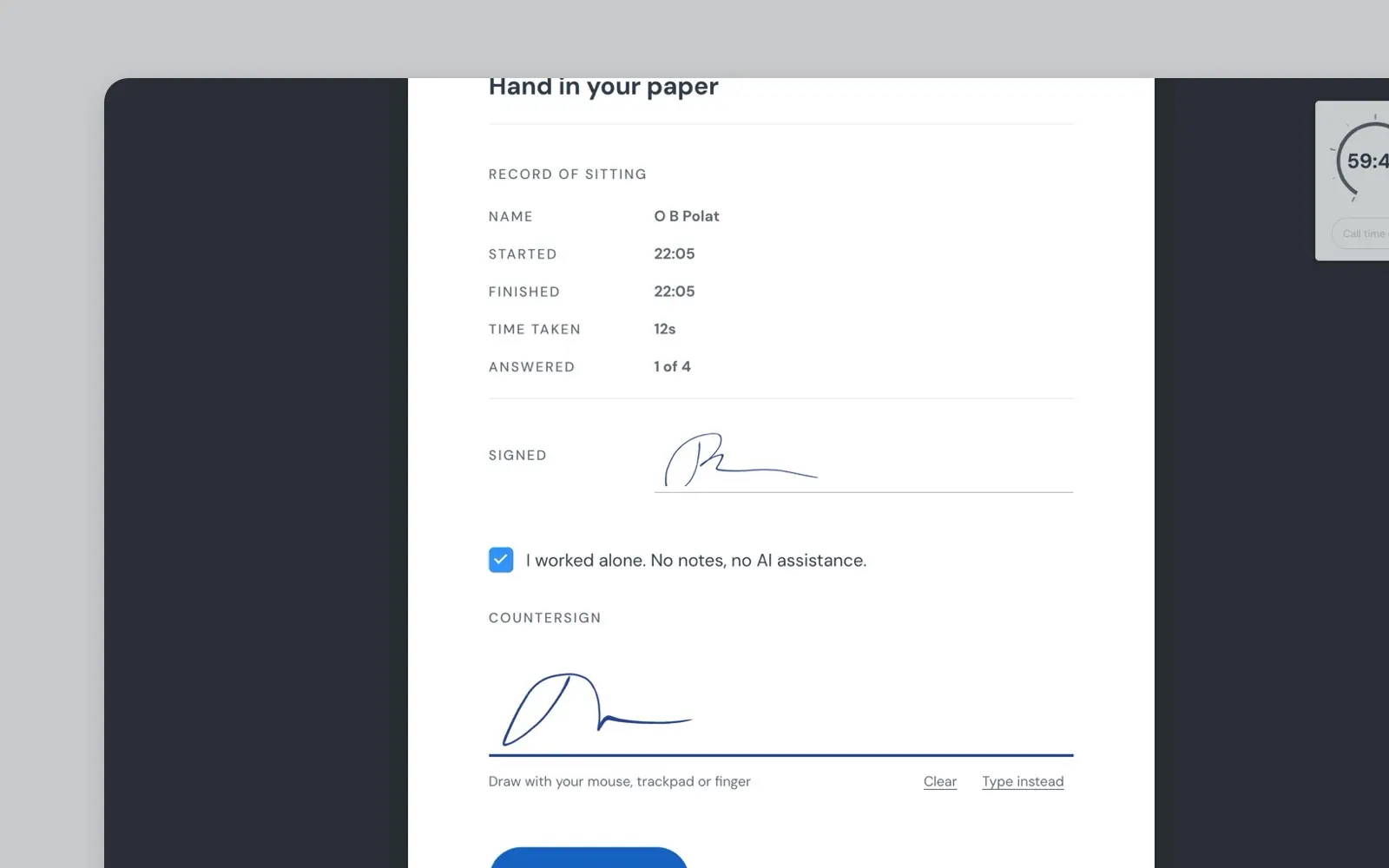
Exam Ritual
A cover page that turns a mock exam into a sitting: sign your name, set the clock, hand in the paper. Shipped to production and A/B tested.
prototype · 2025 · read it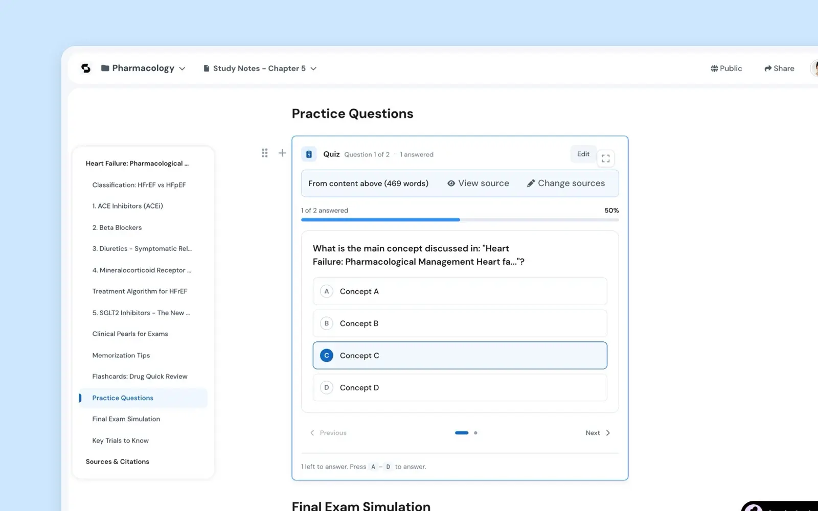
Inline Blocks
Students already build one master document. This puts the study tools inside it: a quiz, a timer, a transcript recorder, inserted as blocks.
prototype · 2025 · read it