Solo
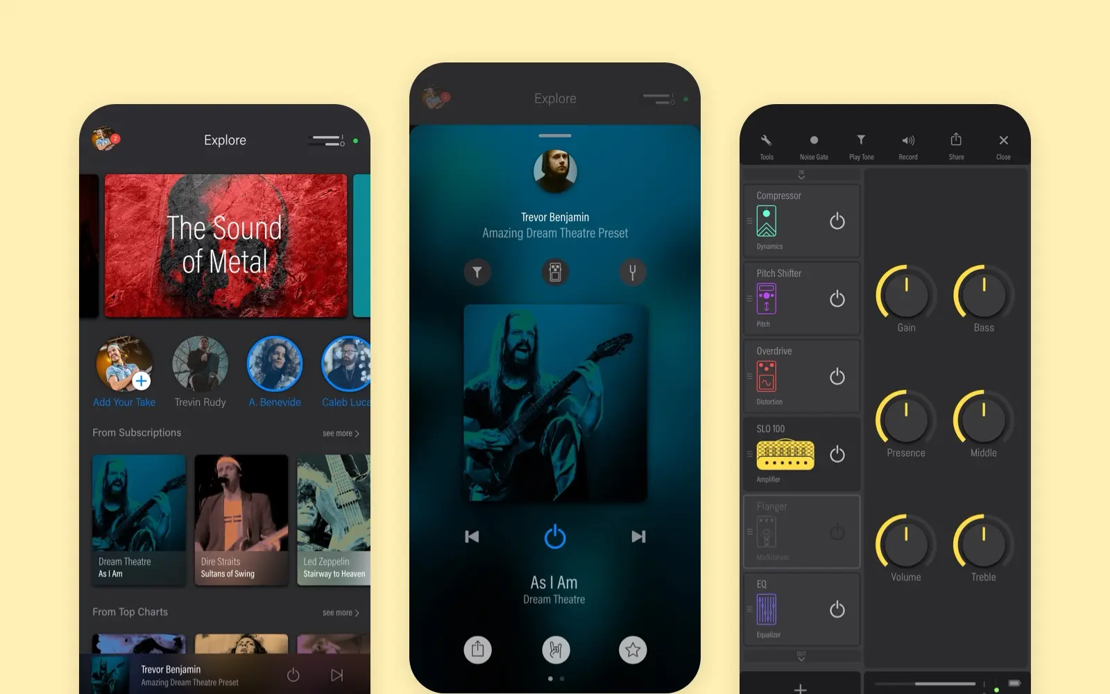
A social app for guitar tones, shipped on iOS and Android. Every pedal and amp is drawn, and the studio knob is rebuilt live on this page.
- Year
- 2019
- Track
- design
- Category
- case-study
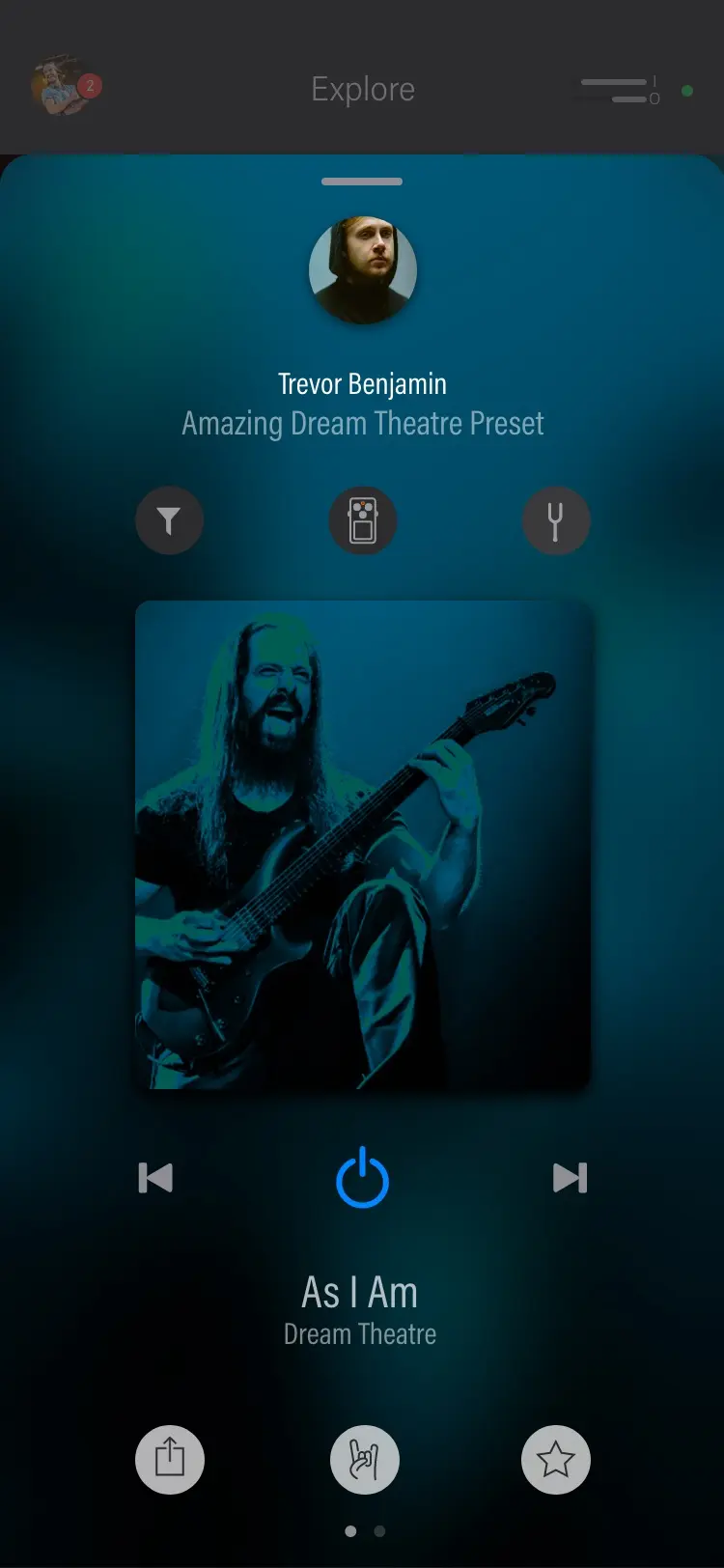
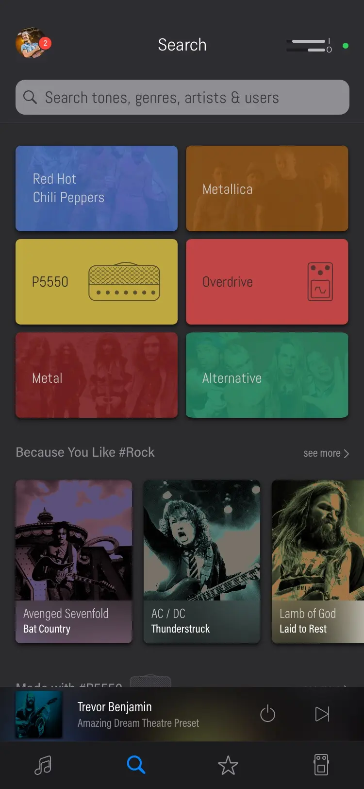
Solo was a social app for guitar tones other people made. I led its design at Deplike in 2019, from a proof of concept done in less than a week to the version that shipped on the App Store and Google Play. A player browses tones, hears one before plugging a guitar in, opens it to see the chain of processors it is made of, takes it into a studio and publishes their own. Two versions were built. The first went to players as a beta and never reached the stores. The second is the one that shipped, and it opens this page.
As it shipped
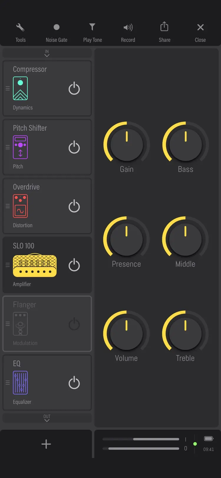
Tones other people made
Deplike already made software that put amps and pedals inside a phone, so a player did not have to spend money on the hardware or carry it around. Solo asked the next question. If the settings are the thing worth having, what happens when you can browse them, hear them, and publish your own? The bet was on guitarists socialising, and on ready-made tones being within reach.
The proof of concept came first: ten screens, done in less than a week, to set a vision for the product and try a brand new UI before anything was built.
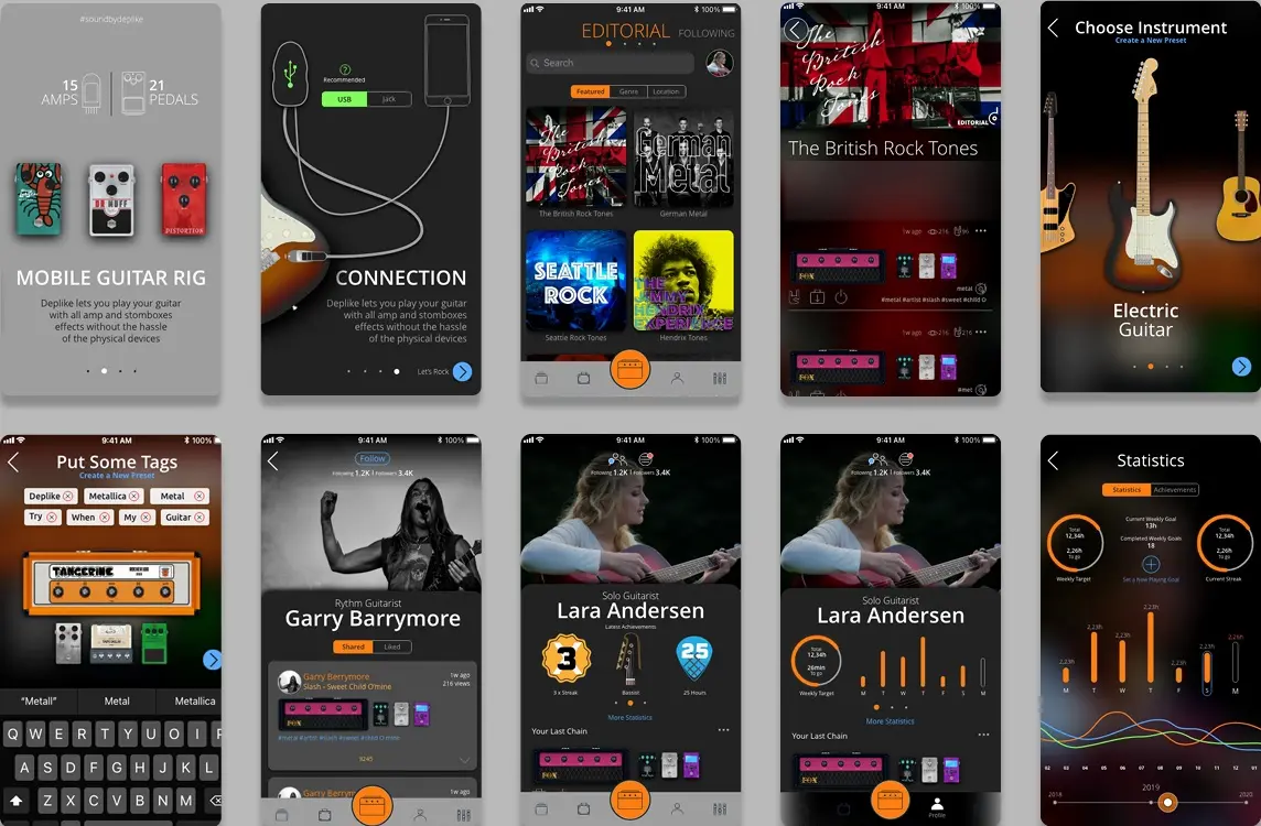
Ten screens in less than a week, to set a vision and try the new UI. The 15 amps and 21 pedals are the proof of concept's own count.
The personas came from segmentation studies that already existed rather than from anything invented for this. Two are beginners who want to try tones as quickly as they can. The third is an advanced player with a home studio full of hardware, the kind of player the content was expected to come from.
Matthew
44 · Advanced creator
- Goal
- Create presets
- Guitar
- Fender Vintage Telecaster, Rickenbacker 4001 bass
- Phone
- High end iPhone
- Genre
- Hard rock, progressive rock
He has many pedals and amps at his home studio, and still wants to experiment with digital effects.
Greg
21 · Beginner consumer
- Goal
- Discover presets and follow
- Guitar
- Ibanez GRG120BDX
- Phone
- Mid-range Android phone
- Genre
- Progressive metal, death metal
He wants to hear what's going on first, before he connects his guitar.
Justin
16 · Beginner consumer
- Goal
- Try presets
- Guitar
- Epiphone Les Paul Standard
- Phone
- Older iPhone
- Genre
- Post grunge, pop rock
He convinced his parents to buy an iRig, thinking it an easier way to learn than expensive pedals and amps.
The information architecture started from the basic relationships and was worked through to the release candidate, and it was never followed strictly. It was useful for deciding what belonged next to what.
Onboarding
What's what How to connect Starter's pack Login
User identification Genre Instrument Level Favourite artists
A beginner starts on the top charts for their genre, an advanced player in the studio.
Home
Your last chain Your feed Last liked preset Notifications and activity Top charts Editorial Search
Suggestions Location based Genre based
Preset
Preset details User profile
Preset actions Activate Virtual guitarist Like Comment Add to library Follow user Message user Share on other social media
Every feed, the search and every profile lead here.
Studio
Performance Backstage Perform and create How to connect
Saving preset Share Save
Library Shared presets Private presets Collected presets Playlists
Recordings Live mode
Auxiliary functions Metronome Backing track Tuner Guitar tabs I/O settings Virtual guitarist Clear all processors
Profile
Social functions Followers Following Direct messaging Other media Shared presets
Usage statistics Badges Streak
Settings Account About
A tone you can read
The first studio put the face of a real amp on the screen, with a row of photoreal pedals for the chain. It was thrown out. A monochrome revision took most of the colour away so the screens would cohere, and for the first time line art stood in for the hardware. That version was tested with players. Then the line art was pushed further: a colour for each kind of processor, a symbol for each kind, and a drawing of each processor, so that every one reads as its own thing on a phone. Once that held, the long search for the studio itself began.
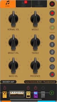
The first studio, the face of a real amp, with photoreal pedals for the chain.
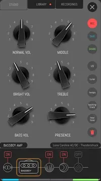
The monochrome revision: less colour so the screens cohere, and line art in place of the photoreal hardware, tested with players.
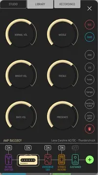
A colour and a symbol for each kind of processor, and the search for the studio's knobs begun.
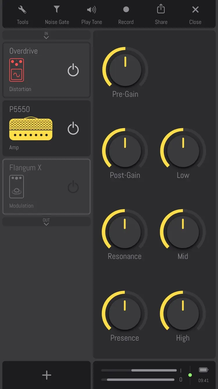
The first version. Tested by players in beta: the four areas, the chain as cards down the left.
The version that shipped. The same studio, with a handle on every card.
The colours were used the same way everywhere: on a tone, in the studio, and in backstage, where every processor lives until it is added to a chain. Every processor was drawn in a plain style that still had to be recognised at a glance. Twenty pedals and fifteen amps shipped, all free to use, each drawn twice: as drawn, and selected.
- Dynamics
- Compressor
- Sustainer
- Pitch
- Octave Shifter
- Pitch Shifter
- Distortion
- OD 808
- Dr. Muff
- Overdrive
- Metal Head
- Full Blast
- Amplifiers
- SVT Bass
- P5550
- JCM 800
- Stock Amp
- Recto
- Fox AC30
- JTM 45
- Bassboy
- Acoustic
- SLO 100
- Tangerine
- Crafter
- DST
- ANRG
- Wapi
- Modulation
- Flangum X
- Phase Shifter
- Chorus
- Auto Wah
- Dizzy Lobster
- Delay
- Delay
- Tape Delay
- Reverb
- Reverb
- Stereo Reverb
- EQ
- EQ
- Looper
- Looper





















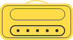



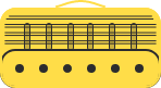



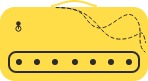


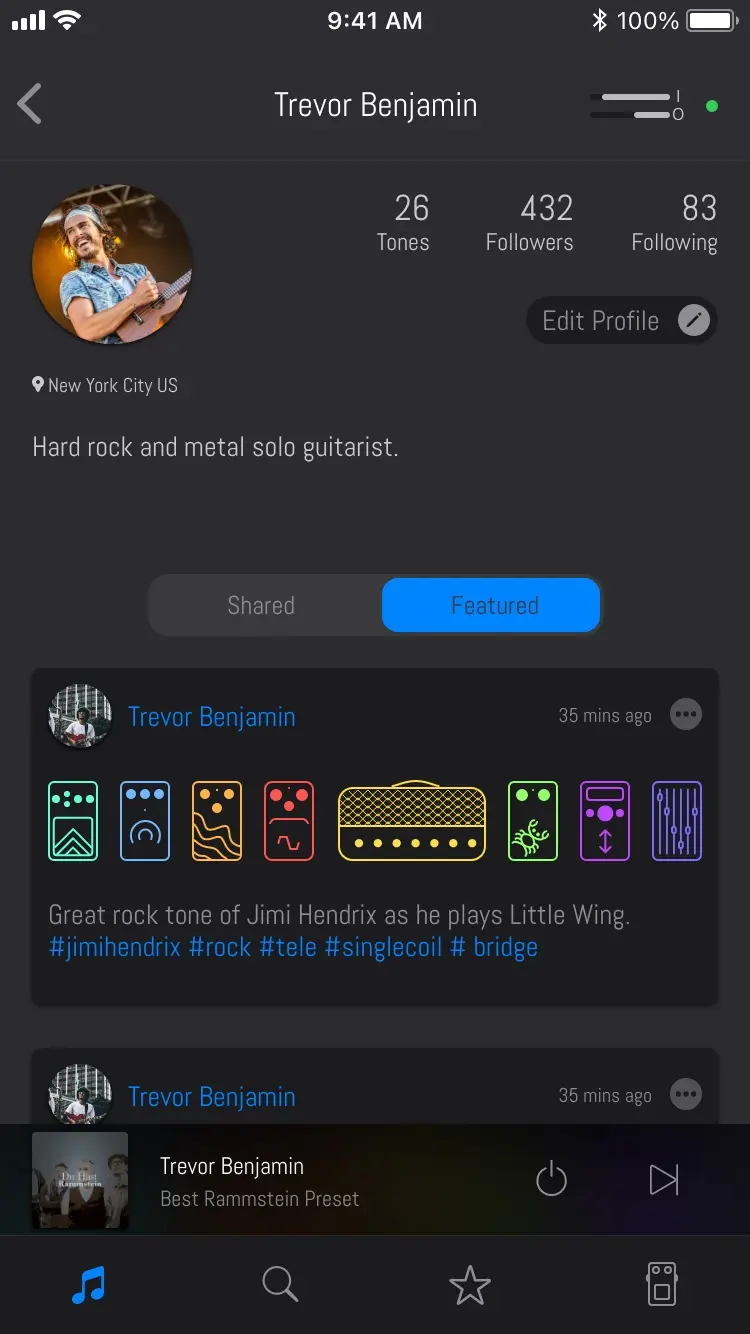
That is what makes a tone readable. On a profile, every tone a player shared shows as its chain.
A studio under your finger
The studio settled into four areas. A top bar for tools, the chain of processors down the left, the parameters of whatever is selected on the right, and input and output levels along the bottom. Processors are dragged to reorder them and dragged out of the chain to remove them. The diagram below went to the developers early, with what every area does and how a processor is held and dragged, down to the press time and the haptic tap when a drag starts.
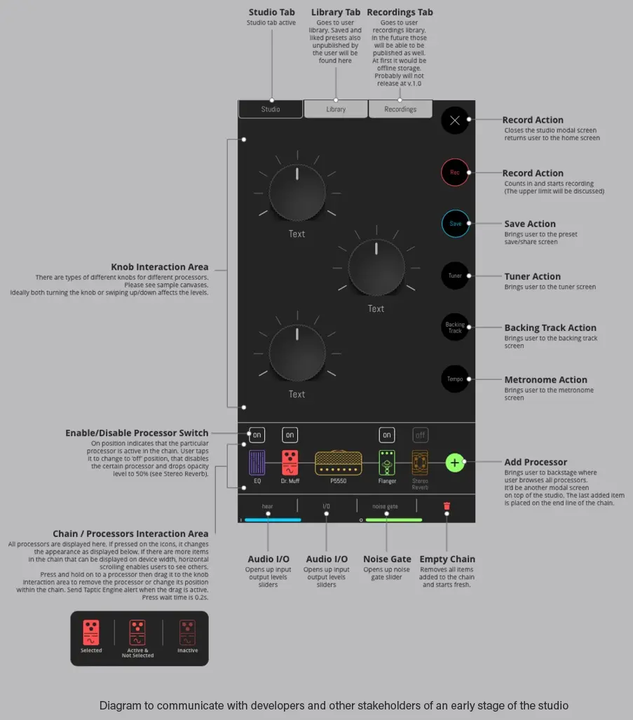
The studio as drawn for the developers early on: what every area does, and how a processor is held and dragged.
Many knobs were tried over the whole development, each after the knobs on the pedals and amps that guitarists already know and love.
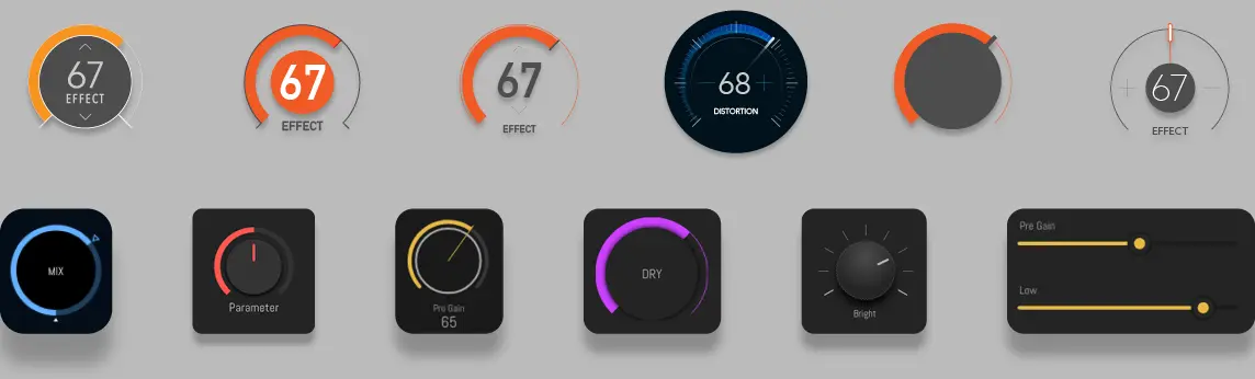
Knob studies from across the whole development, each after the knobs on the pedals and amps guitarists know.
The knob is the detail I would still defend. You can slide up and down or left and right, and while you drag, the left column fades and shows the level of the parameter you are changing, because your finger is covering the control. It is rebuilt below from the first version's three knob screens, with every label and scale as they were printed. Choose a processor and turn a knob.
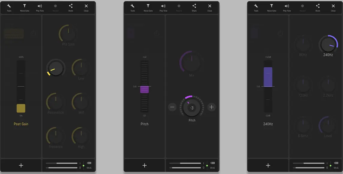
The rest of the studio's moves, as the 2019 prototype of the first version recorded them: a processor lifted out of the chain, the chain cleared to begin from scratch, the knob, and the looper.
What home should show
One of the first things to settle was what to deliver on the home screen, and from whom. A hybrid feed was tried first, mixing the top charts, the player's own tones and tones from other players, with a recommendation engine if one could be had. Then a finding changed the question: many guitarists stay with certain tones for a very long time. So a limited number of tones a day, pushed as cards, was tried, to give those players something to look at and a reason to come back.
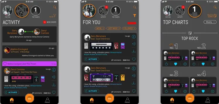
Tried first, a hybrid feed: the top charts, your own tones and other players' tones, mixed. 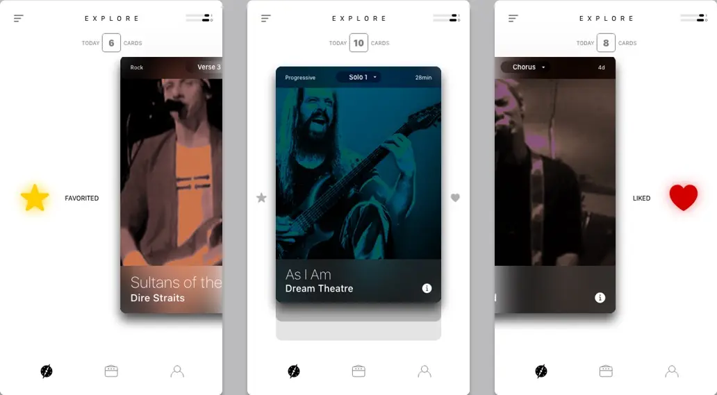
Tried next, reveal cards: a limited number of tones a day, for players who stay with certain tones for a very long time.
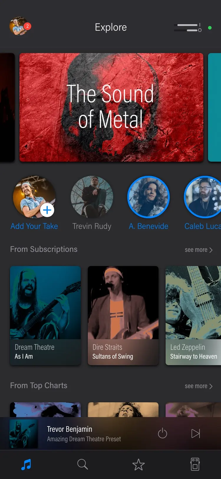
The shipped answer is the Explore tab at the top of this page: a banner, a row of players, tones from your subscriptions, then the top charts.
Plugging in
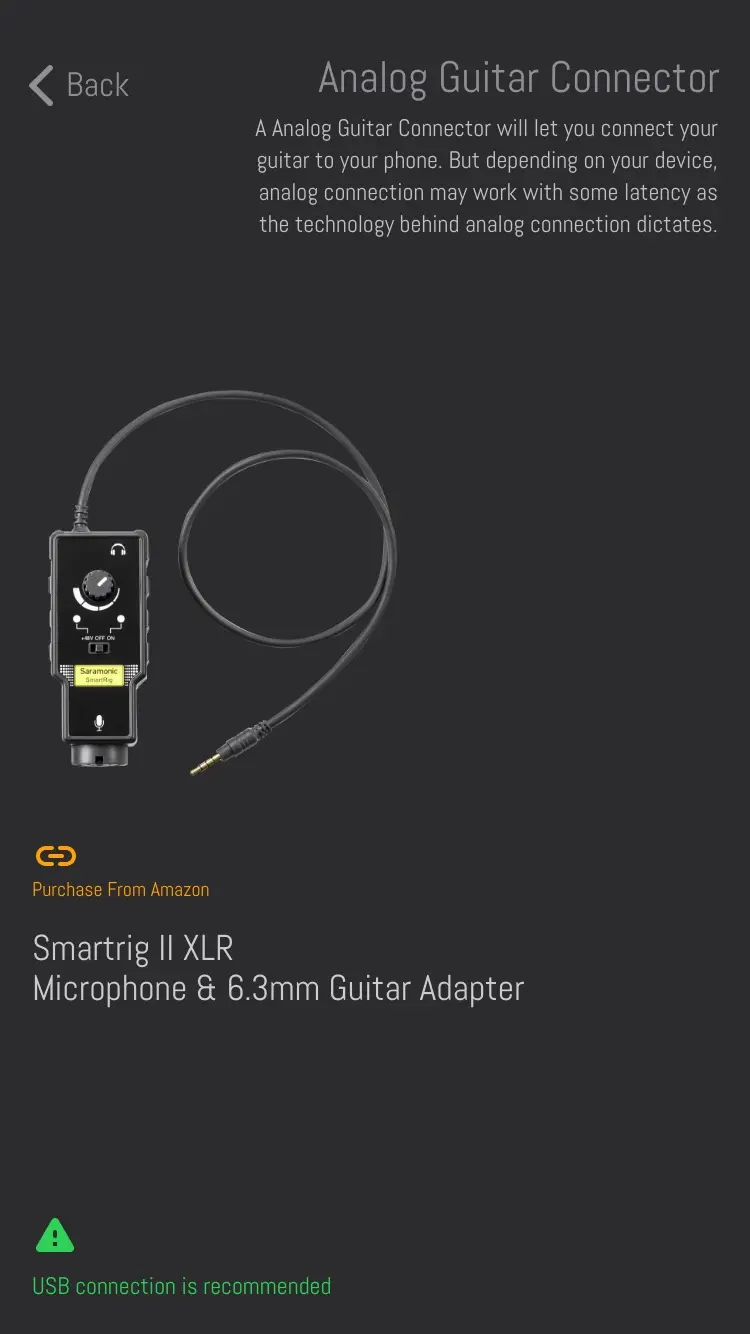
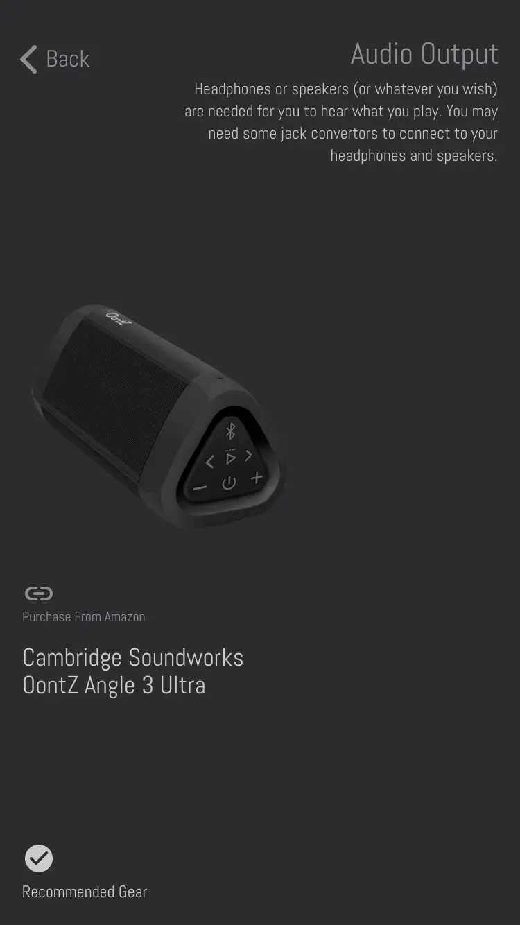
The blocking problem was never the software. You cannot play through a phone without buying something first, a cable or a small interface, and one of the three personas was a sixteen year old who had to talk his parents into it. So the onboarding offers a starter pack of the parts you need, and a separate flow measures what your setup can actually do before you plug a guitar into it.
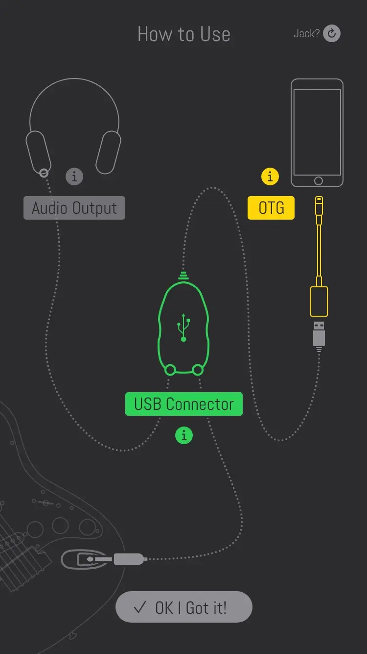
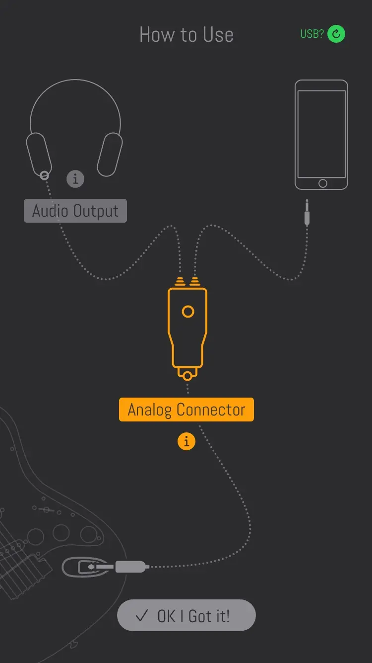
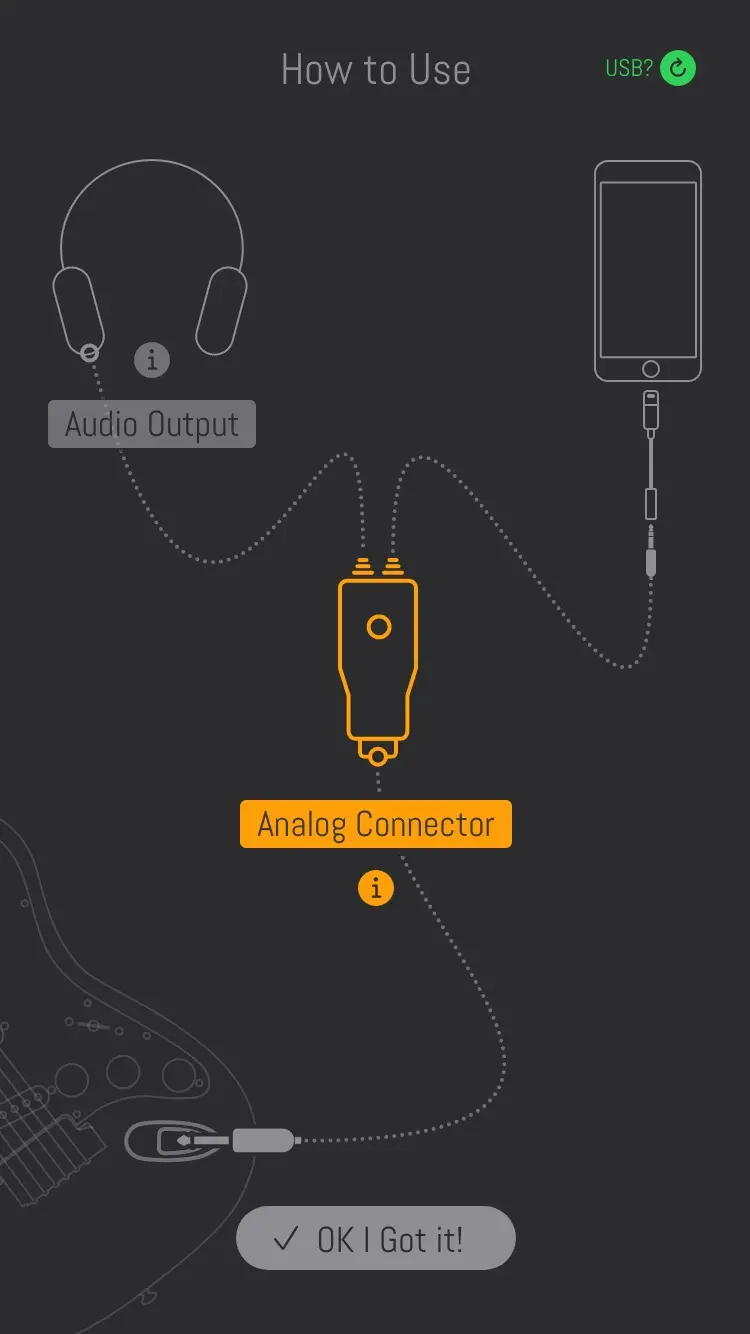
Onboarding was a crucial point for this product, because connecting a guitar to a phone has to be learned. The same line art was used to explain how, and if a part was missing, the screen pointed at where to buy it.
The first version: how to connect
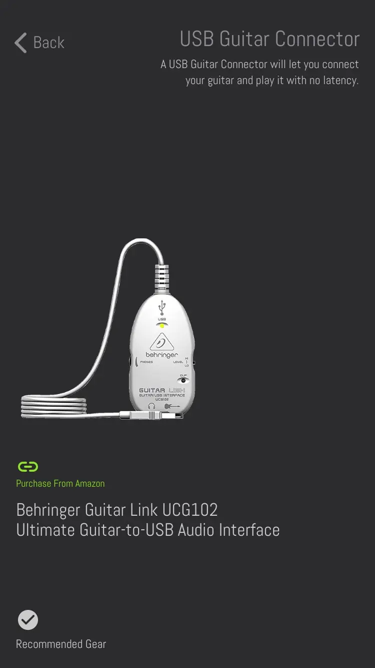
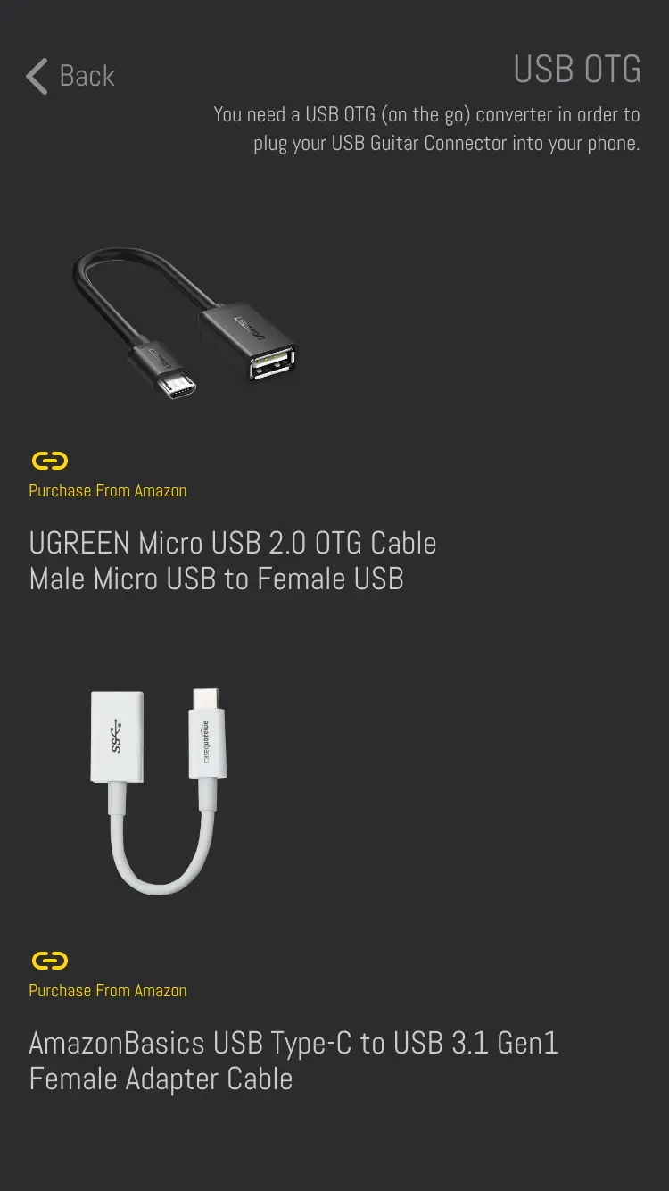
Phones are not created equal, and some of them, with some interfaces, glitch. The team wanted a flow that told a player what to expect from the setup they had and how to do better. The result is a test that measures your latency and rates it, then shows the gear that would improve it.
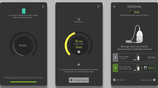
The first version. The test: a latency, a rating, then the gear that would do better.
Sharing a tone
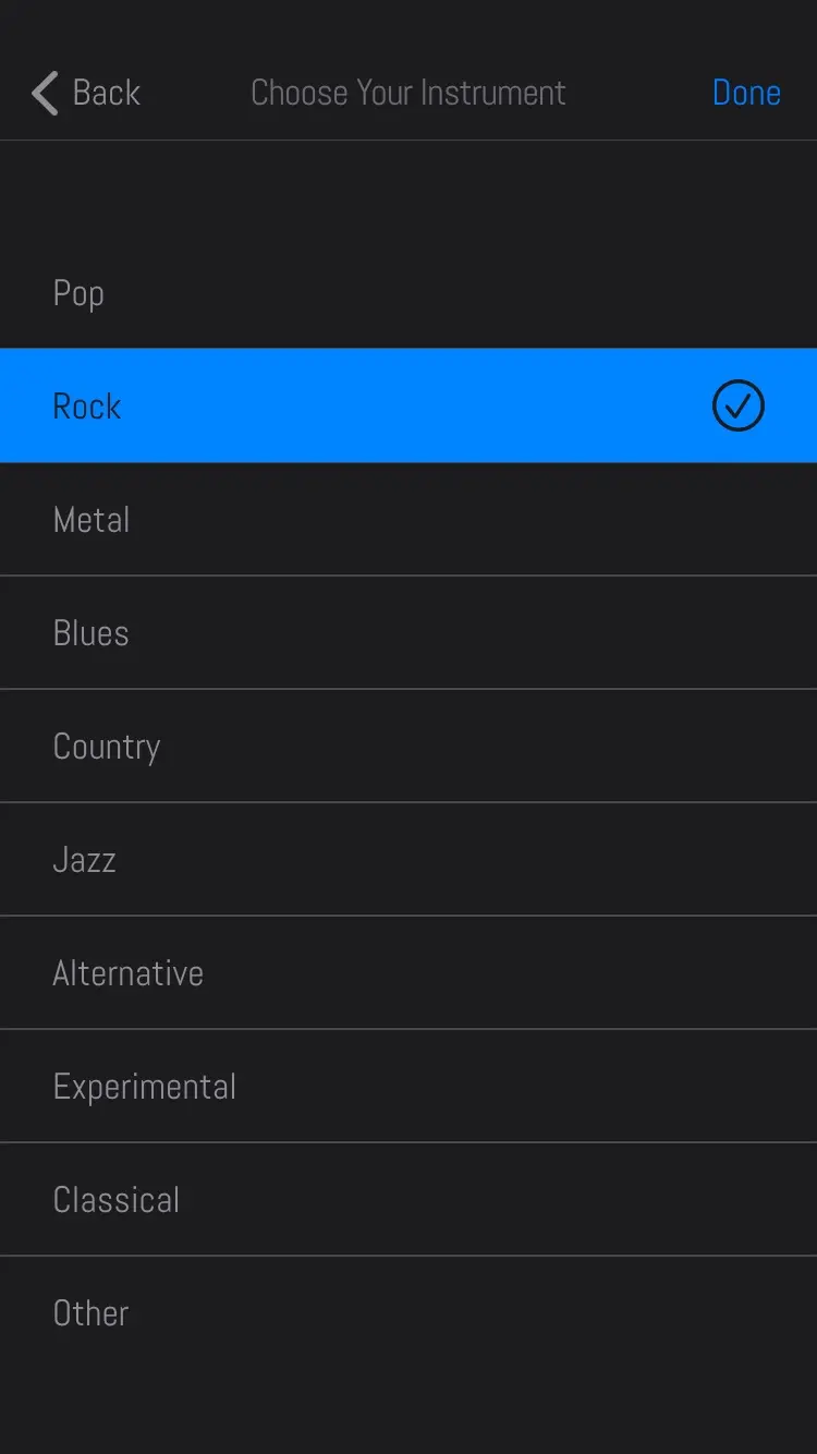
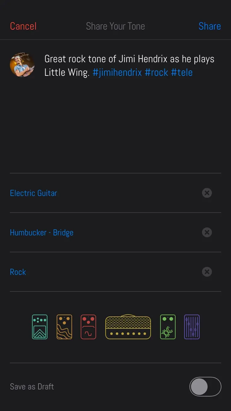
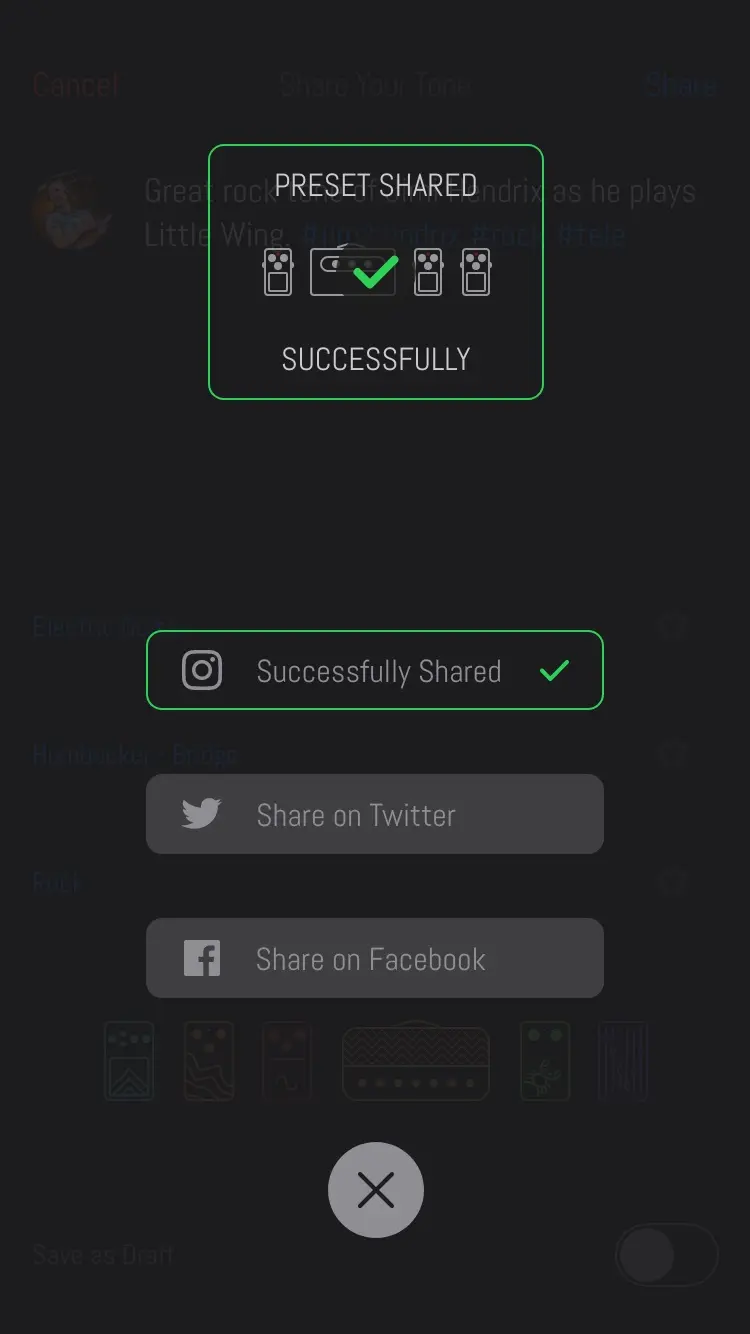
Players' own tones were meant to be one of the main streams of content, so the share flow was studied to remove every hindrance it could while asking only for what was essential. The first version's flow follows Twitter's, to stay inside a mental model players already had: a short description, the instrument, the pickup and the genre, then the tone is pushed to the app with the option to share it on social media.
The first version: sharing a tone
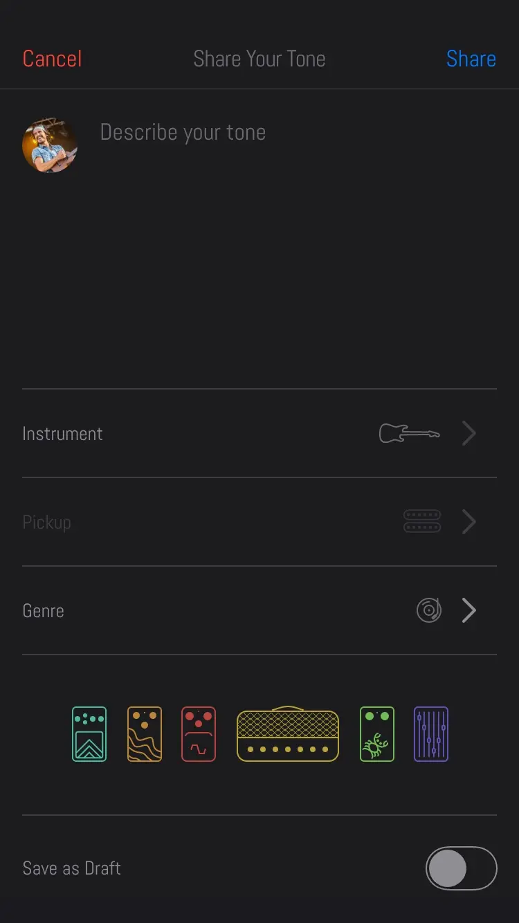
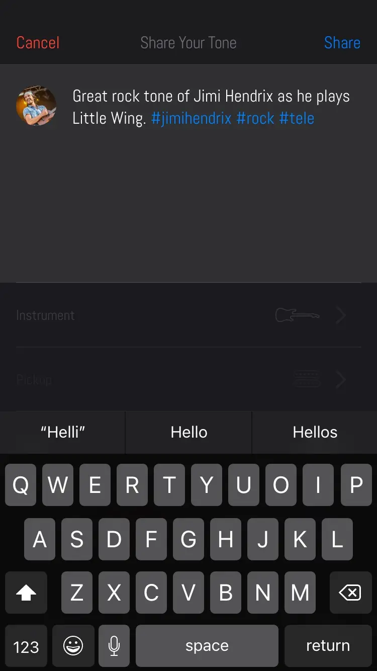
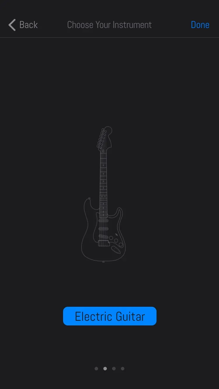
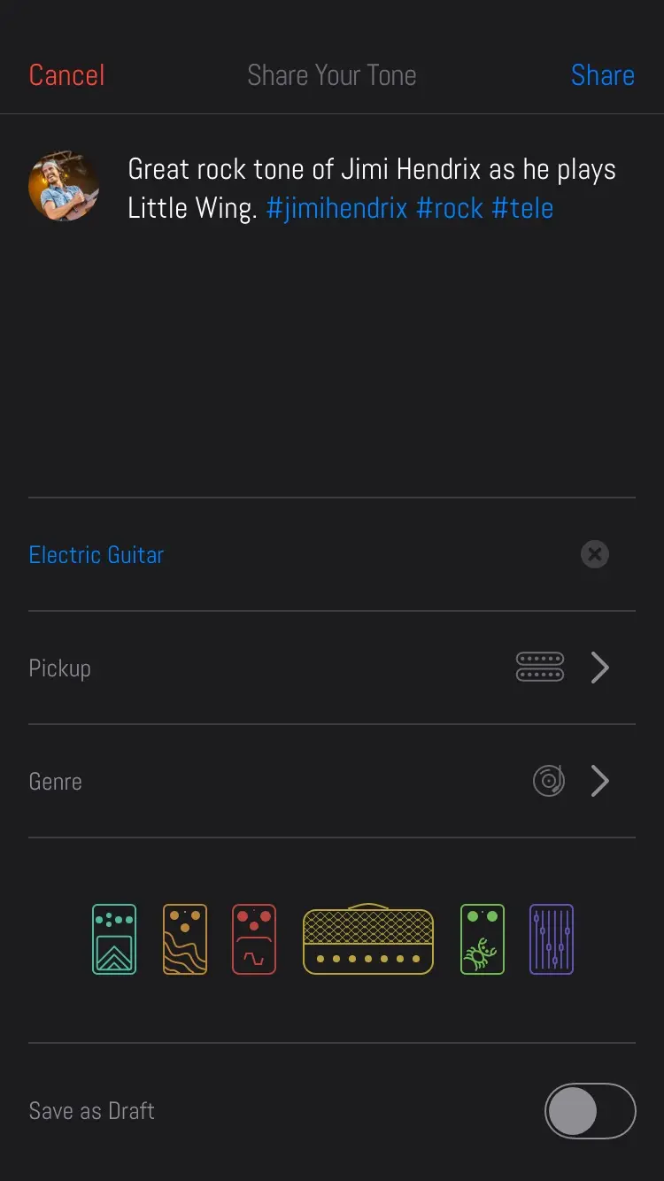
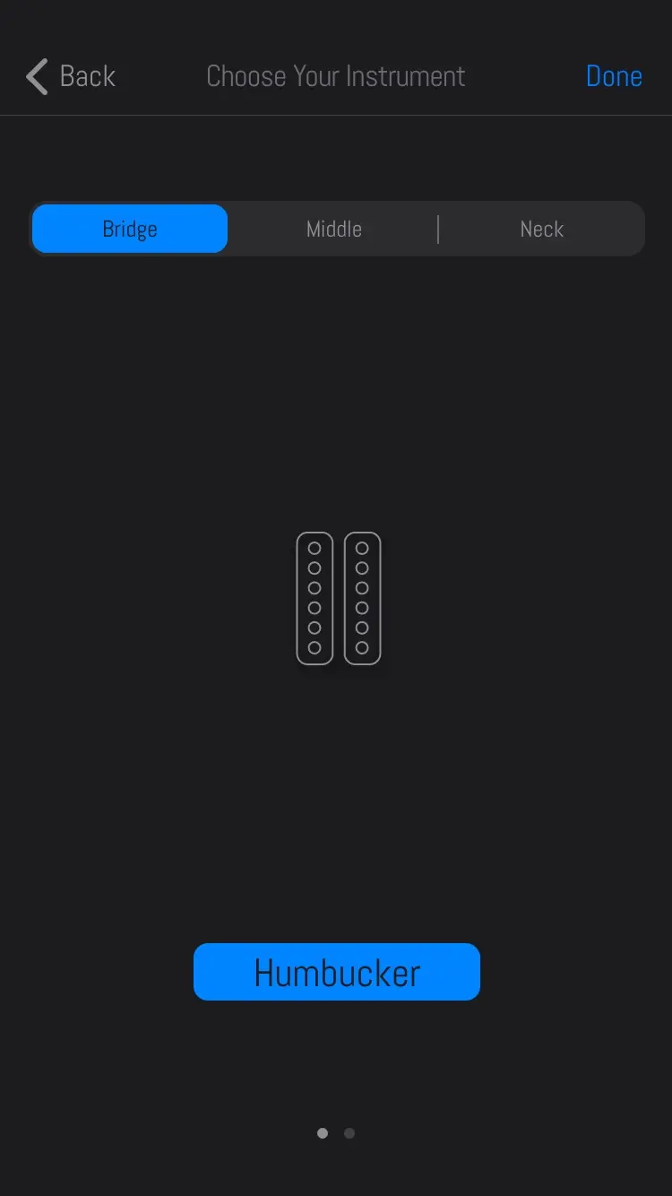
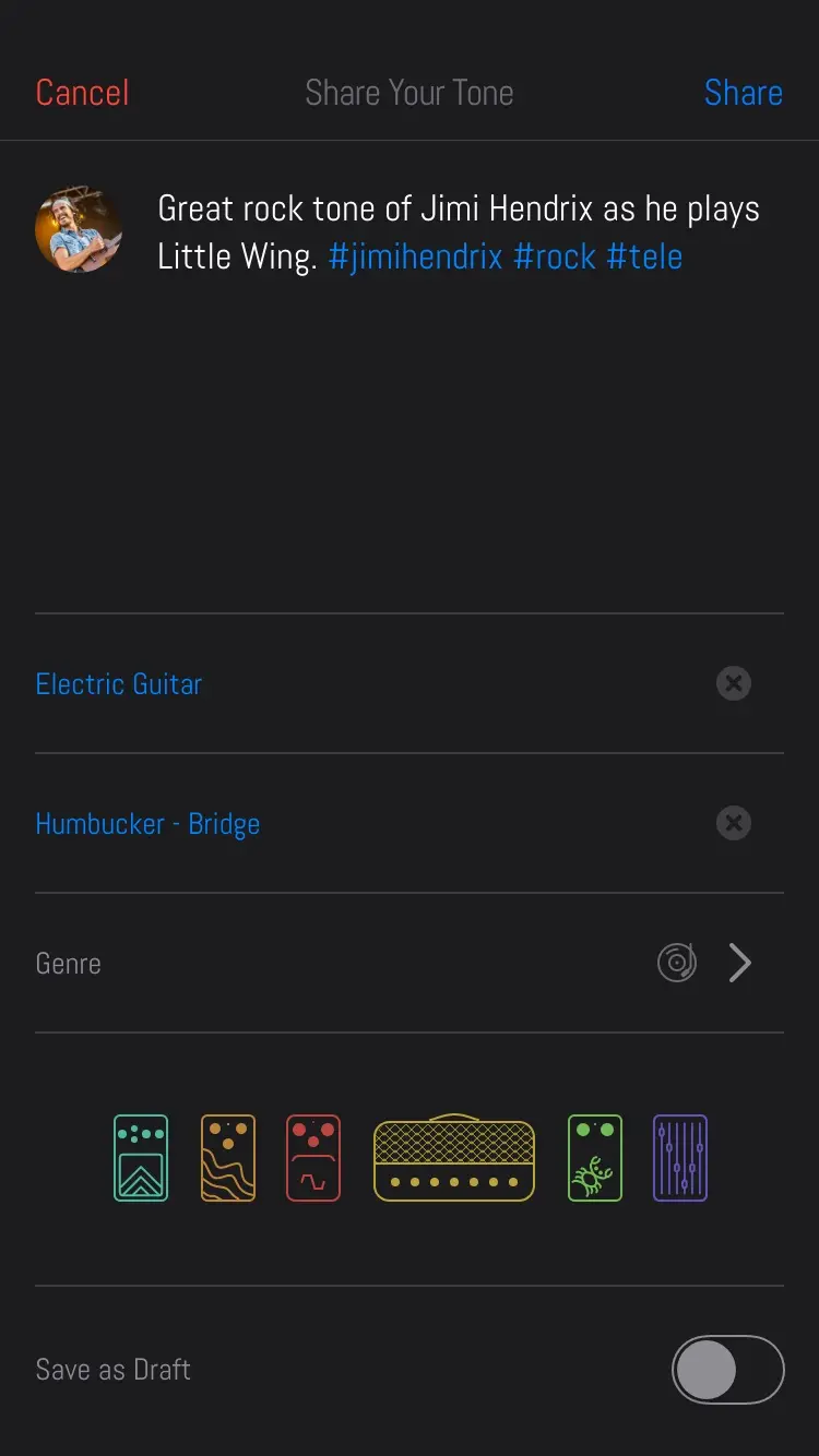
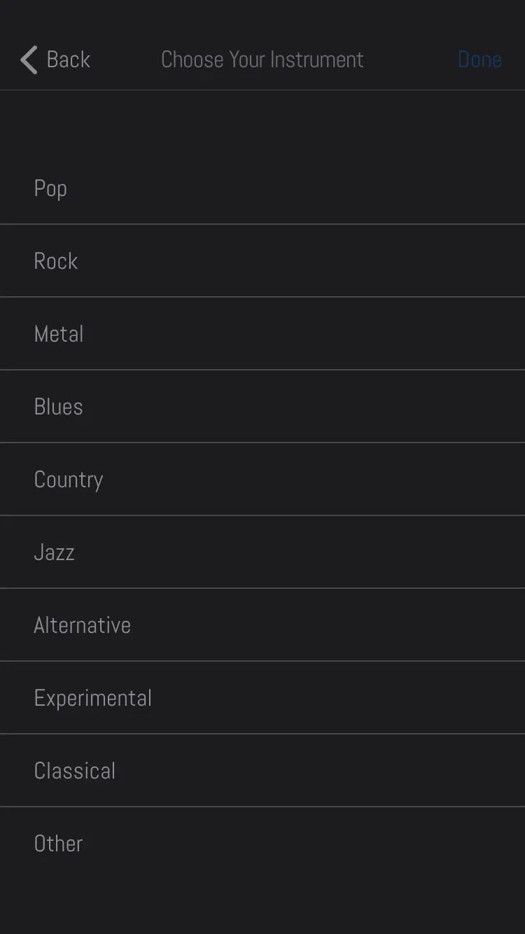
One interview finding never got solved. The advanced player among the three personas did not especially want to publish anything and was content keeping his tones to himself. Sharing was the whole premise, so that needed a convincing mechanism and never got one.
In players' rooms
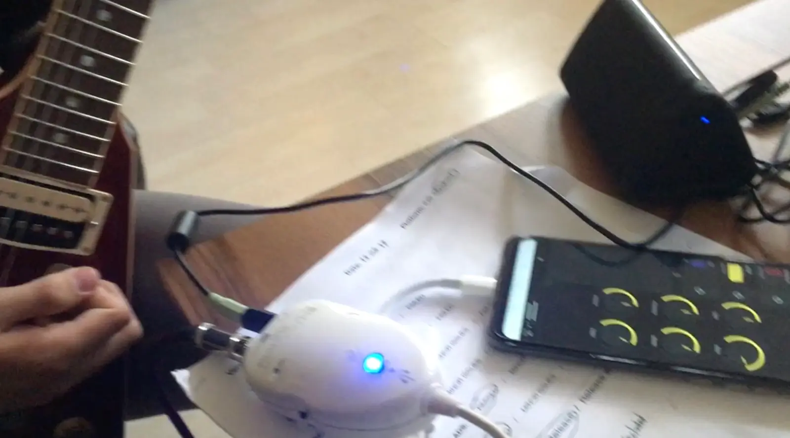
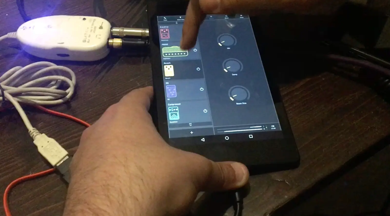
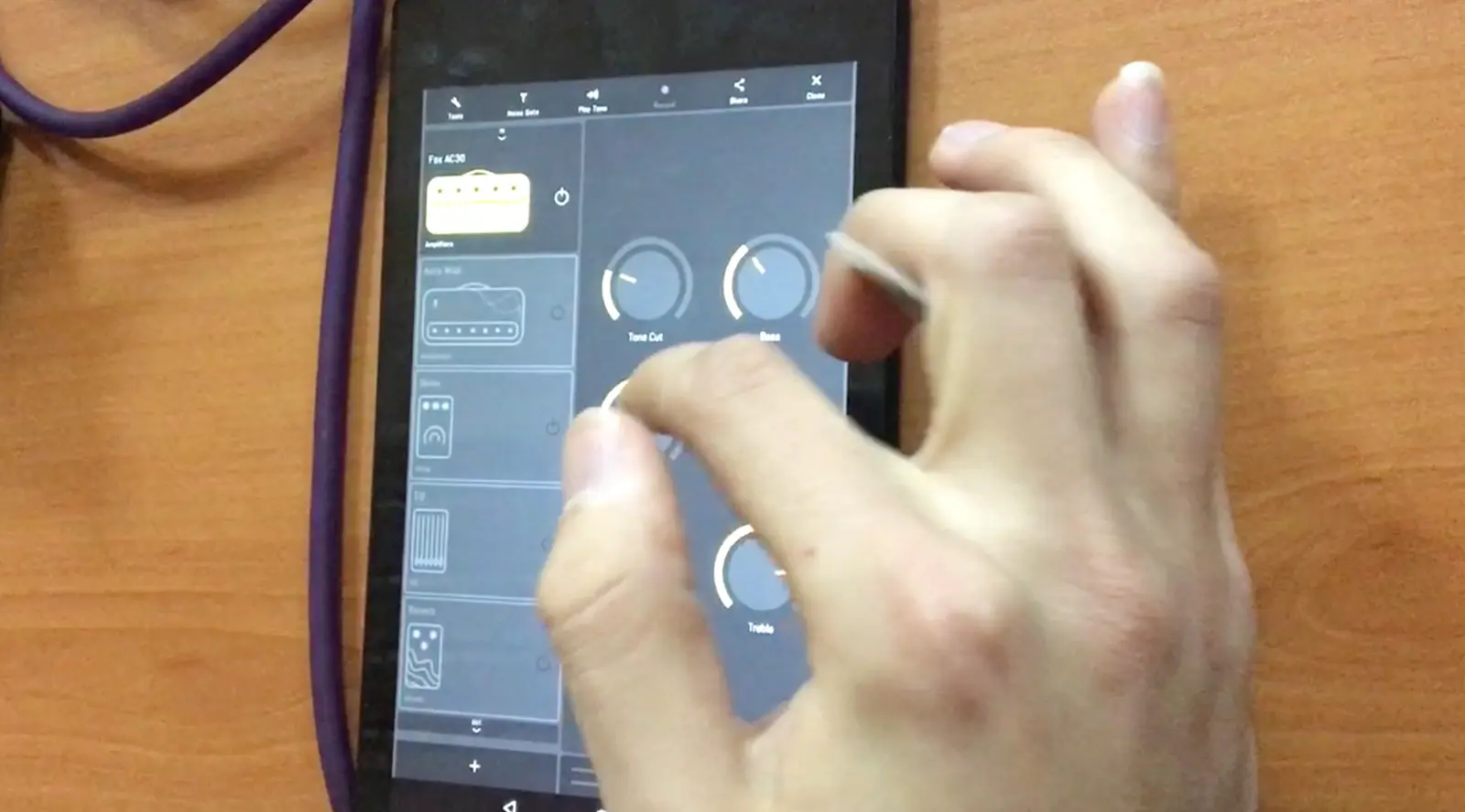
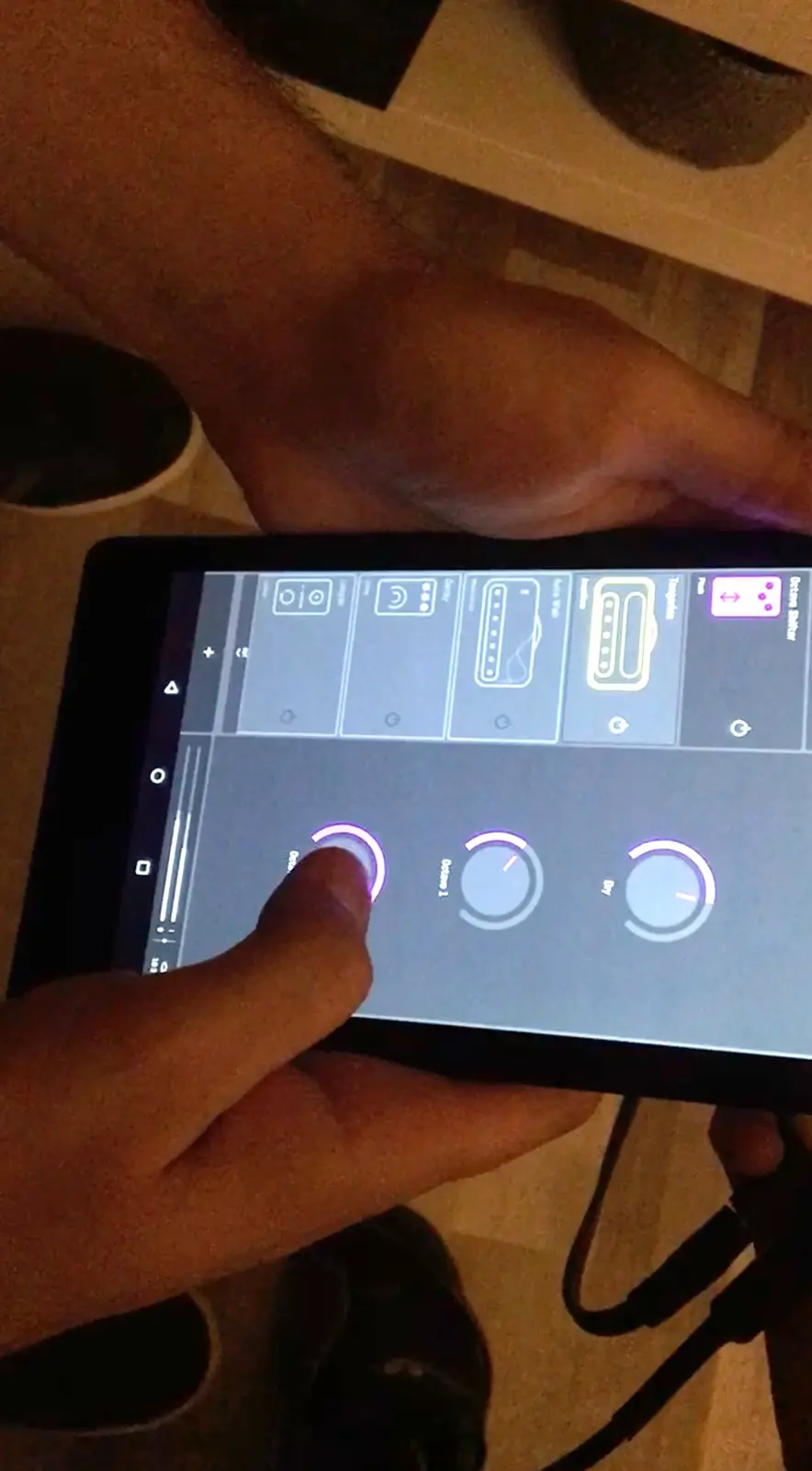
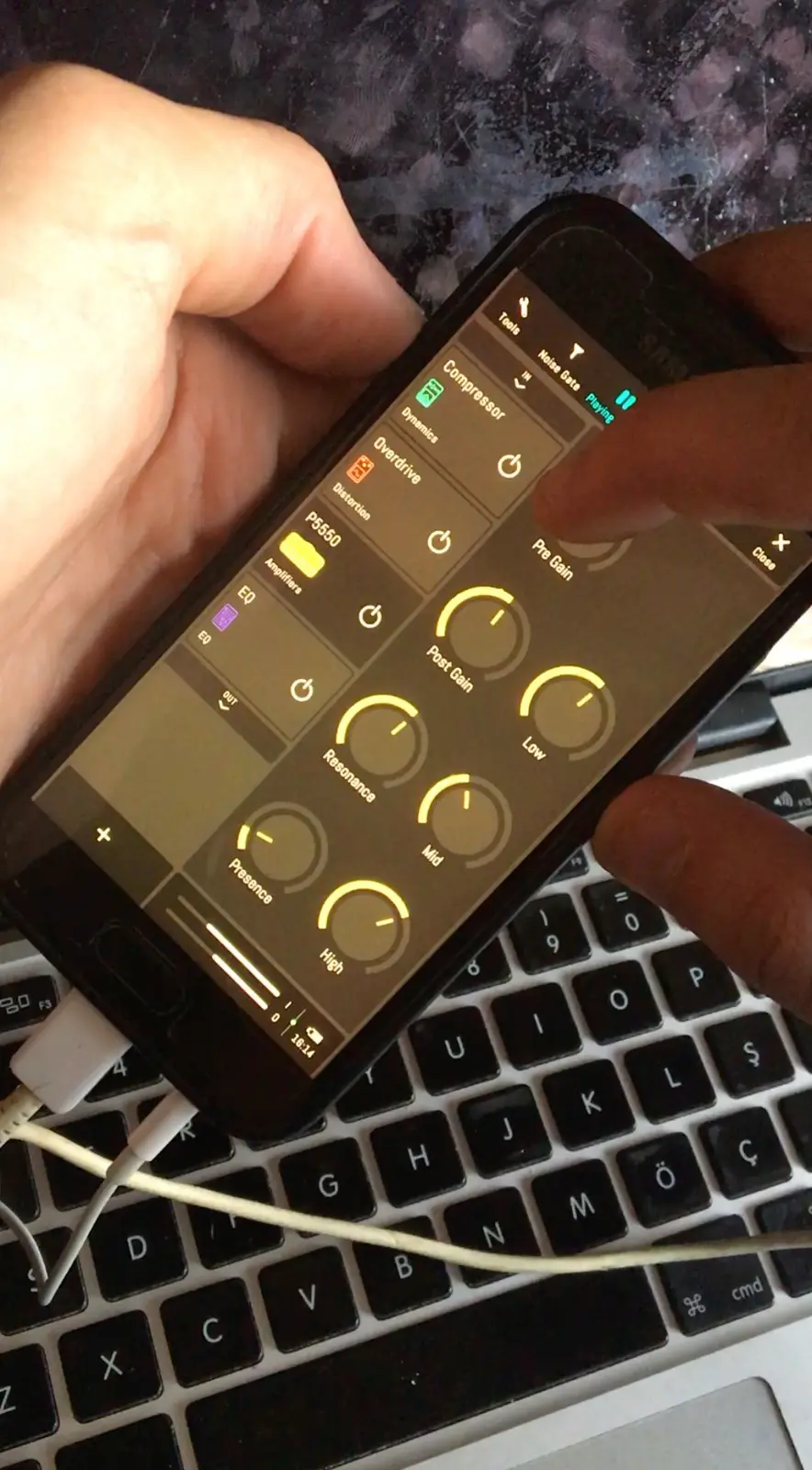
From the first beta on, a colleague who is also a great guitarist ran detailed user tests, in players' own rooms wherever possible, on their own phones. Every session was watched and watched again, then turned into notes for the next iteration. The stills below are from those recordings: hands, screens and guitars.
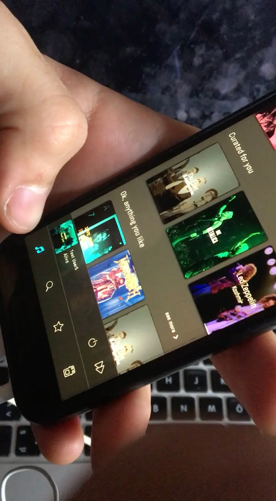
The version that shipped
The studio kept its four areas and its cards, and each card gained a handle. Explore gained a row of players under the banner, and a tone's name moved off the photograph onto a strip beneath it. The shipped version was drawn for a taller phone. The icon came out of moodboards and a long run of explorations shared with stakeholders for feedback. The team chose one and tried it on several mediums.
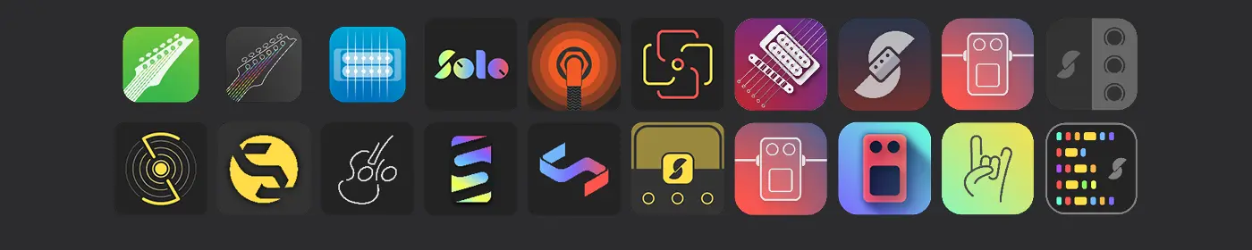
Twenty of the application icon explorations, shared with stakeholders for feedback.
It shipped on the App Store and Google Play.
More case studies
Course Companion
I pitched a course page nobody asked for. It became a funded mission and went live as an A/B test. Sixteen states of what a page may say, flip them here.
case study · 2026 · read it
Soothe
A native iOS proof of concept that pats you until your stop is near, then wakes you kindly. A 2026 rebuild of my 2020 case study. Every ride is simulated.
case study · 2026 · wip · read it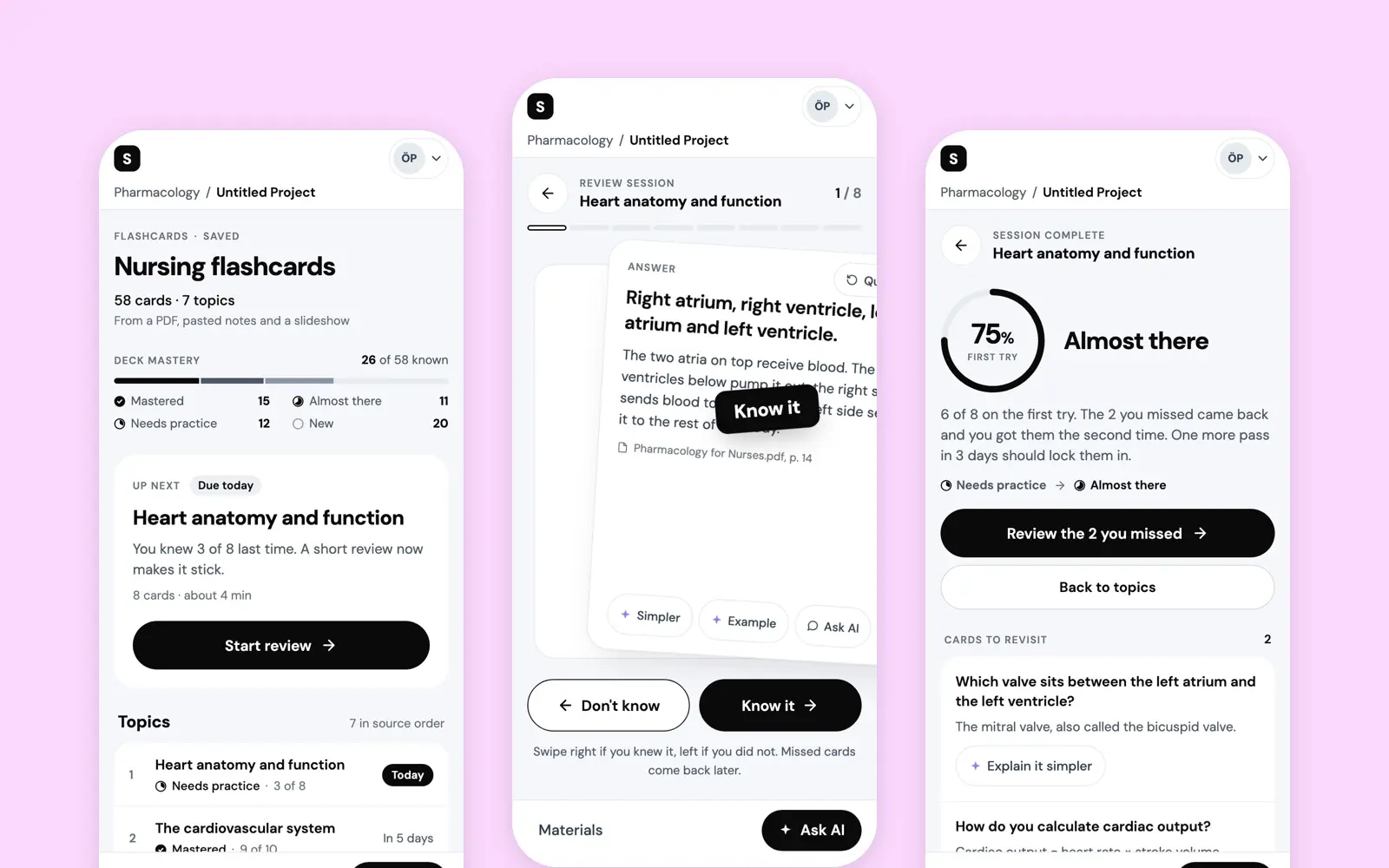
AI Flashcards
A short-term vision for the flashcards in Studocu AI: a deck made from a student's own sources, one rating per card, and a deck that says what to study next.
case study · 2025 · read it