Course Companion
I pitched a course page nobody asked for. It became a funded mission and went live as an A/B test. Sixteen states of what a page may say, flip them here.
- Year
- 2026
- Track
- built
- Category
- case-study
Tools
- Next.js
- Cursor
- Claude Design
In February 2026 I pitched a new course page to the management team. Nobody had asked for one, and the last slide said DEMO. A month later it was a funded mission with a small team. In May it went live as an A/B test against the old page, and over the summer we rebuilt it. I designed it, and we did it without Figma handoffs.
There are no numbers on this page. The figures behind the pitch were the company's, and they described the problem rather than what I did about it.
- I pitched a new course page to the management team, unasked, and ended on a demo.
- It became a funded mission, and the prototype replaced the PRD.
- A running version shipped internally on the date we committed to at kickoff.
- It went live as an A/B test against the old page.
- We decided to rebuild it.
- –I ran the second research wave, putting the loop in front of students before it was built.
- –I split confidence into two axes and wrote the sixteen-state contract.
- – I built the harness that grades the page, then fixed its own false greens.
- –I found the new page hard to find in search, argued to fix it first, and lost.
- Where the record stops, mid-sprint.
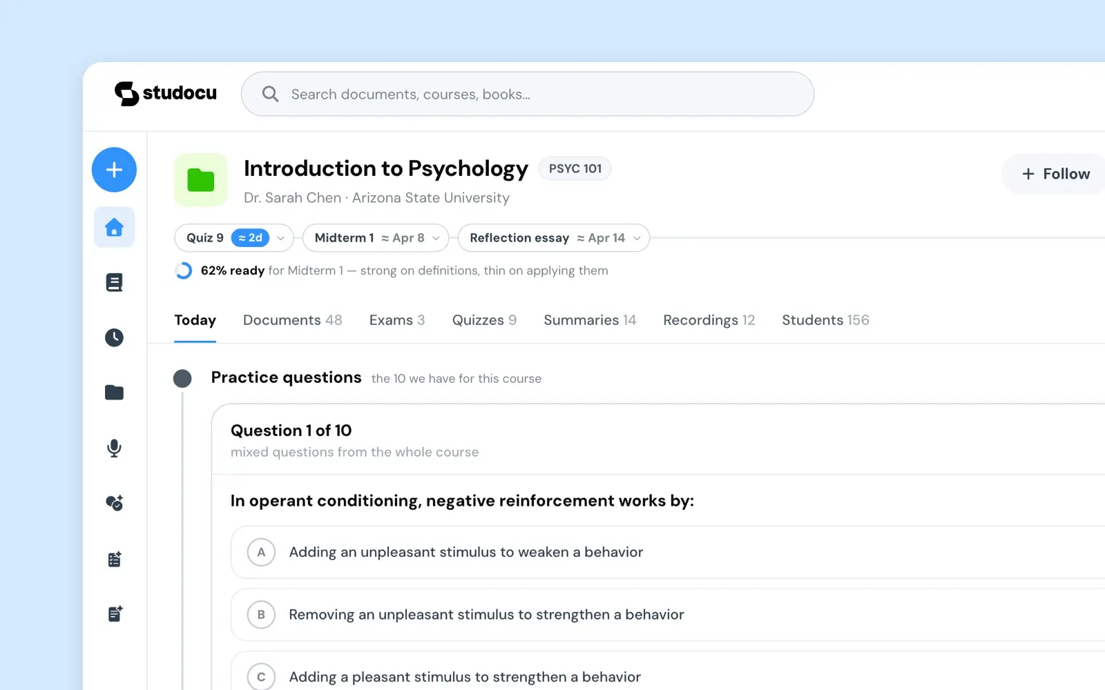
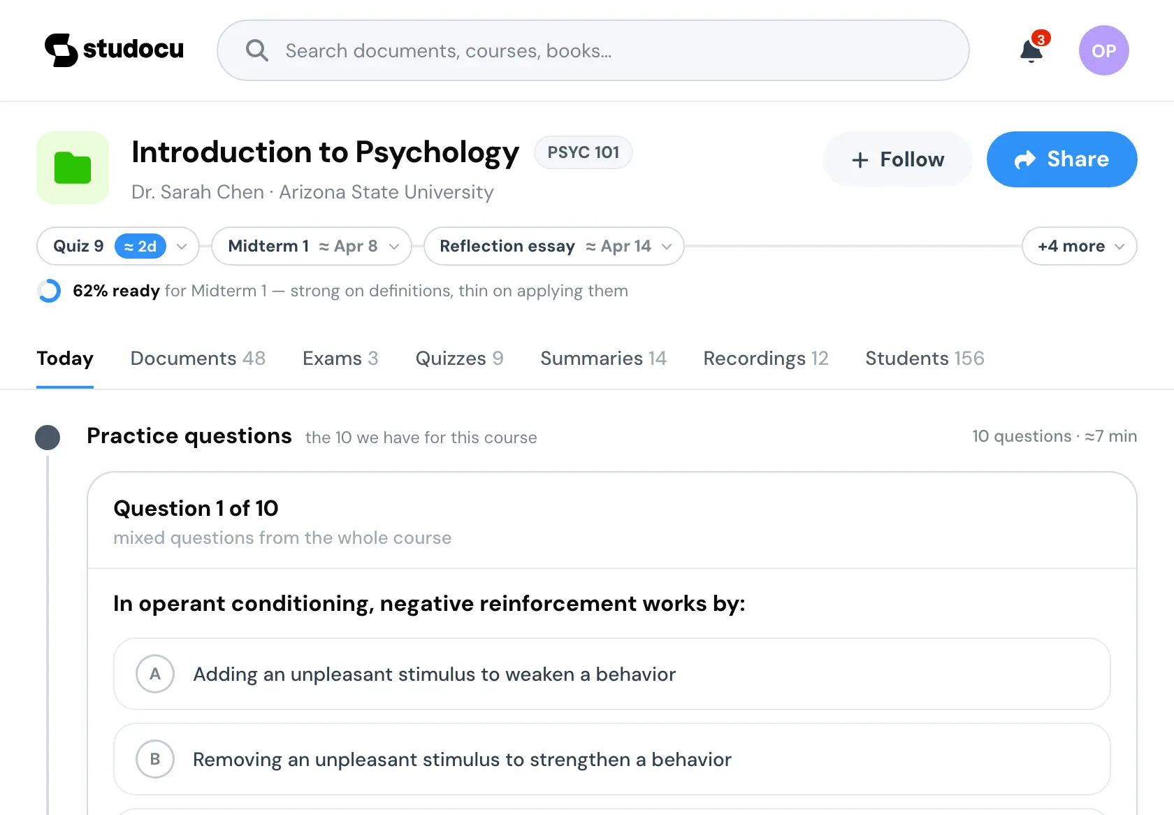
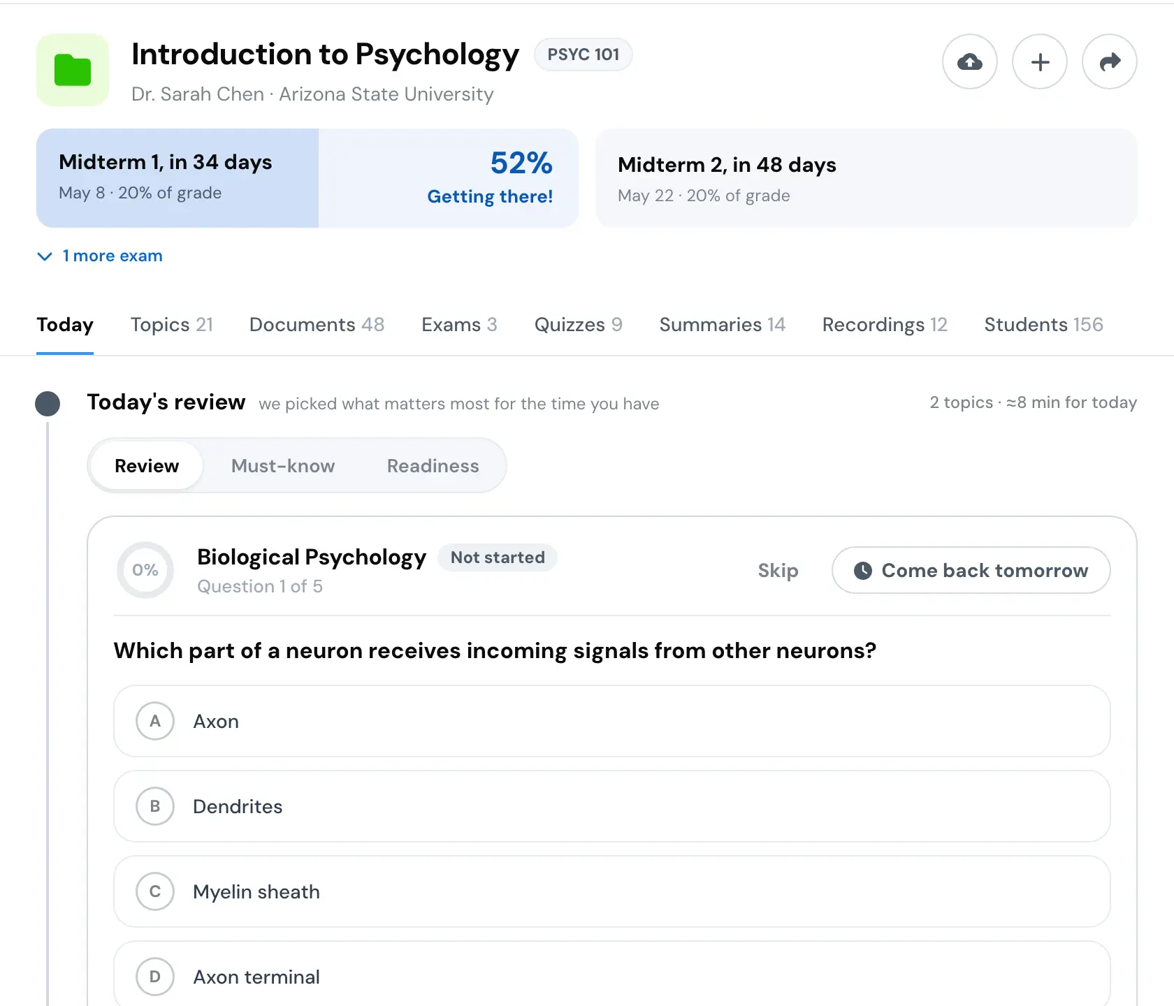
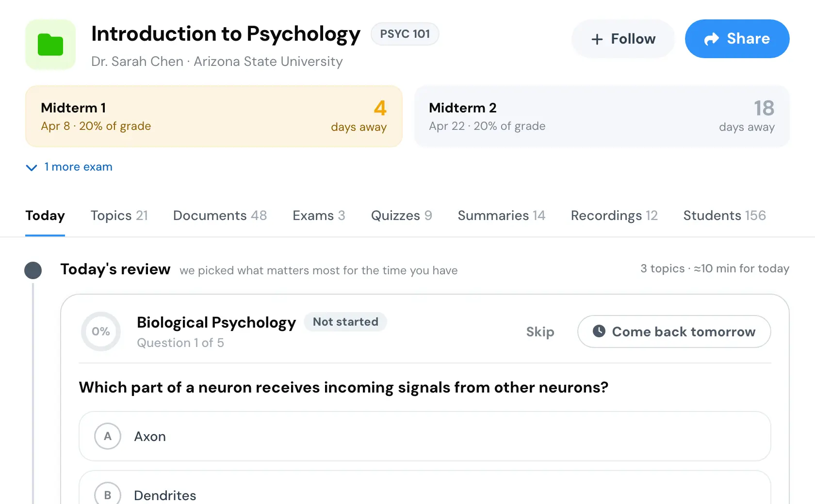
This is the page as it landed. A question is already open before anything is asked of the student.
The reframe
The company had an AI product that turned course material into practice questions, summaries and mock exams. Not many people used it, and that was being treated as a marketing problem.
I thought it was structural. Students do not go looking for an AI tool. They go to their course page, because that is where their material and their classmates are. The AI lived somewhere else, in a personal workspace, and nothing it made stayed behind.
So the pitch was one change. Put the artifacts on the course page, where anyone taking that course can find them, this semester or next. The paywall moves with them, to the moment a student fails a practice question, because that is the most motivated user in the product. Reading and making stay free. Feedback is the paid part.
A question on screen
The brief I wrote for the rebuild starts with one line: do not build a calendar, build a reason to come back. Students do not want a calendar. They want to know they are not behind, and the one thing to do right now.
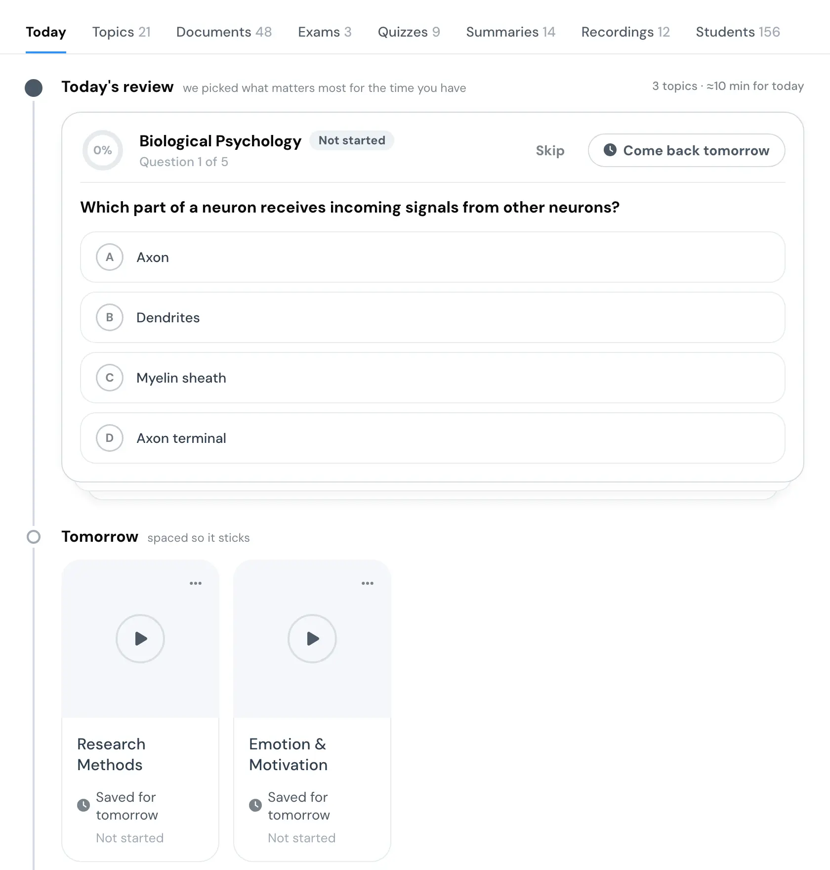
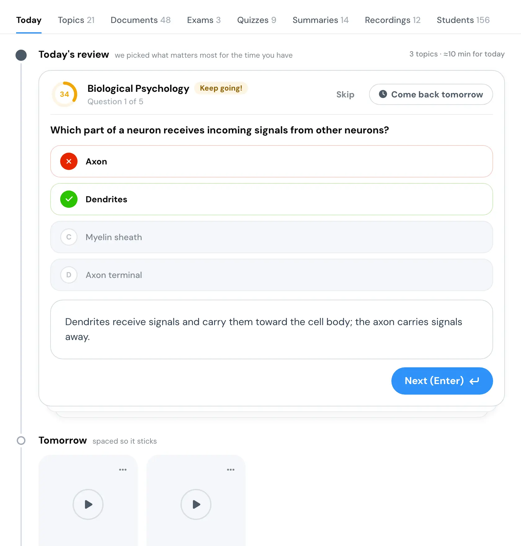
So time is in three layers. The header is stakes, the next exam and nothing else. The body is now, and it is the main thing on the page: today's review renders on load with the first question already open. The full calendar is the third layer, behind a chevron.
A topic you put off is not lost. Come back tomorrow moves it, with your result, into Tomorrow. The ring on a topic shows coverage, not progress. I wrote that into the spec with an instruction not to revert it, because progress is the obvious reading and it is wrong.
Today's review
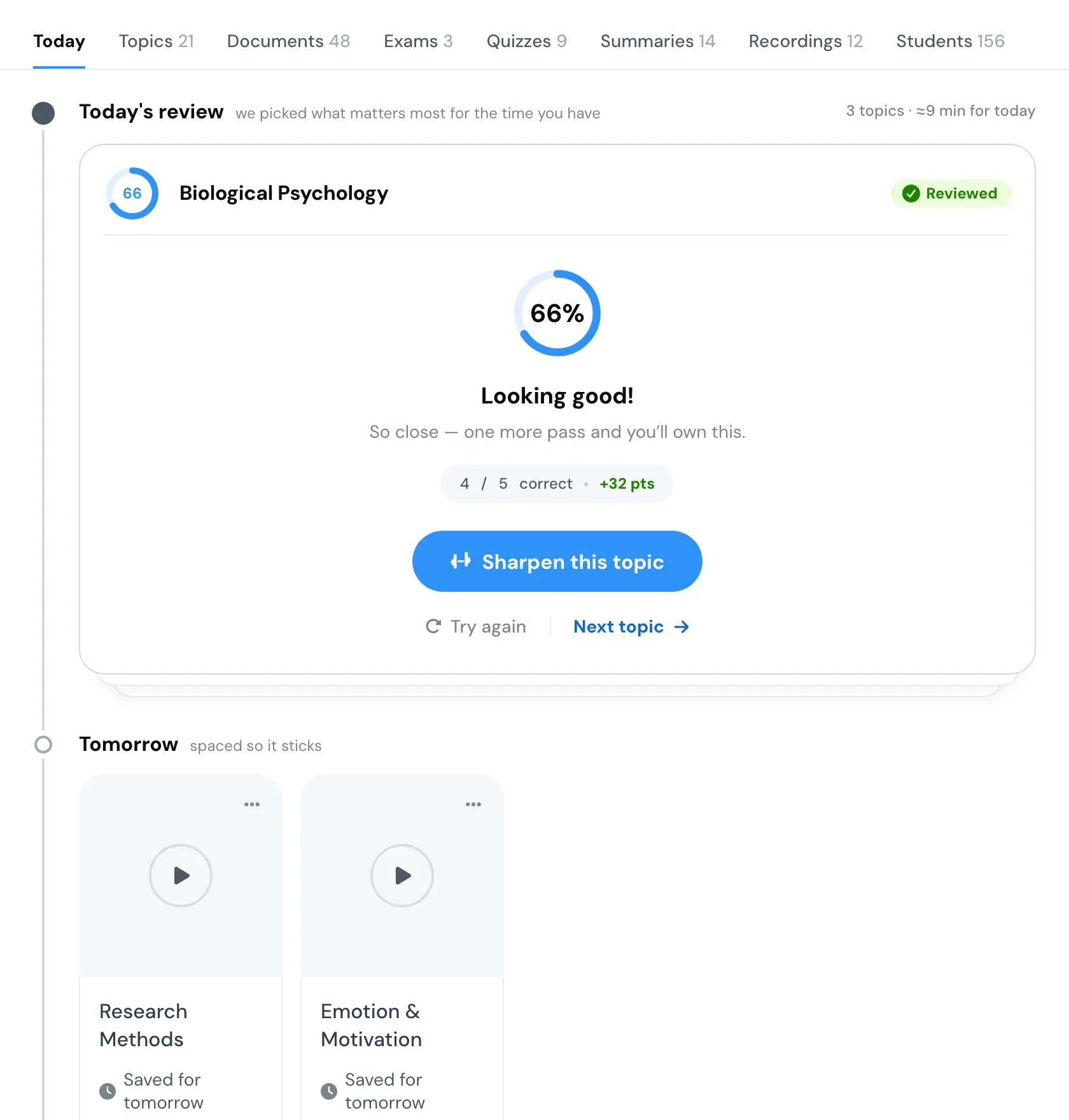
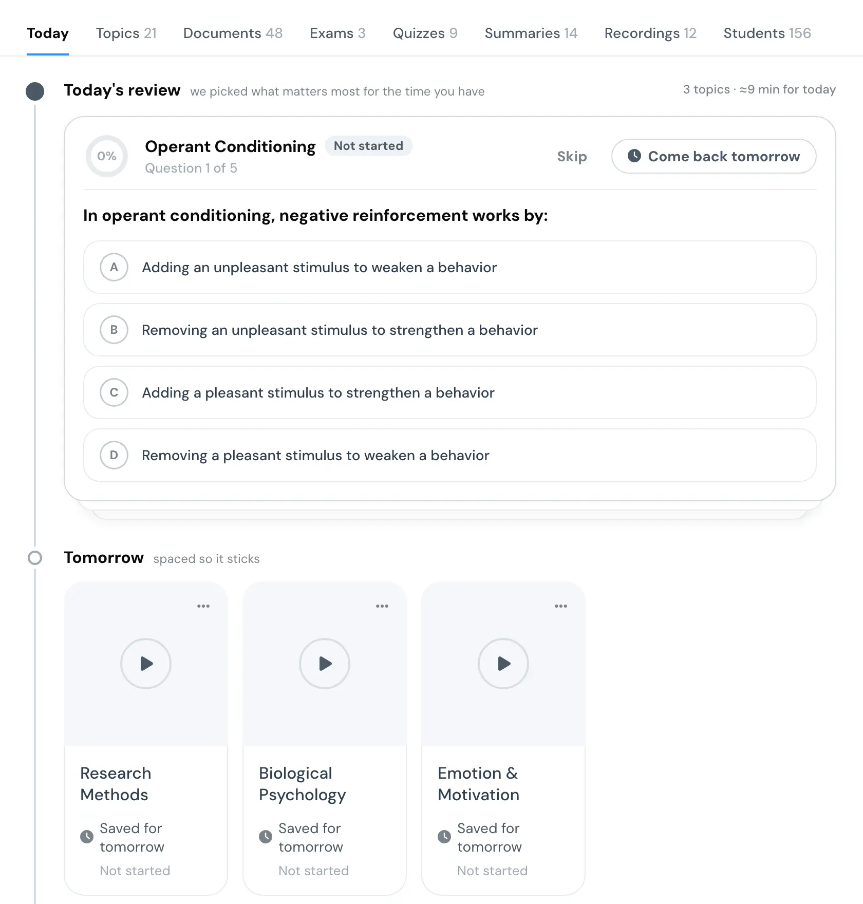
The result ends on four cards dealt as a fan, each marked: tired, hyped, no screen, raw material.
Where to next
5 states
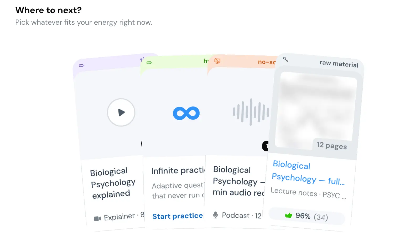
Where to next? Pick whatever fits your energy right now.

Biological Psychology explained. Explainer, 8 min.

Infinite practice. Adaptive questions that never run out.

Biological Psychology, 12-min audio recap. Podcast, 12 min.

Biological Psychology, full reading notes. Lecture notes, PSYC 101.
Sixteen states
The hard problem was not layout. Most of the time we did not know enough about a course to fill the page.
The team had a model for that: one dial, four levels, from we know nothing to we know everything. It was the product manager's, and it held until it had to describe a well-covered course seen by someone on their first visit. One dial has to either invent a readiness score from no history or hide dates we actually hold.
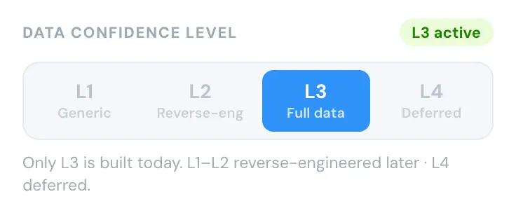
So I split it. What we know about the course is one axis and what we know about the student is the other. Four by four, sixteen states. Down a row is a content problem, a syllabus or an upload, and nothing a student does at the keyboard moves it. Across a column is an engagement problem, and only the student moves it.
Four things vary per state: the daily card, the plan below it, the topic radar and the one ask we are allowed to make. Everything else stays the same.
Then I built a harness that grades the page against the contract, before the page it grades, so it could not be tuned to flatter the work. It had its own bug: reading the whole document made it match its own copy of the expected text and mark everything green.
This is that harness, redrawn. Every cell is a real capture of my prototype with my note on it, and it opens on the cell that forced the split.
Confidence matrix
16 states

- The setup
- We hold no topics for this course, and this is a student who just arrived and has done nothing yet.
- So we show
- the Must-know deck. It only needs documents, and that is all we have.
- We ask
- for the exam date, since we have none.

- The setup
- We hold no topics for this course, and this is a guest who has answered a few questions.
- So we show
- the Must-know deck. It only needs documents, and that is all we have.
- We ask
- them to sign in, so the answers they are giving us survive.

- The setup
- We hold no topics for this course, and this is someone who has been back a few times.
- So we show
- the Must-know deck. It only needs documents, and that is all we have.
- We ask
- for the course schedule, which is what unlocks the plan.

- The setup
- We hold no topics for this course, and this is a regular with real history here.
- So we show
- the Must-know deck. It only needs documents, and that is all we have.
- We ask
- them to contribute. They have practised here often enough to know this course better than we do.

- The setup
- We extracted some topics, but nobody confirmed them, and this is a student who just arrived and has done nothing yet.
- So we show
- the readiness check. It is the only card that works with no history, and taking it unlocks the other two.
- We ask
- whether the topic on screen is really part of their course.

- The setup
- We extracted some topics, but nobody confirmed them, and this is a guest who has answered a few questions.
- So we show
- the readiness check. It is the only card that works with no history, and taking it unlocks the other two.
- We ask
- them to sign in, so the answers they are giving us survive.

- The setup
- We extracted some topics, but nobody confirmed them, and this is someone who has been back a few times.
- So we show
- the daily review, because they have enough history for us to pick what matters today.
- We ask
- them to confirm the topic list their scores are built on.

- The setup
- We extracted some topics, but nobody confirmed them, and this is a regular with real history here.
- So we show
- the daily review, because they have enough history for us to pick what matters today.
- We ask
- them to confirm the topic list their scores are built on.

- The setup
- We have the real topic list and the exam dates, and this is a student who just arrived and has done nothing yet.
- So we show
- the readiness check. It is the only card that works with no history, and taking it unlocks the other two.
- We ask
- nothing. We have what we need. Get out of the way.

- The setup
- We have the real topic list and the exam dates, and this is a guest who has answered a few questions.
- So we show
- the readiness check. It is the only card that works with no history, and taking it unlocks the other two.
- We ask
- them to sign in, so the answers they are giving us survive.

- The setup
- We have the real topic list and the exam dates, and this is someone who has been back a few times.
- So we show
- the daily review, because they have enough history for us to pick what matters today.
- We ask
- nothing. We have what we need. Get out of the way.

- The setup
- We have the real topic list and the exam dates, and this is a regular with real history here.
- So we show
- the daily review, because they have enough history for us to pick what matters today.
- We ask
- nothing. We have what we need. Get out of the way.

- The setup
- We have everything, including what the instructor added, and this is a student who just arrived and has done nothing yet.
- So we show
- the readiness check. It is the only card that works with no history, and taking it unlocks the other two.
- We ask
- nothing. We have what we need. Get out of the way.

- The setup
- We have everything, including what the instructor added, and this is a guest who has answered a few questions.
- So we show
- the readiness check. It is the only card that works with no history, and taking it unlocks the other two.
- We ask
- them to sign in, so the answers they are giving us survive.

- The setup
- We have everything, including what the instructor added, and this is someone who has been back a few times.
- So we show
- the daily review, because they have enough history for us to pick what matters today.
- We ask
- nothing. We have what we need. Get out of the way.

- The setup
- We have everything, including what the instructor added, and this is a regular with real history here.
- So we show
- the daily review, because they have enough history for us to pick what matters today.
- We ask
- nothing. We have what we need. Get out of the way.
The matrix holds one axis it does not draw: how far off the exam is. This is the same page at six distances, from a month out to nine days after, with the Timing note the harness prints for each.
Distance from the exam
6 states
The exam is a month out. Nothing is urgent, so nothing is coloured urgent.


The exam is imminent, so the plan is thrown out and everything is ordered by exam yield.

We ask how it went, and the answer decides whether we move on.

We stopped asking and moved the plan on. We just say so.

Too long to ask. The plan moved on by itself.
What the page may say
Under the states are rules about what we are allowed to say.
A field renders only if we can produce a value and that value can drive something. Both, or it does not show.
An estimated value carries a small mark, and the mark is a call to action rather than a badge. Press it and you get the document the estimate came from and a way to correct it.
When we do not have an exam date, we ask blind. The field is empty, and our guess shows only after you answer, because showing the guess first anchors the answer.
We ask only about something you are looking at, never a cold audit of a list. One gate decides when asking is wrong at all, so two asks cannot compete for the same moment.
Readiness is personal, so a student with no history has no score. The readout says that rather than printing a number, because any number there would be invented.
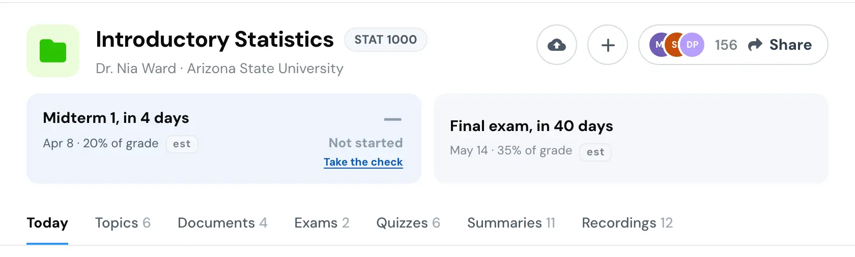
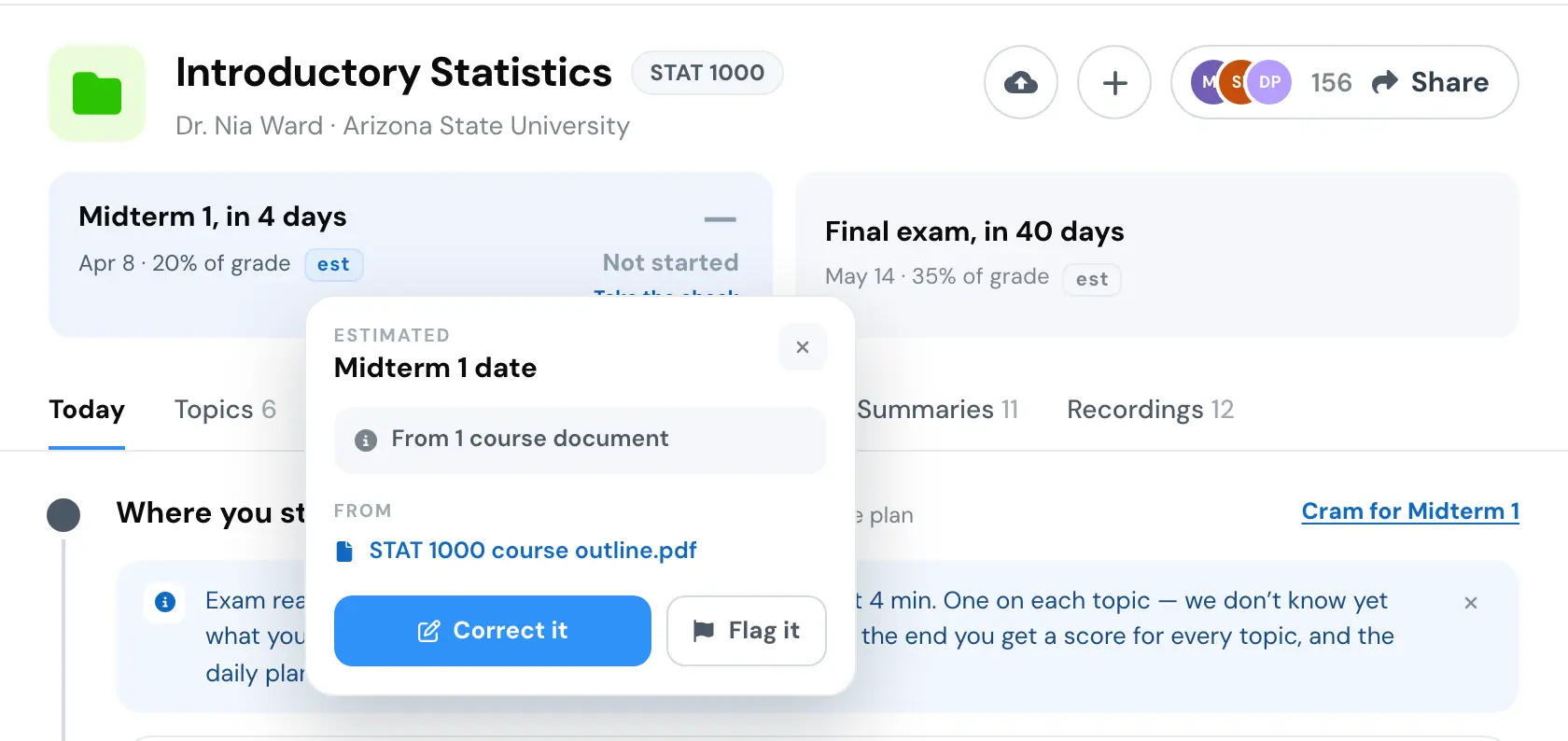
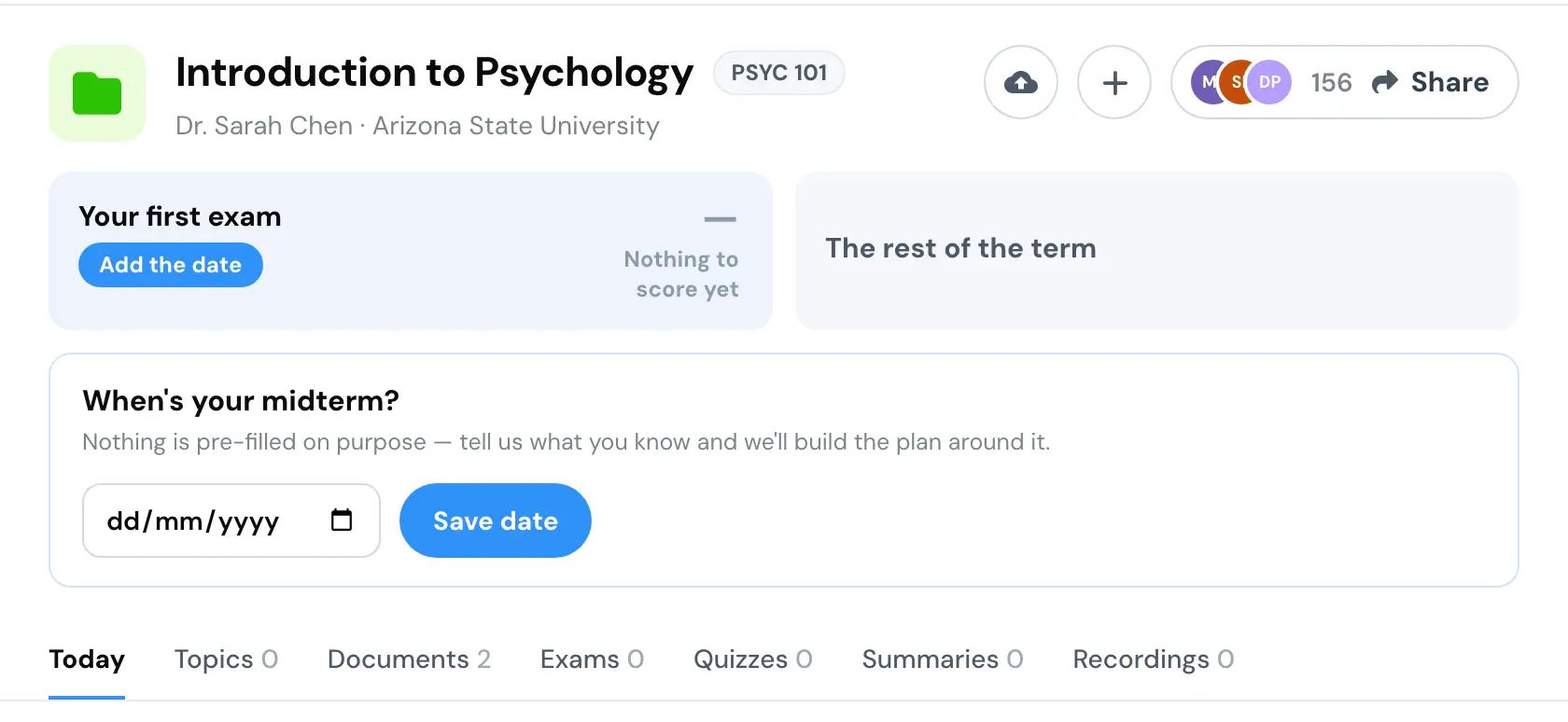
And what the blind ask says once you have answered.

When the topics can't be trusted
Most courses did not have the topic structure the daily loop assumed. So I forked the build to answer one question: what does this page do when we cannot trust the topics?
The review becomes one set of questions across the whole course, and the topics tab goes. The other lanes fill with documents, ranked three ways on purpose, because the most opened material is not the best rated and flattening that loses the only signal we have.
The exam strip took the most work. It says what is at stake, and for most courses we had no date to put in it. The card we shipped said dates are not in yet, which is true and gives a student nothing to do. So it became seven treatments, and this is the panel we walked them with, redrawn. It opens on the one we shipped.
The exam strip, with no dates
7 states

What we ship today: one honest “dates aren’t in yet” card. True, and nothing to walk toward.

The exam strip one confidence step down: same cards, the status-warning ramp carrying the confidence. Set it or leave it.

One 62px track: confirmed coursework as a chip, the roughly-known exams as pressable pills sitting on the rail.

Today’s strip shape with three states: pinned, roughly known (Set day), set by you. Nothing new to learn.

Collapsed by default. One row: the next thing up with its countdown, the rest of the term as a quiet line, and “Term calendar” unfolds the real month grids, where a week we only know roughly is a band across that week.

The same months, no day grids, monochrome: each item carries its kind’s glyph, “≈” marks a week we are guessing, and every box hugs its own content. One item is ~58px, a second grows it. The + on a month adds one; a month holding nothing is a thin +.

The brainstorm’s converged band, fully chronological: the next three term items by time (exam, quiz, essay, whatever comes first) as tab pills on one centered line, with a ≈ countdown chip on the nearest, the only blue. A readiness readout while collapsed, and everything further out behind +N more, where each row expands in place: covers, format, notes, when. Scraped from past terms’ syllabi, so every date reads ≈ and carries a Set-the-day ask.
The ladder under the exam slot became the rule. Whatever is the best thing we hold about a course is what the slot says, and the ask under it is the same sentence at every level.
When the slot holds nothing, the ask is a schedule. The rule I wrote for that upload was ask, check, confirm, rebuild, and every failed check has a real way out, never a dead end.
The schedule upload
4 states
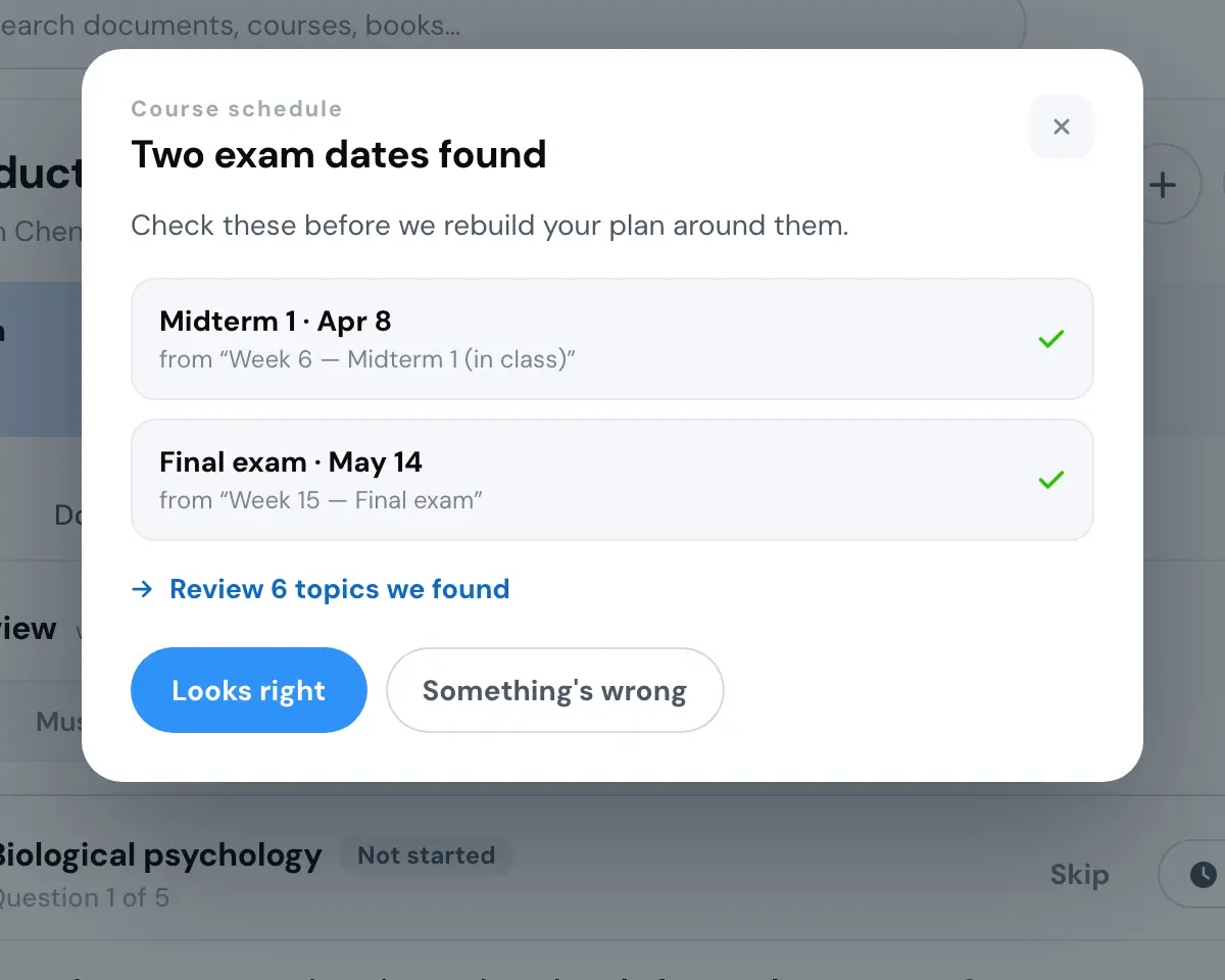
Two exam dates found. Check these before we rebuild your plan around them.

This looks like lecture slides, not a schedule. We couldn't find exam dates or a week-by-week outline in it.

This schedule is for PSY 150. The course code inside doesn't match this course, so its dates would be wrong here.

This schedule is from Fall 2025. Dates from a past term would put your whole plan in the wrong place.
In front of the Documents tab there were six orders. The old library stays reachable from every one of them, as the last line under the results and never the first thing.
In front of the Documents tab
6 states
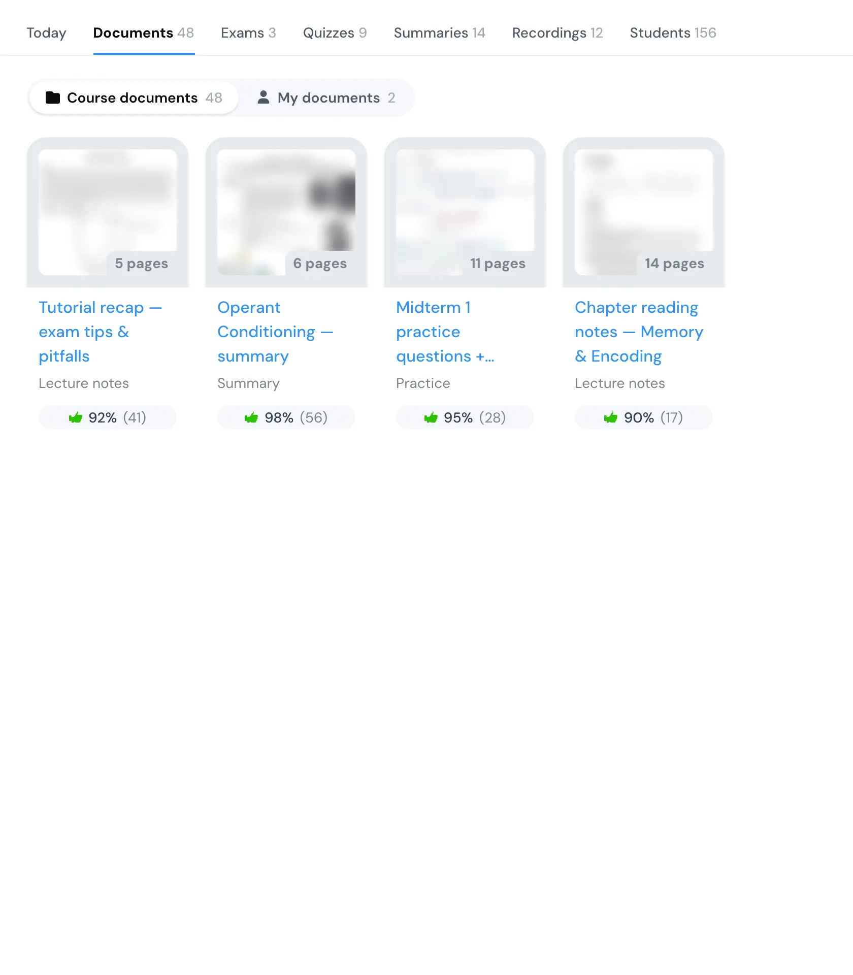
The legacy library grid, untouched: everything we hold, in no particular order. The control.

A find-in-this-course box over type facets, the one thing the flat grid cannot do. Best when the student already knows what they want.

One ranked rail per kind, best-rated first. “I want a practice exam” becomes a glance instead of a scan.

Documents mapped onto the course’s topics, so “which doc covers X” is answerable. And it says out loud that the mapping is our guess, filing the rest under the whole course.

Six documents, each with the reason it earned a place: opens, ratings, this week. The library is a scroll; this is an answer. Browse-all is one click behind it.

The same grid with an honest default sort and facets. Nothing new to learn, and the cheapest of the five to ship.
After the last question
When the questions run out, the page has one thing worth sending: the set a student just did, and their score on it. So the ask to share the course comes once, under the score, and never beside another ask. A classmate who opens the link lands signed out on the same ten questions, and when they finish, the save ask takes the share's place. One ask at a time.
The share loop
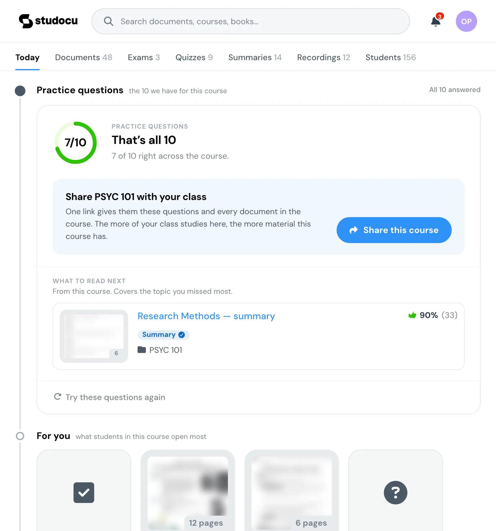
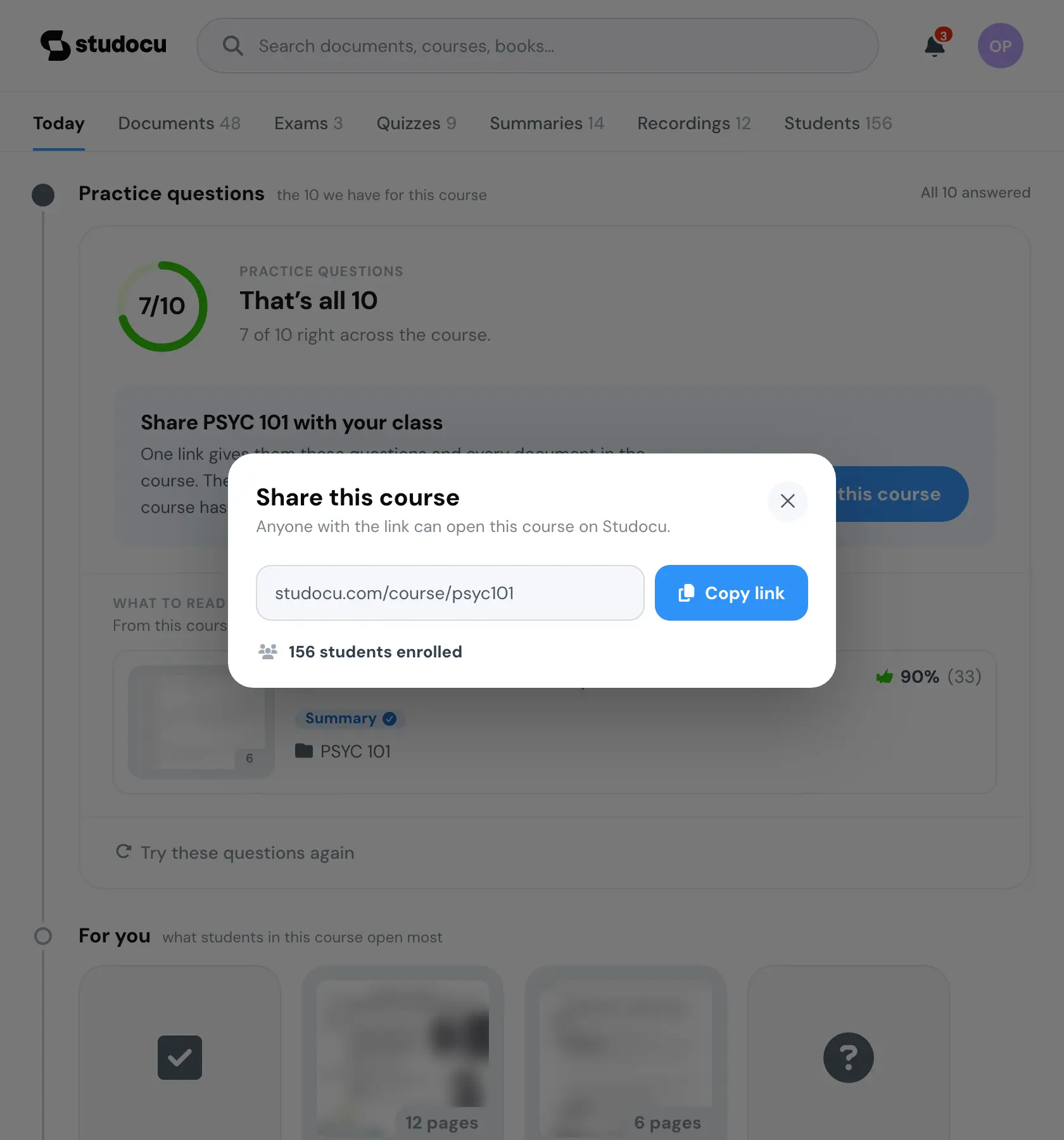
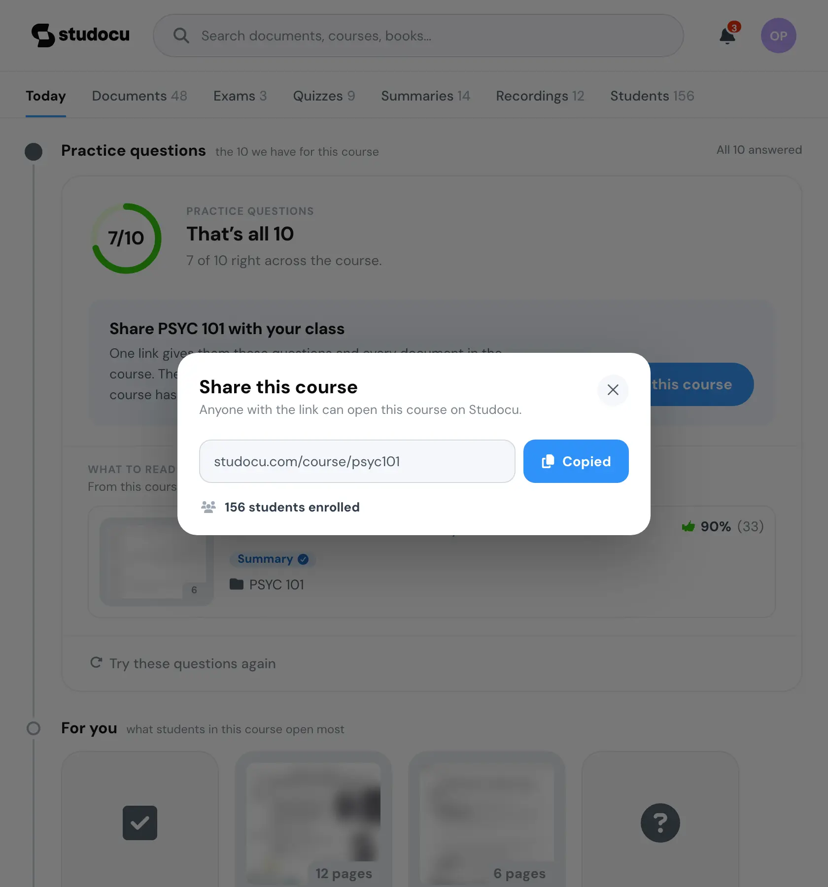
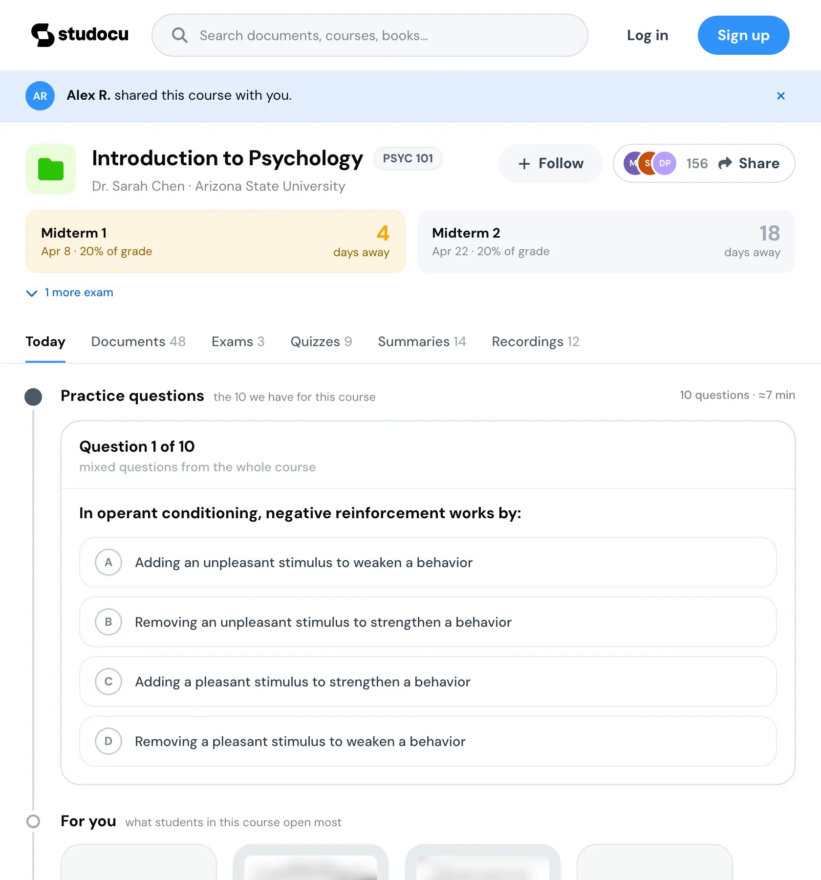
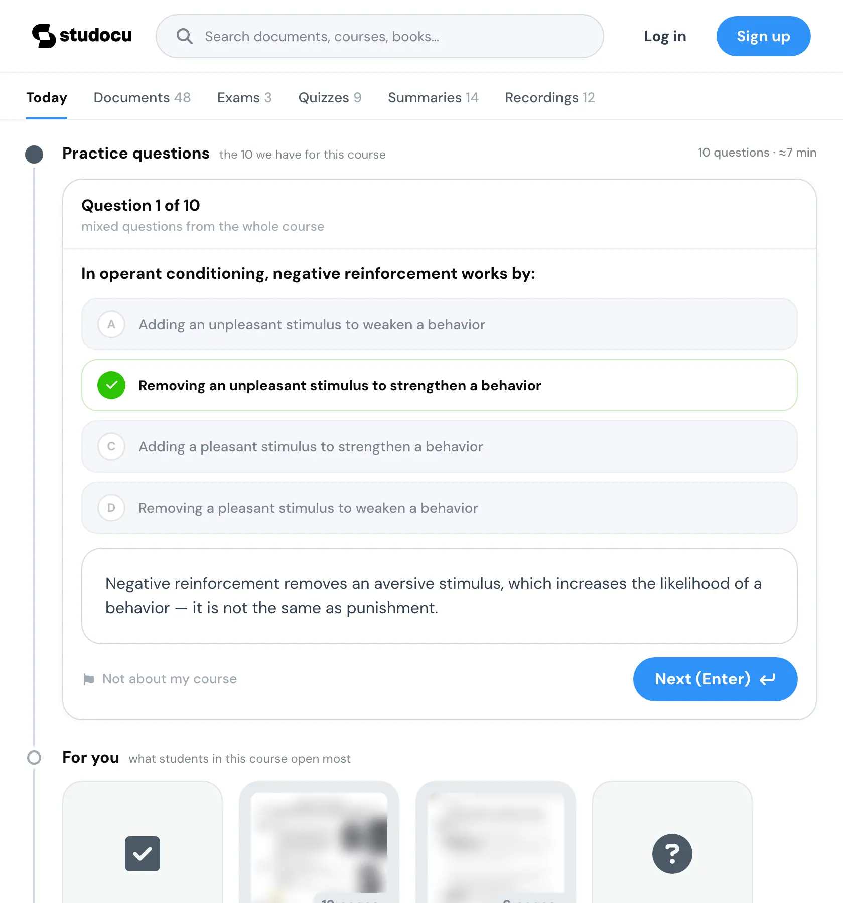
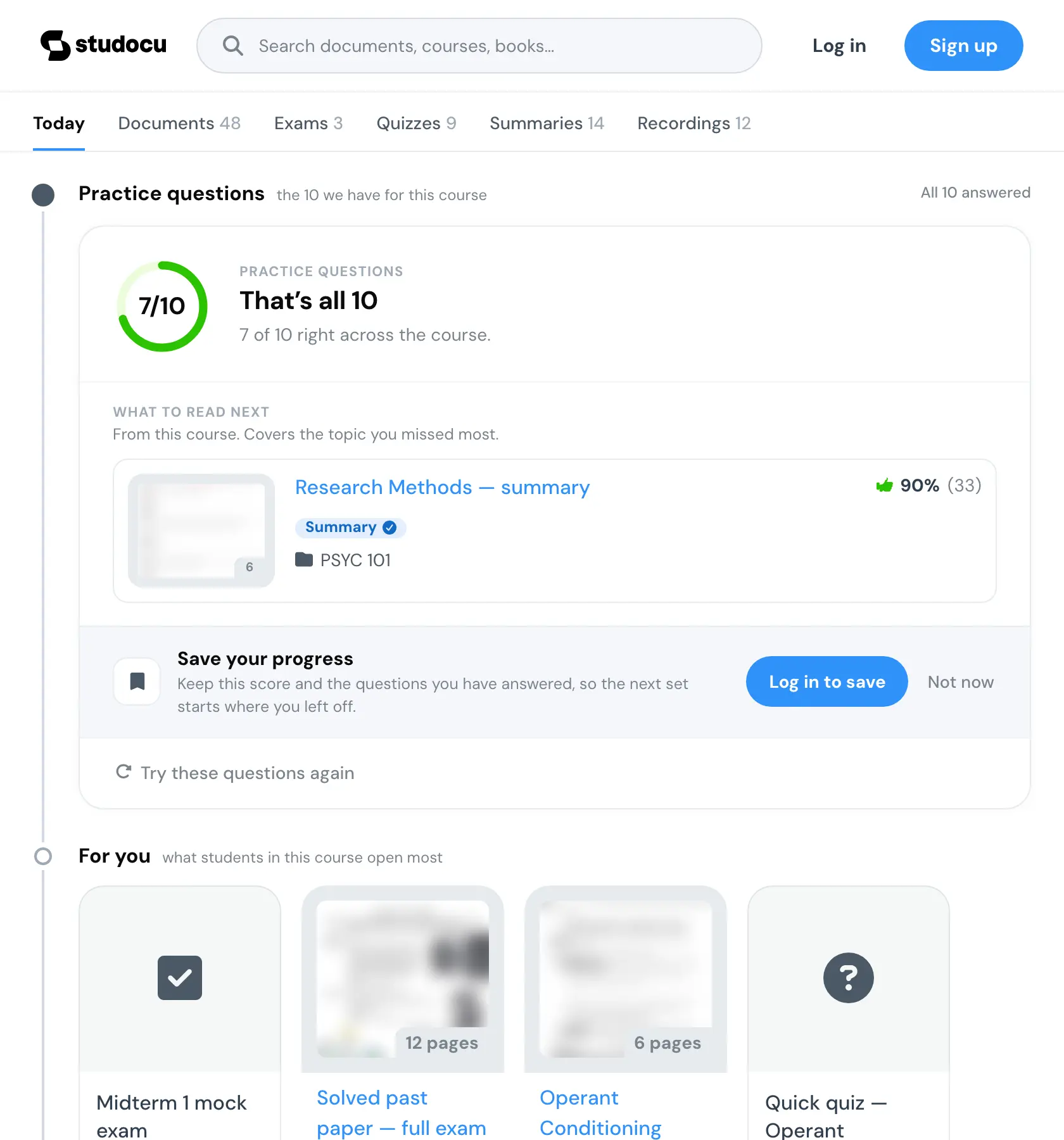
I built fifteen treatments of that ask, from a plain row to a sticker sheet, and the prototype records one of them as selected to be built. The other fourteen stayed in the harness as the comparison, and it opens on the one.
The share ask
15 states

Most conservative: one sentence and an outline button, no tint. Tests whether any theatre matters at all.

Conservative: the URL is shown, so the ask is exactly as big as it looks. Transparency as the pitch.

The default push: a tinted ask under the score, one pill, no theatre. The other fourteen stay here as comparison.

The result becomes the thing worth sending: a scorecard preview travels with the link. People share what they did, not URLs.

People-first: five course mates up front, the chat is the destination. A concrete recipient beats an abstract link.

The shared deadline does the pushing: real exam date, real classmate count, exam amber.

Creative: your scorecard next to your class’s blank one. Same set, fair fight.

Creative: the share as a gift, an admit-one ticket that seats a course mate, not a broadcast.

Creative: a 3D wristband for the whole crew, idling in a slow turn. The link as group access, not a one-to-one favour.

Creative: the same crew band with the course code printed around the ring itself, the message written on the band, turning with it.

Creative: a lanyard study pass with a blank “issued to” line, a gift that begs a name. Grab the pass and it swings, stretches and flips, then snaps back.

Creative: a holographic crew sticker. The foil tilts and shifts under your cursor. The link underneath gets the whole chat in.

Creative: a dark story-size card, the set stamped like a passport: course, score, date, the URL. A receipt you are handed, not a badge you earn. Press the card to stamp it again.

Creative: a cute die-cut sticker sheet of course facts: score, exam day, the crew. The recipient does the distribution work.

Creative: the sheet gone maximalist, patterned die-cut circles (graph grid, crosshatch, halftone dots) packed and overlapping like the back of a phone case. Same facts, louder object.
Seven of them move. Press one to see how.
Crew wristband. It floats and turns, a sheen crossing it. Lettered band. The course code and the score spin around the ring. All-access pass. Grabbed, pulled and flung, it swings back to rest. Holo sticker. The foil tilts and shifts under the cursor. Course stamp. Pressed, it stamps again. Sticker sheet. A sticker straightens and grows under the pointer. Sticker bomb. One sticker lifts to the top of the pile.
The prototype was the handoff
We agreed at kickoff not to write requirement documents. The prototype was the alignment artifact instead. So the handoff and the prototype are one file, with two tracks always visible: product context, with the bets, the decisions and the open questions, and developer handoff, with component pages, measurements, props, a token reference and the tracking spec. Forty-two pages.
The way I worked was to build the options instead of arguing about them. The header is the clearest case. There were nine ways to combine the next exam with how ready you are, so I built all nine behind one flag, and they shipped that way, with no single pick. That is a five minute decision in a room and an unresolvable one in a document. The note under each is what the board and the handoff said about it.
The course header
9 states
The current header.

One bar, an 80% “exam-ready” flag, the date beside it. Lowest cognitive load.

Two stacked bars: time-to-exam vs your readiness. Closest to my sketch.

Blue fill (you) on a gray time-elapsed ghost, one bar. Its line comes closest to a pace judgment, where the others state a gap and the days left.

Bounded height, checkered finish, one accent.

A mini timeline, the climb from 62% to 80% by Apr 8. Most expressive. In this build the label under the chart lost its number.

Readiness over the last 8 weeks, trending toward exam-ready. Backward-looking momentum where the other timeline styles are a forward climb.

A calm take on a study-consistency streak, in the design system's own parts (not a Strava clone).

The shipped exam-strip tile with readiness merged in, and the cheapest variant to build and test.
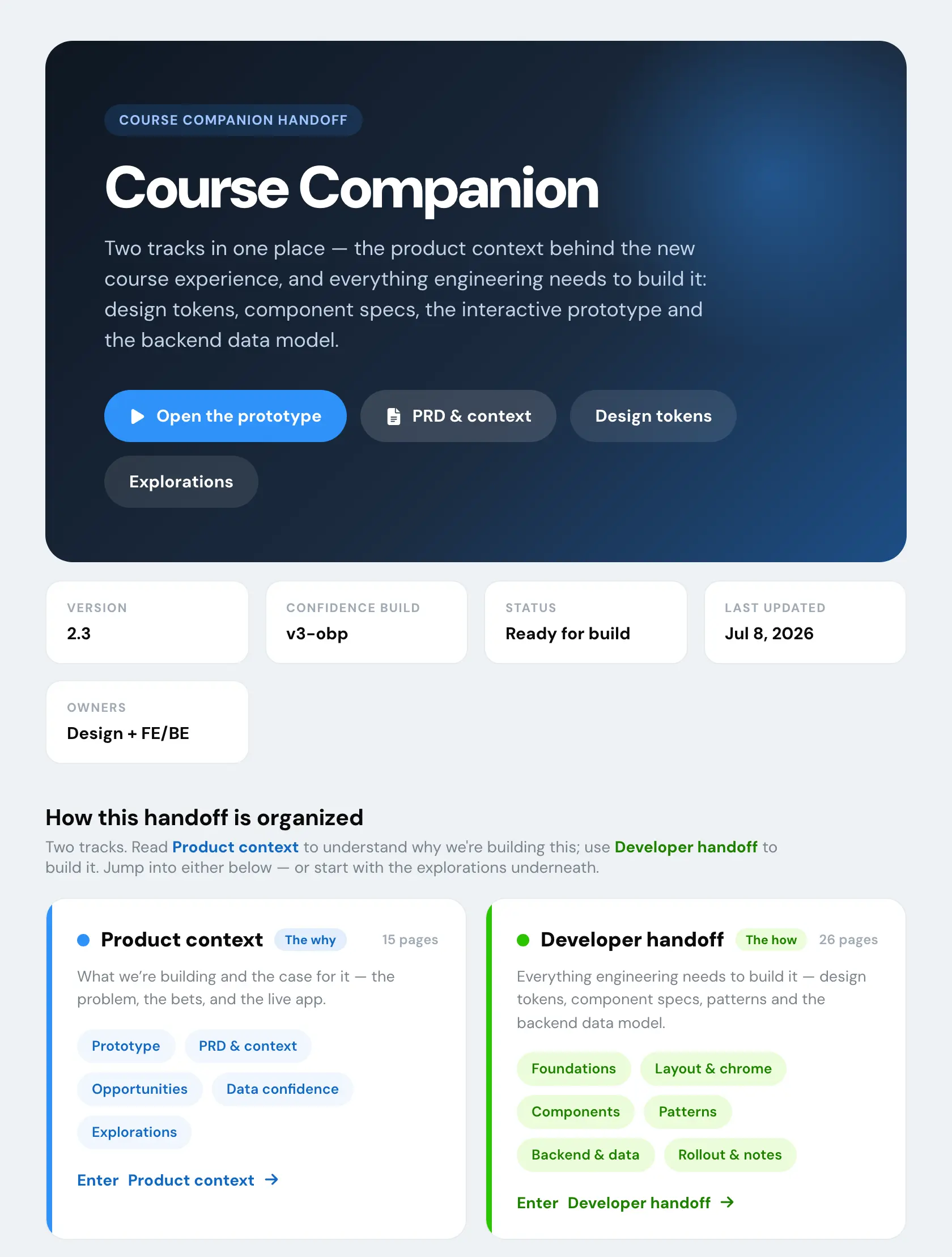
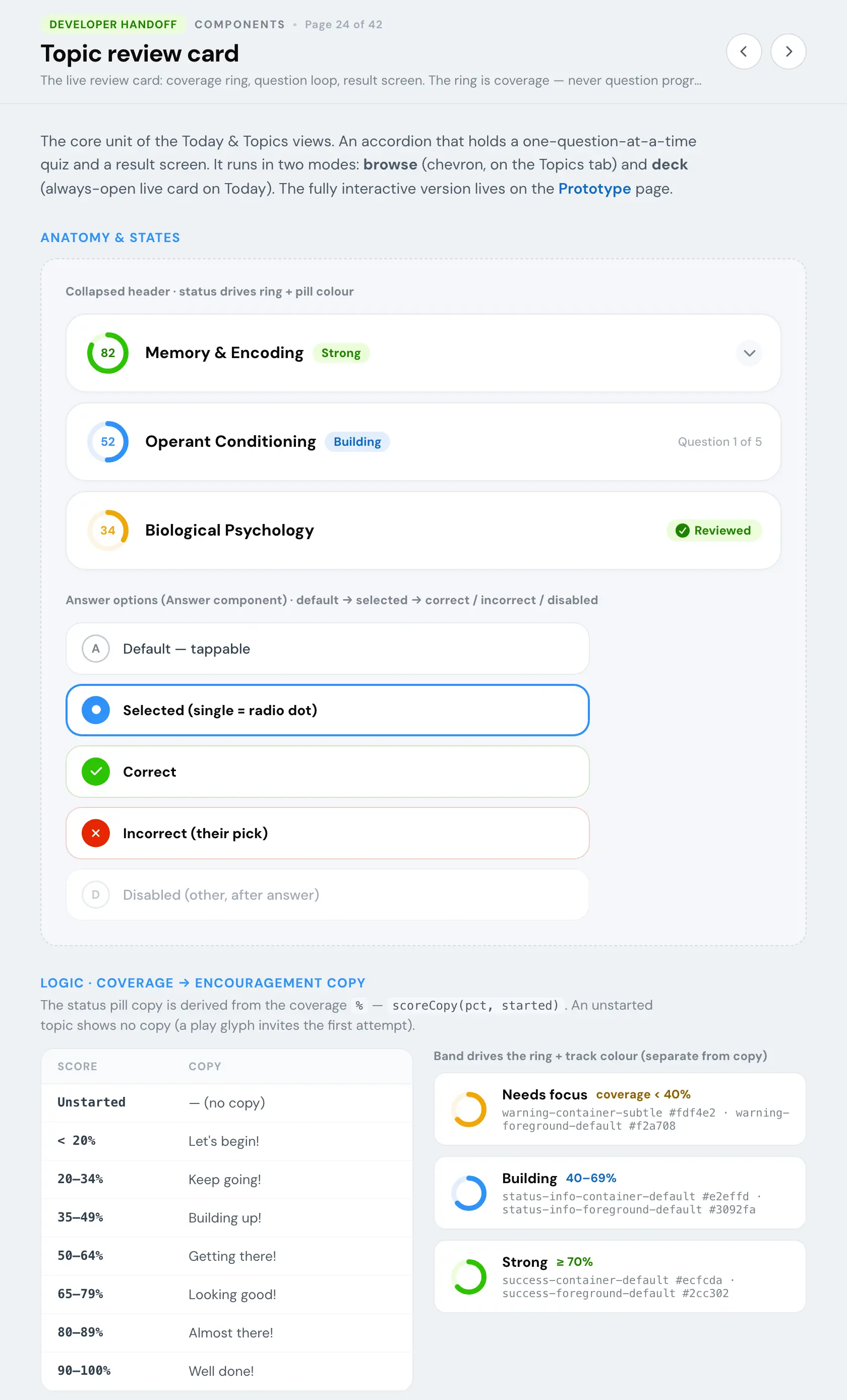
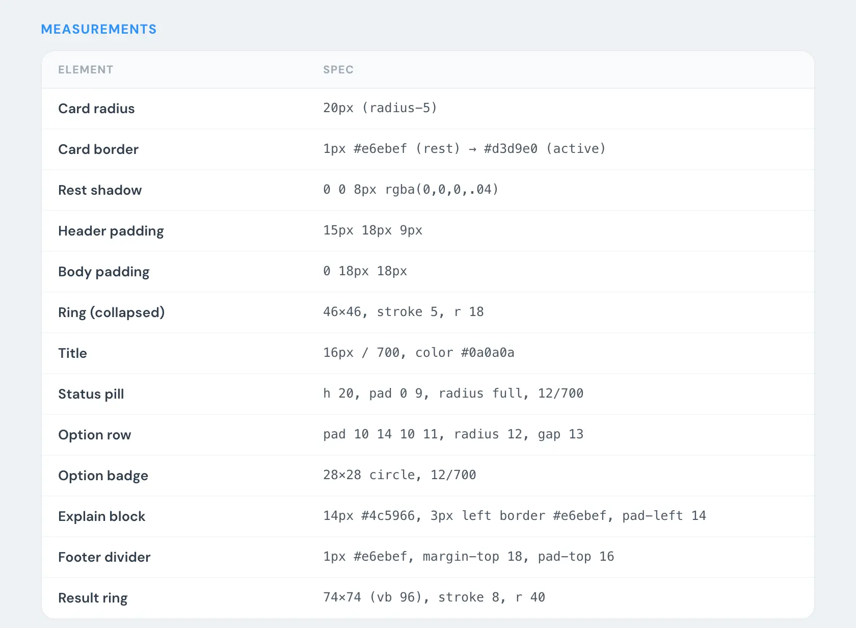
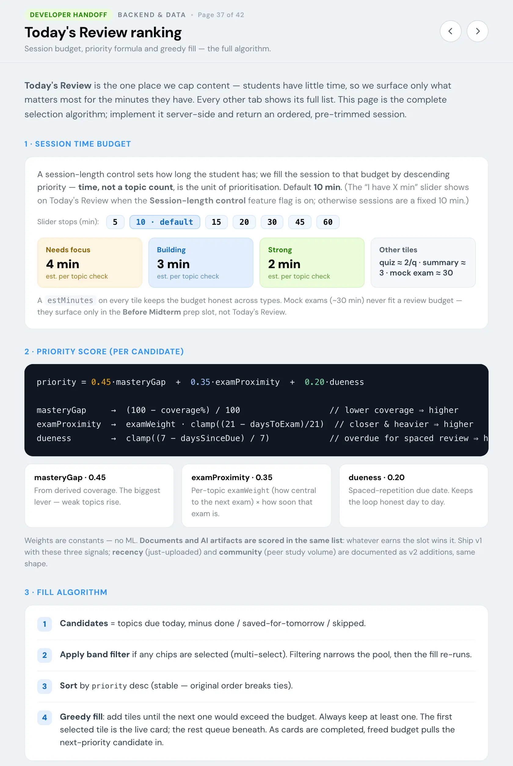
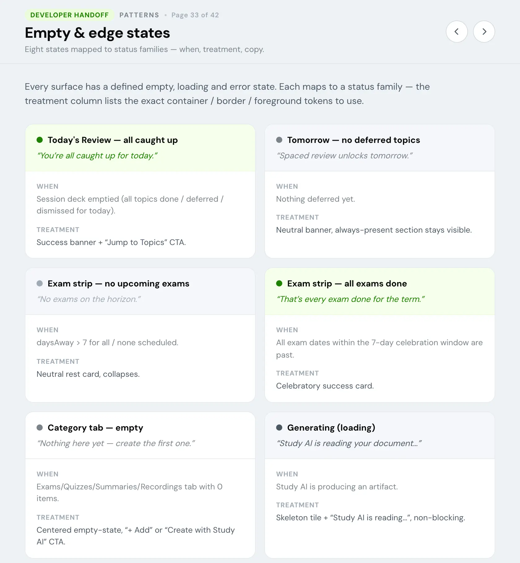
Everything else the prototypes hold, and what was on the boards before any of it was wired.
Built into the prototype
- 16 statesConfidence matrixShown in Sixteen states
- 6 statesDistance from the examShown in Sixteen states
- 4 cardsWhere to nextShown in A question on screen
- 7 treatmentsThe exam strip with no datesShown in When the topics can't be trusted
- 8 statesThe schedule uploadShown in When the topics can't be trusted, four of them
- 6 ordersThe Documents tabShown in When the topics can't be trusted
- 15 asksThe share askShown in After the last question
- 7 objectsAsks that moveShown in After the last question
- 3 statesWhat an ask may print
- 6 framesThe share loopShown in After the last question
- 10 treatmentsThe course headerShown in The prototype was the handoff, nine of them
- 4 stylesThe save ask, with its honest copy
- 3 statesThe topic list
- 3 statesThe estimate mark, finishedShown in What the page may say, two of them
- on or offTriage under an answered question
- 4 statesWhat leads a course with no questions
- 3 statesWhat the course holds
- 4 treatmentsMaking an estimated date pressable
- 8 probesInterview probesShown in Tested with students, two of them
On the boards before anything was wired
Generated by the design tool on my brief, before anything was wired. The brief was mine, and so were the picks and what got built from them.
- 23 optionsExam date bannersShown in When the topics can't be trusted, as the date ladder
- 5 buildsExam date banners, my five comments built
- 23 statesExplanation sources
- 16 optionsHeader, eight rounds of review
- 18 optionsHappy moments
- 11 optionsPractice shape
- 8 optionsAfter the exam
- 6 optionsConfidence asks
- 17 optionsProximity decisions
Tested with students
The second research wave, in July, put the loop in front of students before it was built. I designed the study, wrote the guide and built the tooling. A session is set up in the prototype's own panel and becomes a link that opens the clean user view with those exact settings. The interview companion beside it runs the session: a script, a consent line to wait for, and a list of things not to say.
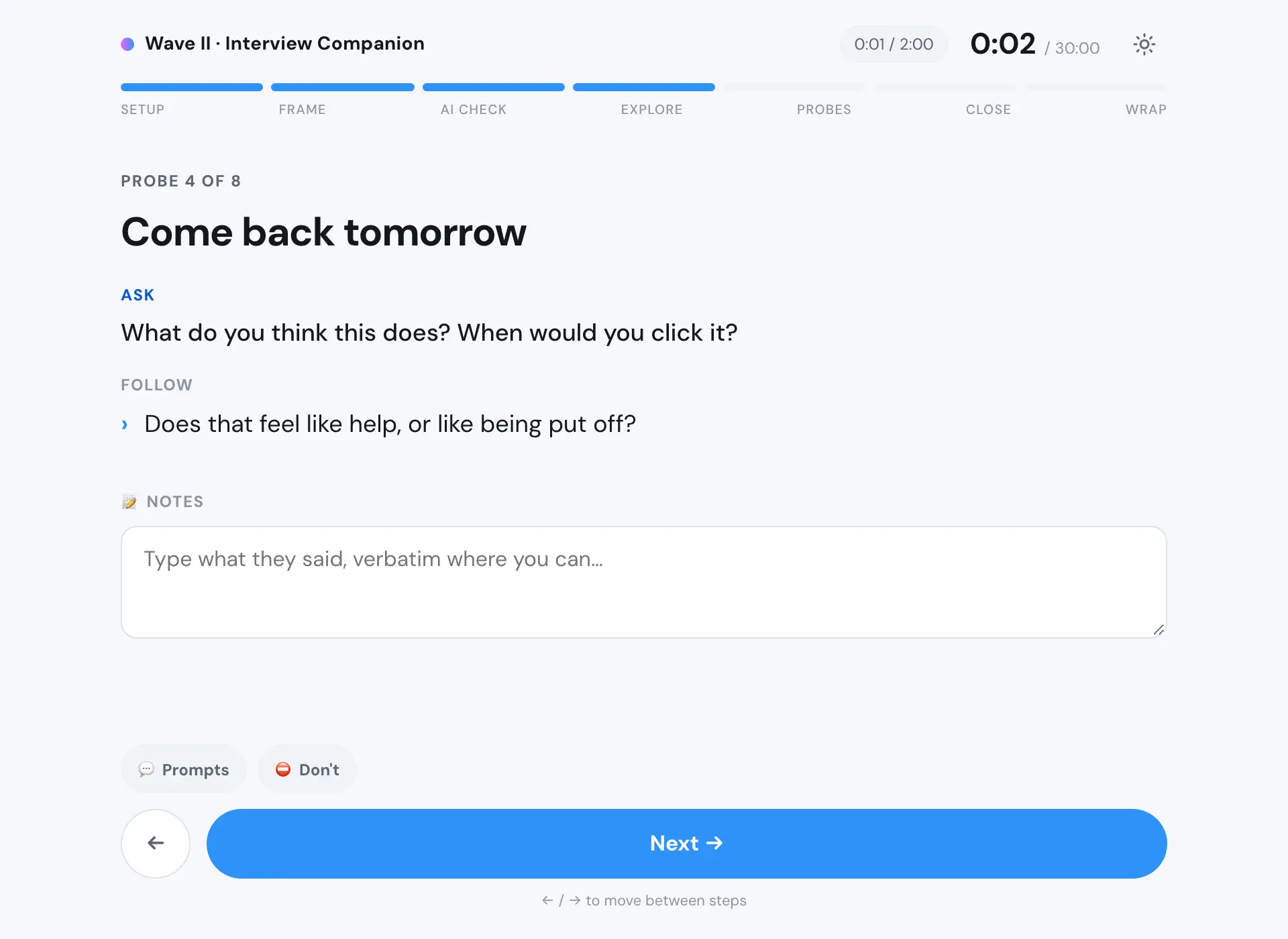
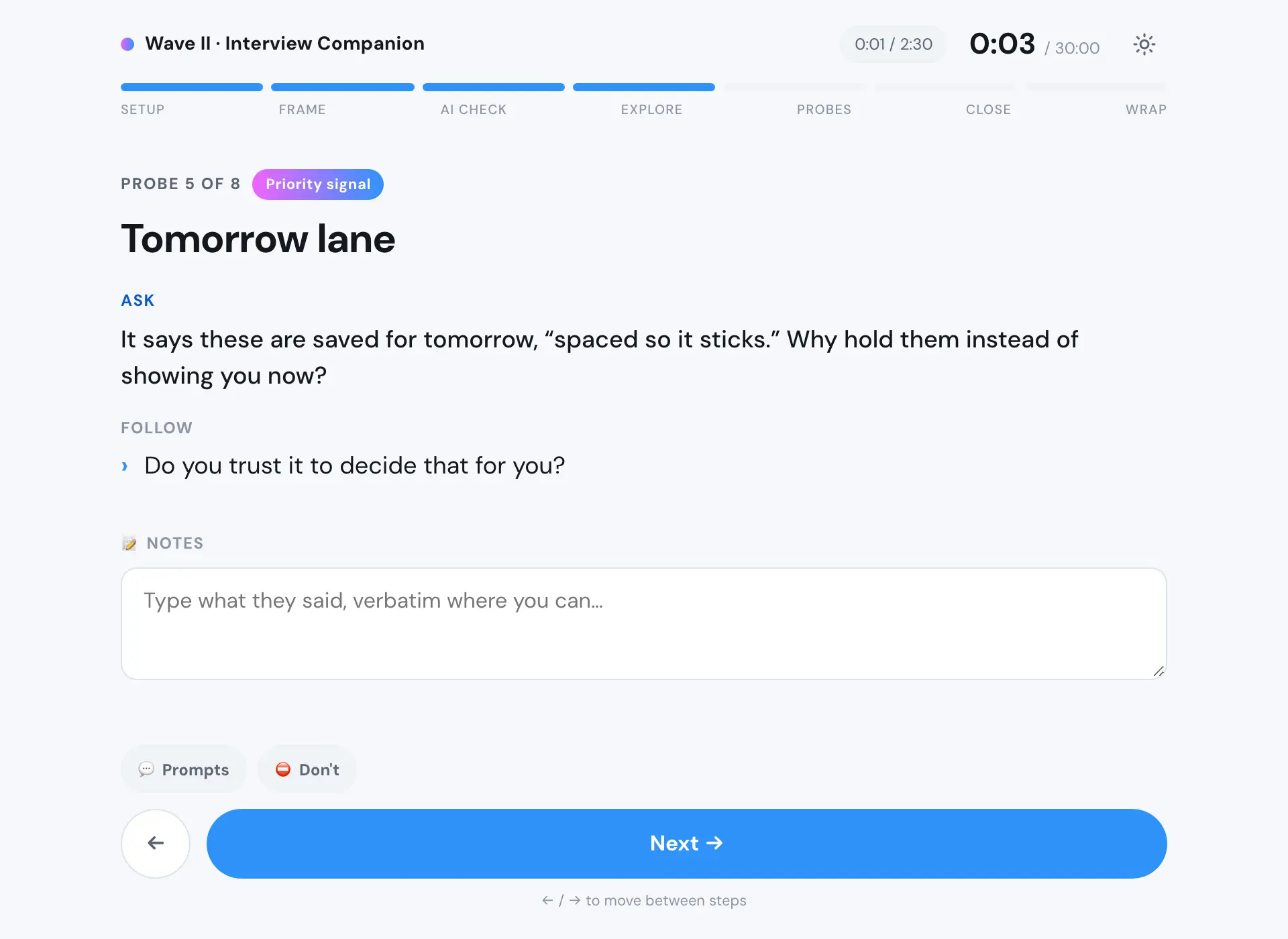
The wave killed one of my own mechanics. Come back tomorrow was meant to read as spacing, and students read it as scheduling and gating. Endless adaptive practice read as stress rather than help, which is where cram mode came from.
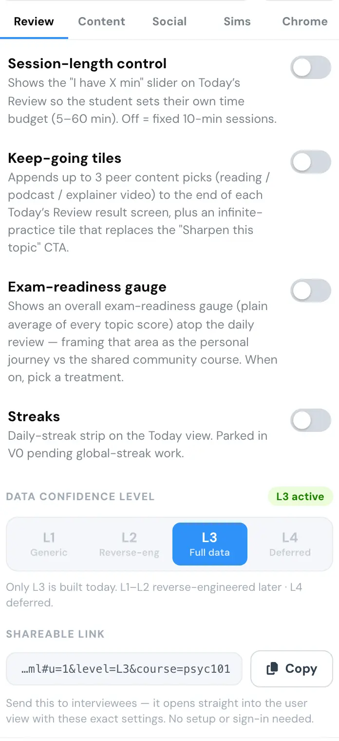
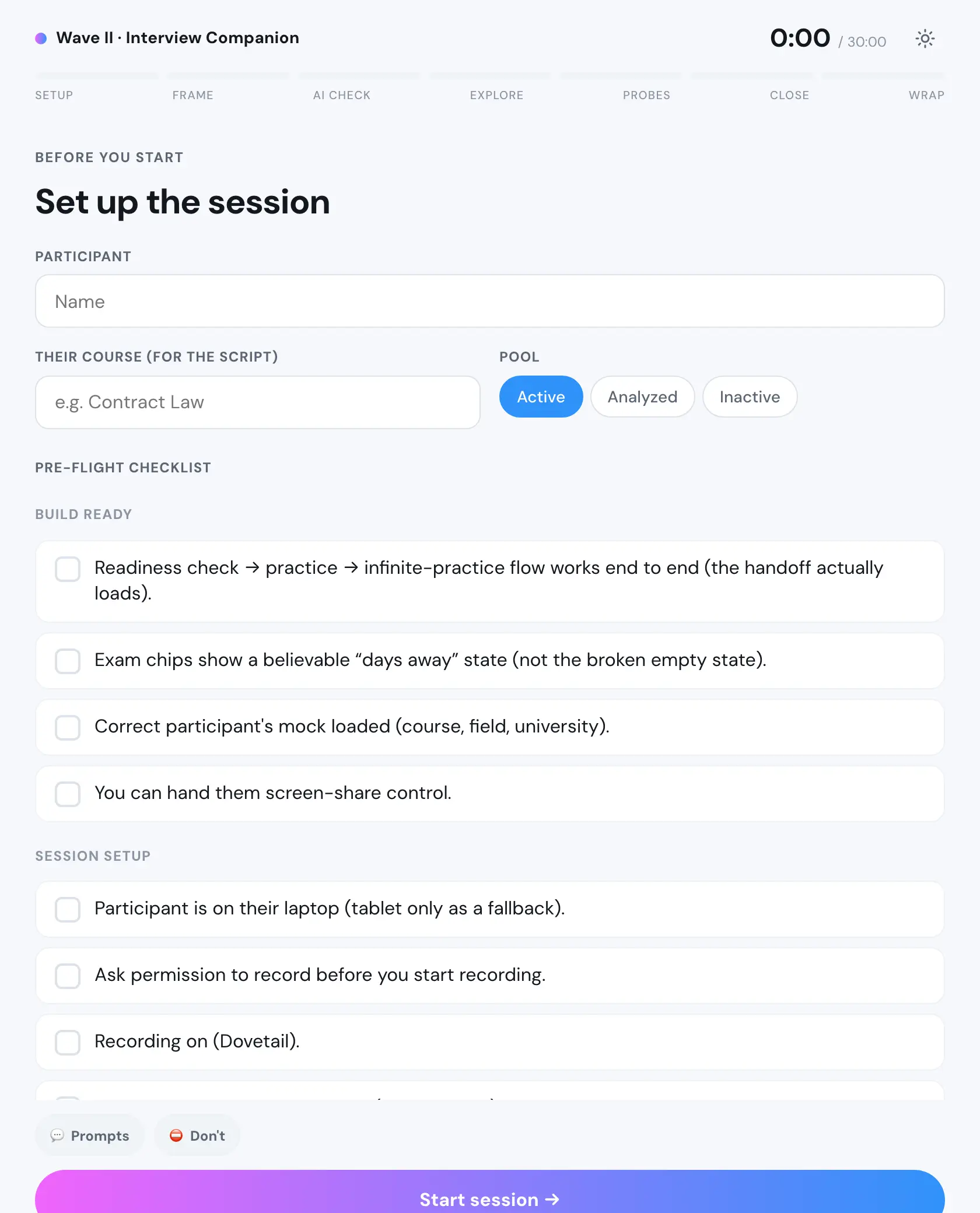
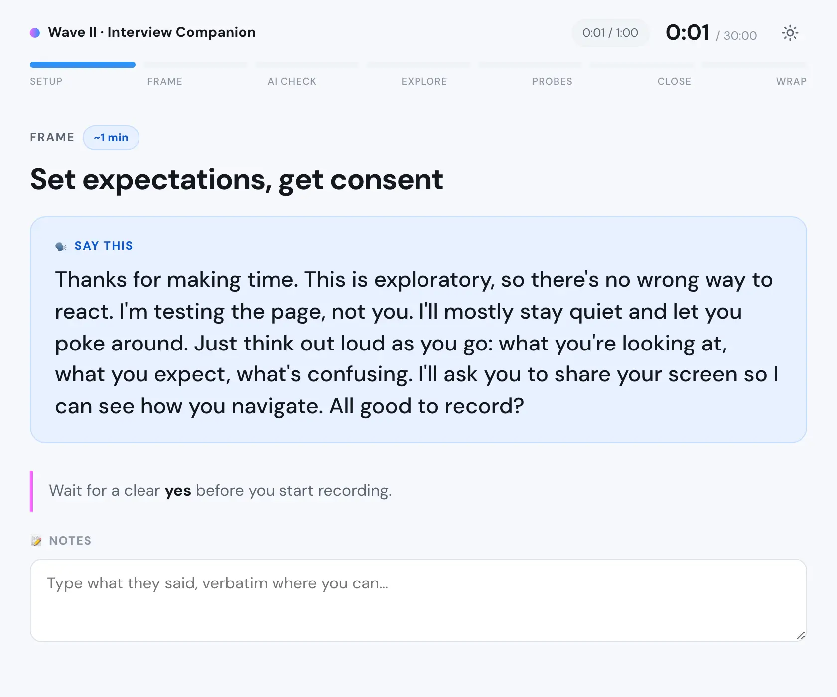
The two probes that found it.
Shipping it
Most of the code was pushed by the frontend engineer on the team, who was very good. What changed is that we stopped doing Figma handoffs. I built the initial states in the real codebase, he rebuilt and hardened them on a shared branch, and I kept pushing code myself from time to time. One of those weeks was five cards: the first daily card built from popular material, the router that picks the confidence state, an edge case for courses with no exam date, a way to flag a topic that looks wrong, and a rewrite nobody had picked up.
Getting the environment running cost me a day, and while doing it I found why nobody could push, and wrote the fix down for the team.
The part worth telling is the mistake. I was asked to bring four sections of the old page onto the new one, and the person asking named three. I searched for what they named, found it, and wrote a three section spec. It was consistent and it was wrong. Someone else found the fourth section two days later, and the evidence had been in my own notes: the name of the test variant was a list of the sections it contained, and I had read it as a label.
The rule I wrote afterwards: enumerate the parent, do not hunt for the children. A screenshot proves something is there. It never proves something is missing.
Findable, or not
In August I measured our own page in both arms of the live test, on the same course. The new one served a fraction of the old page's text and none of its document links. We had built something students could not find.
It was not a tag to flip. The crawler exclusion sat on a URL a crawler never reaches, so removing it would change nothing. You cannot serve one version of a page to a search engine and another to people, which makes a single crawlable URL a launch requirement rather than a cleanup task.
Then I argued my own case down. The uplift estimate was experienced judgement rather than a model, and it would land months after the launch it was being weighed against. In the meeting I had called to push it, I asked whether making the page findable would bring in new users at all, and nobody could say yes. What kept it alive was that the URL structure would block any future migration, so it had to happen either way.
It was scoped and deferred. I think that was the wrong call and I understand it. Four people, one engineer, and a launch in front of us.
Where it ended
When I left it was live and running as a test, the rebuild was shipping behind its flags, and the findability work was scoped and waiting.
The part I would defend is the sixteen states. Almost every decision on that page came down to what we are allowed to say when we do not know, and the honest answer was always more work than the dishonest one: ask instead of guessing, show a grey arc instead of a number, build a page that degrades in pieces instead of one that assumes the data arrived.
What I would change is the order. I spent four months on the problem in front of me, and the one that mattered, whether anyone could find the thing, was one measurement away the whole time.
More case studies
Soothe
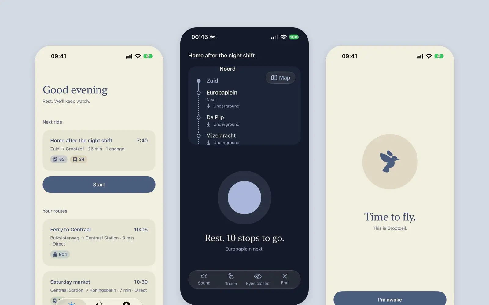
A native iOS proof of concept that pats you until your stop is near, then wakes you kindly. A 2026 rebuild of my 2020 case study. Every ride is simulated.
case study · 2026 · wip · read it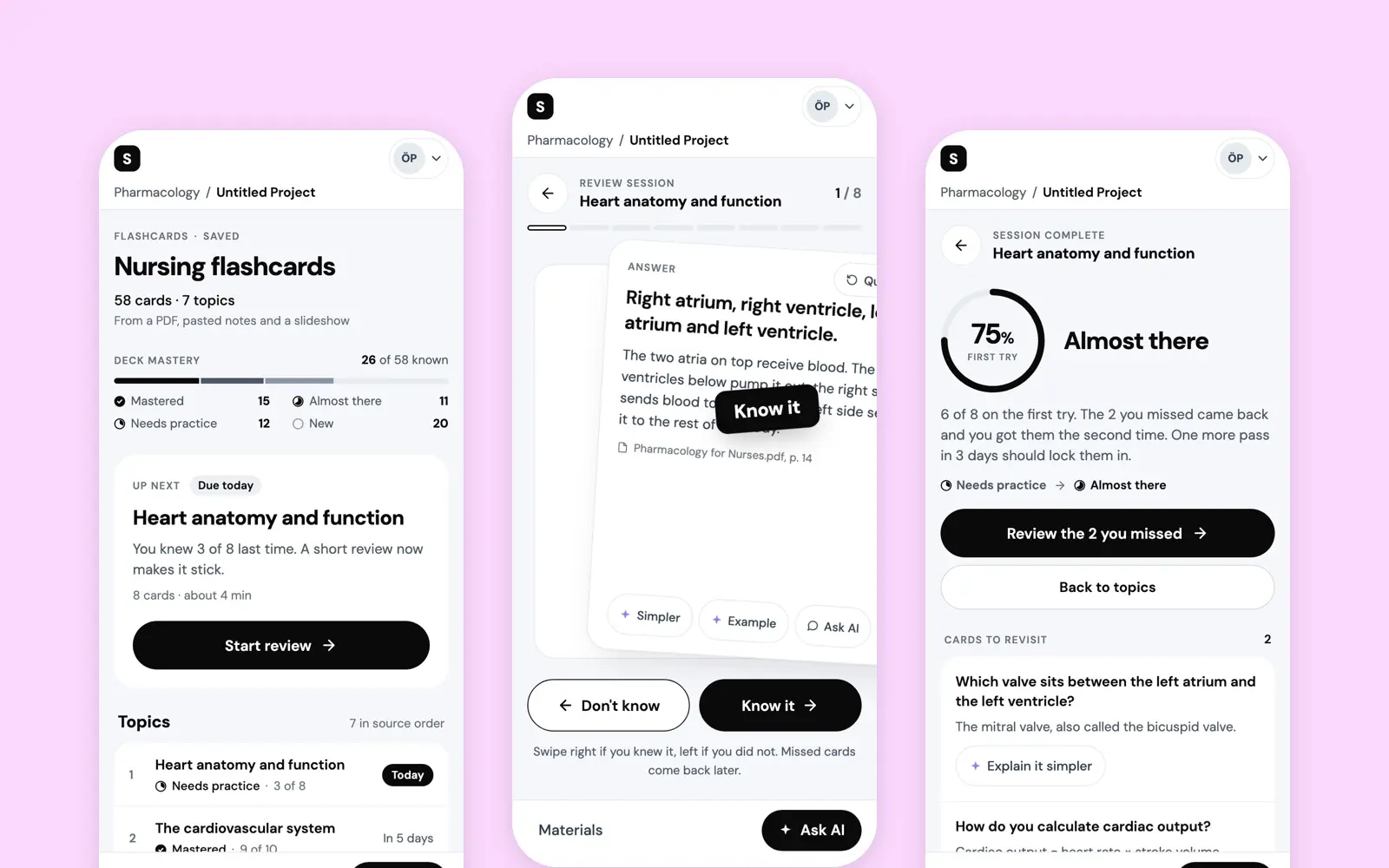
AI Flashcards
A short-term vision for the flashcards in Studocu AI: a deck made from a student's own sources, one rating per card, and a deck that says what to study next.
case study · 2025 · read it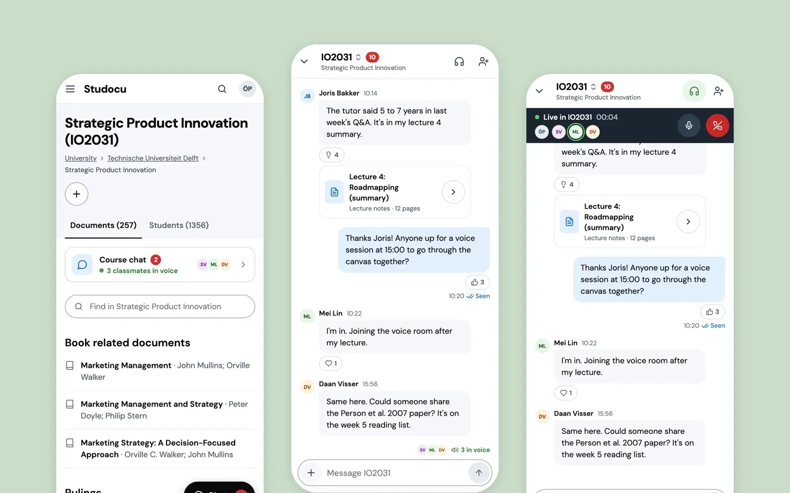
Course Chat
The take-home that got me hired at Studocu in 2022: a live chat with voice rooms on the course page, chosen after asking students what they already do.
case study · 2022 · read it