← Systems

Design System for AI Prototyping

design-system
Year
2026
Used by
The whole company
  1. triggerSomebody prompts an AI for a screen and gets something generic back, because the model has never seen the product's real components.
  2. transformationPoint an agent at the actual frontend repository and at the design files, then iterate component by component until every variant, size and state matches the real thing.
  3. outputTwo component systems, desktop and app, that a colleague can prototype against so what comes out already looks like the product.

metricNo public number

Ask a model for a settings screen and you get a settings screen. It will look like nothing your team has ever shipped, because the model has never seen your buttons.

So it gets shown them. An agent reads the actual frontend repository, the components as they are really written, with their real props and their real tokens, and the design files alongside. Every component is rebuilt as a self contained page and compared against the thing it is meant to be, again and again, until they match.

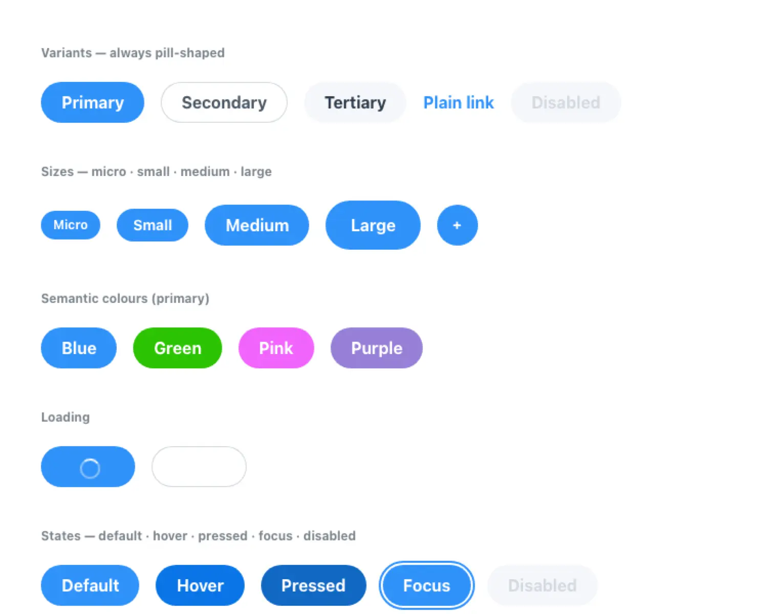
The bar is 1:1. Every variant, every size and every interactive state. Hover is the one everybody remembers. Pressed, focused and disabled exist in the code and in no frame, and they are why a prototype built from the design file alone feels slightly fake without anyone being able to say why.
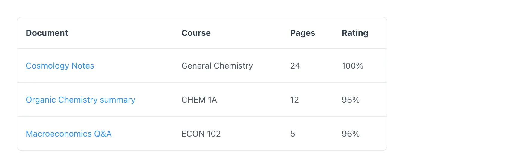
  • TableA data table with four columns for document, course, pages and rating, and three rows of fictional course material.
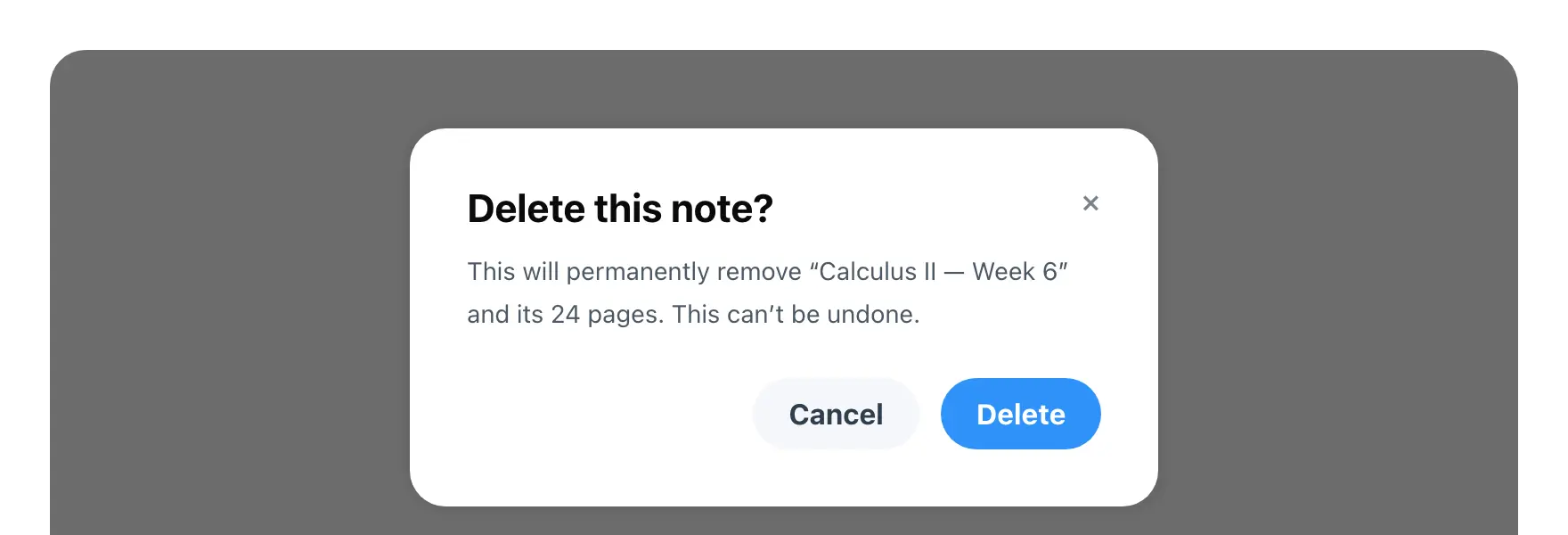
  • ModalA confirmation dialog over a dimmed backdrop, asking whether to delete a note, with a cancel button and a destructive confirm.
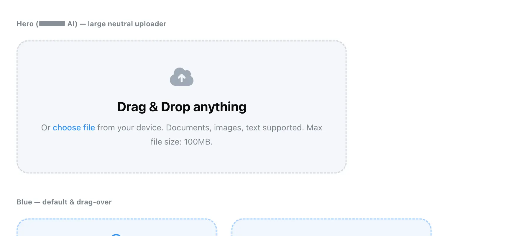
  • UploadA large dashed upload target reading drag and drop anything, with a link to choose a file instead and a maximum file size. Two smaller drop zones sit below it showing the resting and drag-over states. The section label has a word redacted.
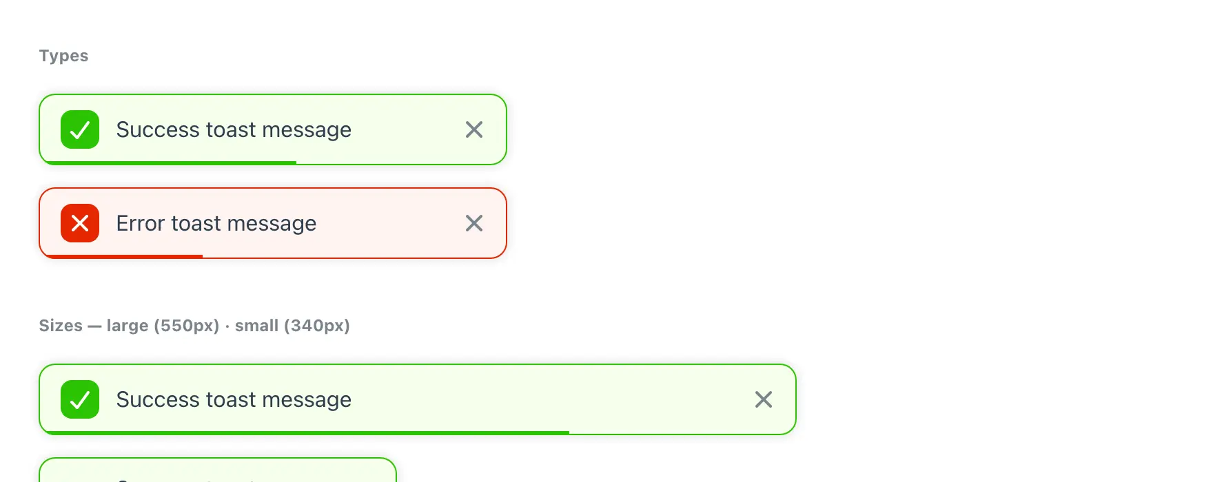
  • ToastSuccess and error notifications with an icon and a dismiss control, then the same message at two widths, the narrower one wrapping to four lines.
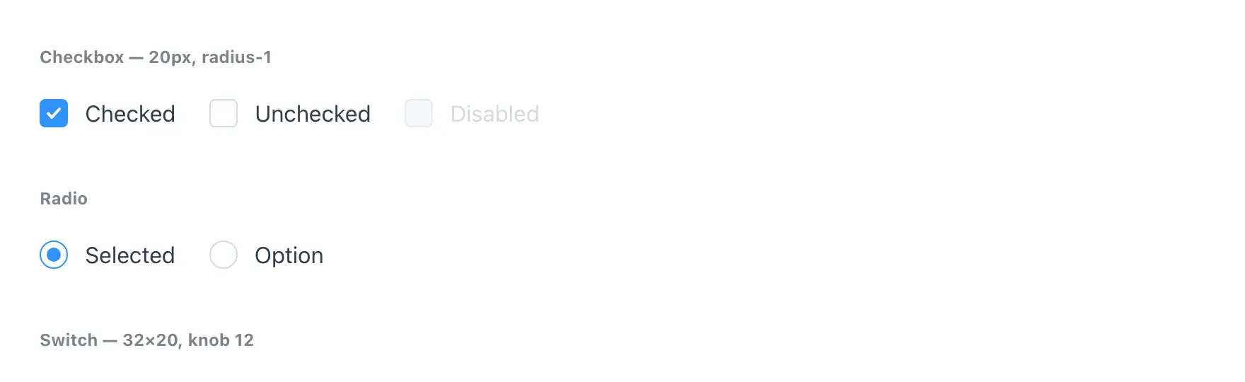
  • Selection controlsCheckbox, radio and switch, each shown selected, unselected and disabled, with their pixel sizes noted beside the group.
  • SkeletonShimmer placeholders standing in for content that has not loaded: a large block, a circle, and three lines of decreasing width.
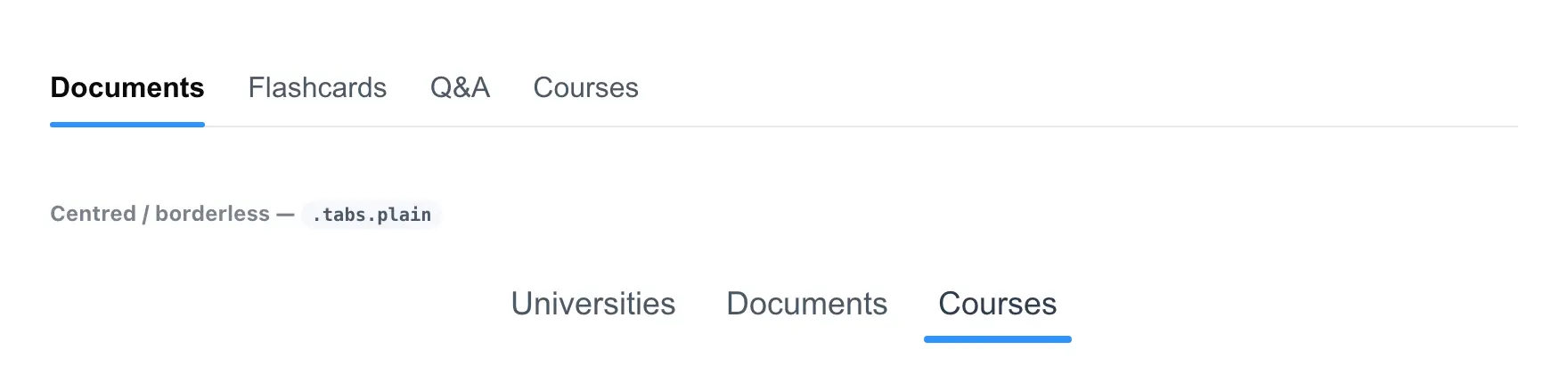
  • TabsA tab bar with the first item selected and underlined, then a second centred variant with no dividing rule.
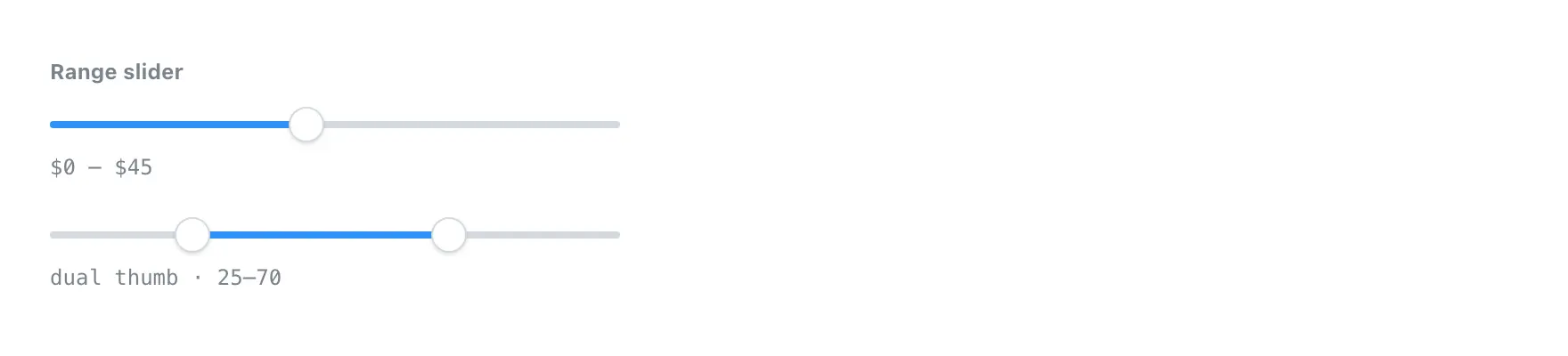
  • Range sliderA single-handle slider with its value shown beneath, and a two-handle version below it selecting a range.
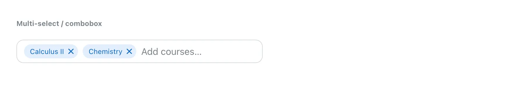
  • Multi selectA combobox holding two removable chips for fictional courses, with room to type another after them.
  • StepperA three step progress indicator. The first step is complete and ticked, the second is current, the third is still to come.
Drag or scroll sideways, or use the arrow keys. Every one of these is a generated page in the bundle rather than a picture drawn for this site. Names and internal paths are removed at capture, and one label has a word redacted.

Where the two sources disagree, the code wins. A value gets nudged in the browser during review and never travels back, and a component picks up a variant no frame has ever shown. So the rule is settled before the first component: the code is the source of truth for values, and the design file is a visual cue for what the thing is supposed to feel like.

Desktop first, then the app, which is a separate system with its own components rather than the first one with smaller padding. Both are what the whole company prototypes against.
Screens

  1. A component specimen sheet. Five button variants in a row, then four sizes, then four semantic colours, then a loading pair, then the five interactive states side by side: default, hover, pressed, focus with its ring, and disabled.
    A generated specimen page. Every component in the system gets one, and it is the surface the rebuild is checked against, state by state, until the two agree.
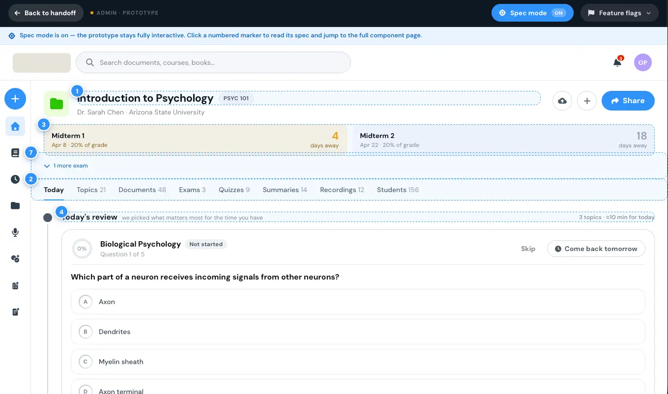
  2. A course page prototype with spec mode switched on. Numbered markers sit beside the header, the exam strip, the tab bar and the daily review card, and a banner across the top says the prototype stays interactive and that each marker opens the spec for that component.
    Spec mode on. Every marker opens the spec for the component beside it, so the prototype is the handoff rather than a picture of one.

More systems

  • Frontend Shipping Guide

    A skill that takes a designer, PM or analyst from an idea to a merged change, and proves with a search which files the change can reach before a line is written.

    pipeline · 2026 · how it works
  • Intelligent Interview Analyzer

    Loads the study before the transcripts, then reads 30 to 50 transcripts in a single run into one synthesis, on the researcher's own machine.

    pipeline · 2025 · how it works
See all 5